Assisted Housing & Spatial Opportunity
A few weeks ago I gave an interview for a Baltimore Sun article, published yesterday, about Baltimore's geography of opportunity and housing policies designed to help level the playing field (this is my dissertation topic). After Chetty, the spatial structure of opportunity became a topic of a public interest, and after Freddie Gray, Baltimore was a natural place to dig into the issue. It's a good topic for the Sun; people are increasingly concerned about growing inequality and Google maps ushered in the era of spatial literacy, so using maps to evaluate assisted housing seems relatively straightforward.
But while recent events may have brought neighborhood effects to the mainstream, mapping metropolitan inequality (what I call the cartography of opportunity) has been a driving factor in Baltimore's housing policy for more than a decade. The Sun article starts to get at this--but because almost all of my material was cut from the piece, and because I think some important points weren't emphasized properly, I want to share a few things from my dissertation.
First, I think it's important to point out (as I've written before) that measuring and displaying geographic variations in opportunity is no simple task. "Opportunity" means many things to many people. Even if the outcomes were clear (do we mean opportunity for health? happiness? economic sufficiency? education?) identifying the combination of spatially defined variables that lead to each of these ends is extraordinarily difficult. With that said, though, at least 30 years worth of empirical research exists to help guide our efforts, so we're not exactly shooting in the dark either. The real point is that if you're going to try and map "opportunity," a lot of things need to be considered simultaneously.
For Baltimore's recent regional plan for sustainable development, for example, I led the development of a series of opportunity indices intended to measure different aspects of wellbeing. Indices are divided into categories like education, employment, social capital, and public health, then each is mapped separately. The education index uses data from the Maryland Department of Education and measures the quality of neighborhood schools; the social index uses census data to measure demographic features like employment, education and income levels (things that contribute to social capital accumulation); the employment index uses data from the MD Department of Labor to measure access to jobs; the public health index uses data from the EPA and Applied Geographic Solutions to measure crime victimization and exposure to environmental hazards.
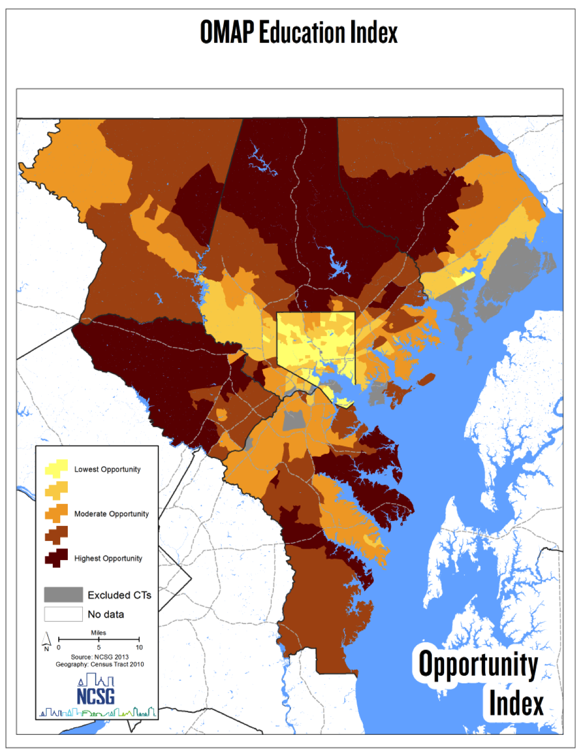
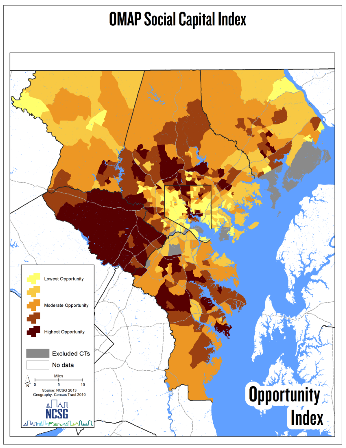
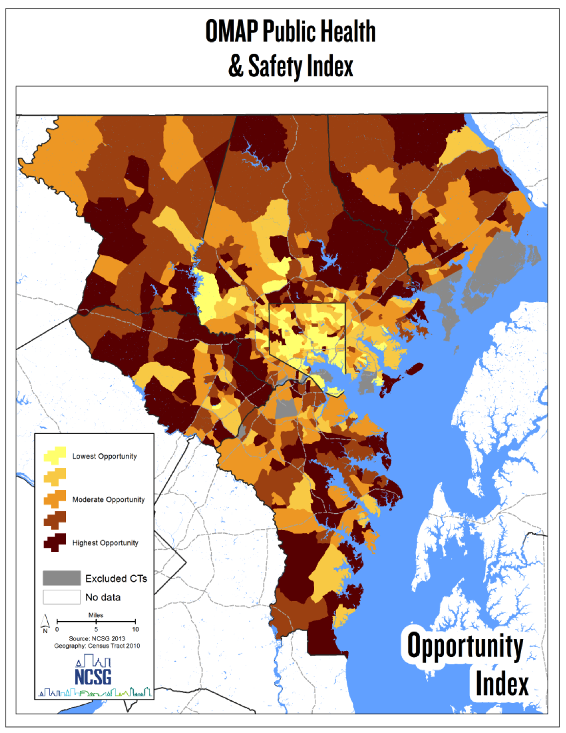
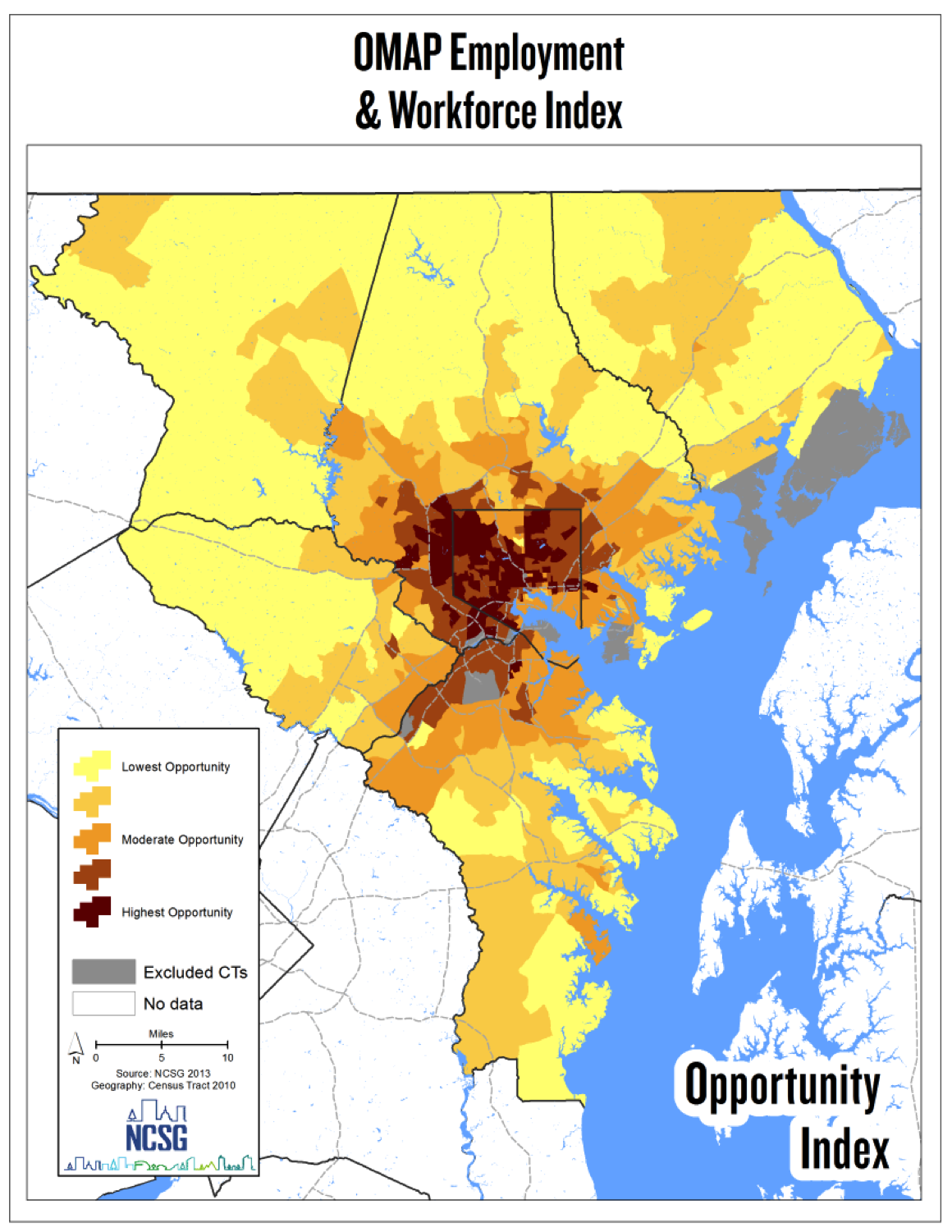
The maps reval some interesting (though not unexpected) patterns. First, there appears to be a typical urban/suburban competition for resources: social, health and education opportunities seem to be richest in the suburbs, while the City suffers. Employment, however, bucks this trend. Baltimore City is still Maryland's largest job center, it has the densest transit system in the region, and it's centrally located which facilitates quick access to other regional job centers.
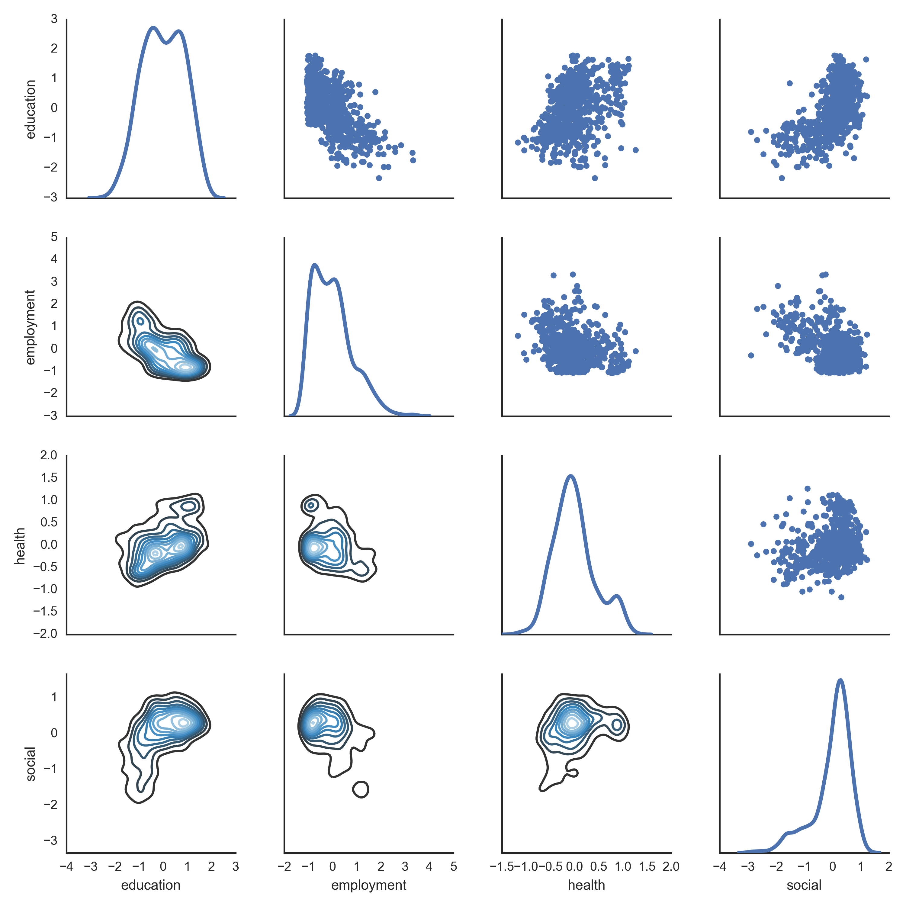
Since several of the maps share the same overall pattern, it's also clear that several different measures of opportunity correlate with one another. Again, this isn't terribly surprising, Well-educated people tend to make more money, and they tend to live near good schools, and they are able to pay a premium for healthy environments. It's useful to get a sense of how much the different aspects of opportunity correlate with one another, though, which is why it's useful to make some descriptive plots. The graphic matrix on the left helps accomplish this. Images along the diagonal are univariate density plots showing how each opportunity index is distributed across the region. Graphs below the diagonal are bivariate density plots, emphasizing areas where both variables cluster. Graphs above the diagonal are scatterplots that show how each of the metrics correlate with one another. The scatterplots confirm that many of the opportunity metrics (education, social, health) are positively correlated, and the employment access tends to be negatively correlated with all three.
Despite longstanding concerns about the spatial mismatch hypothesis, I think these maps and graphs make clear that the best employment prospects in the Baltimore region are found in the City itself. While several other types of opportunity abound in the suburbs, transit dependent households whose members are employed or looking for employment will have a tough time leaving the city. The Sun article hints at this, and I've written about it as well
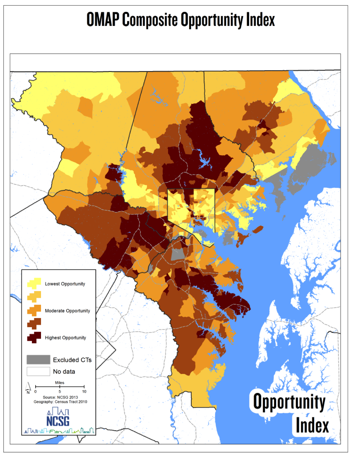
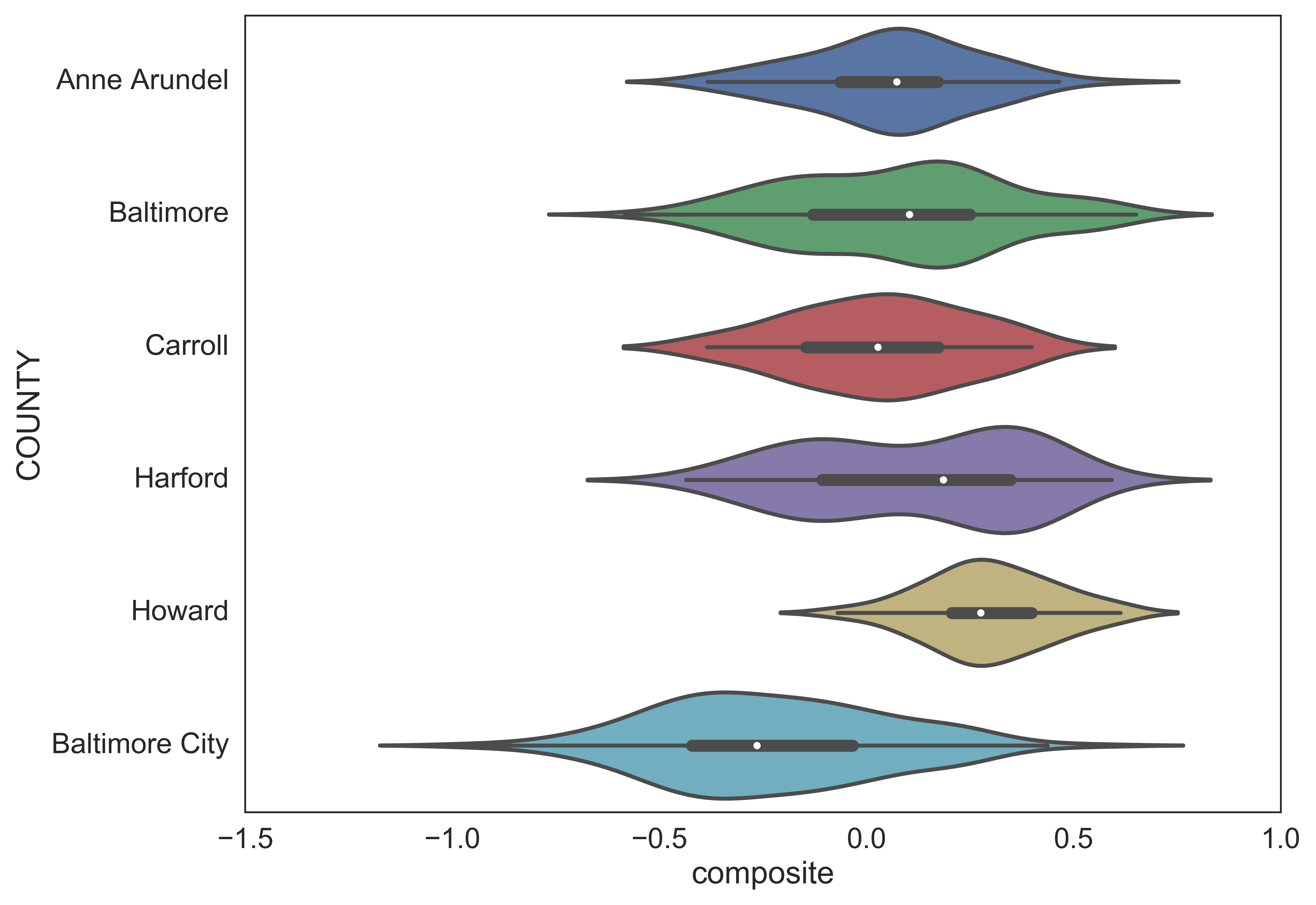
Even with its dominance in employment opportunity, it's clear that the City is disadvantaged with respect to overall levels of opportunity. Because of the correlation among social, education, and health measures, aggregating opportunity scores into a composite metric reveals clear urban/suburban disparities. The composite map below shows the aggregate opportunity score for each neighborhood in the region, and the violin plots on the right show how the composite score is distributed within each county. Both the map and the violin plot make it clear that Howard county has the highest levels of opportunity, while Baltimore City has the lowest. In fact, Baltimore City (which has the same status as a county) is the only place with a median opportunity score below zero (i.e. low opportunity).
The composite opportunity map is designed to show the overall structure of opportunity by combining each of the subject indices. Aggregating sub-indices helps give a sense of the average opportunity level of each neighborhood, but it doesn't help you get a sense of the tradeoffs each neighborhood embodies. In some places, residents may be sacrificing some public health risk for better school quality, or they may be trading social capital for greater job accessibility. The map below attempts to help illustrate these tradeoffs. The colors on the map correspond to the composite opportunity level, but mousing over each tract will reveal the opportunity score for each sub index. If you know Baltimore well, you can also search for a particular neighborhood or address to see how the different measures of opportunity stack up in that area. Try searching for sandtown-winchester, Freddie Gray's neighborhood.
The three smaller maps beneath (which will all pan and zoom together) show the concentration of different assisted housing programs, thanks to HUD's public data portal. Instead of points, assisted housing locations are displayed as heatmaps, which are useful in this case for two reasons. First, heatmaps take advantage of more data because they take into account the number of units at each location rather than simply displaying the location itself. Second, HUD only provides Housing Choice Voucher (HCV) data at the census tract level. Since we're already using census tracts to display the opportunity scores for each neighborhood, the best way to display both datasets simultaneously is to compute a density kernel based on tract centroids. The heatmaps are computed on the fly, so panning and zooming on the maps will reveal different patterns (note, however, that because the HCV data is tract-based, excessive zooming into the HCV map will only reveal census tract centroids not the precise location of any voucher holders
Public Housing
Low Income Housing Tax Credit
Housing Choice Vouchers
These maps make it clear that the vast majority of Baltimore's public housing is concentrated in areas of low opportunity. LIHTC properties and voucher holders are also disproportionately concentrated in low-opportunity areas, but these programs are more dispersed throughout the region (and throughout opportunity levels). This, I think, was the point of the Sun article; as assisted housing policy has increasingly relied on the private market, some low income households have found themselves in better neighborhoods, but the overall spatial pattern has remained largely unchanged.
The narrative is accurate, but it's only part of the story. Another important part has to do with the way that voucher programs have evolved over time.
MTO
HCV
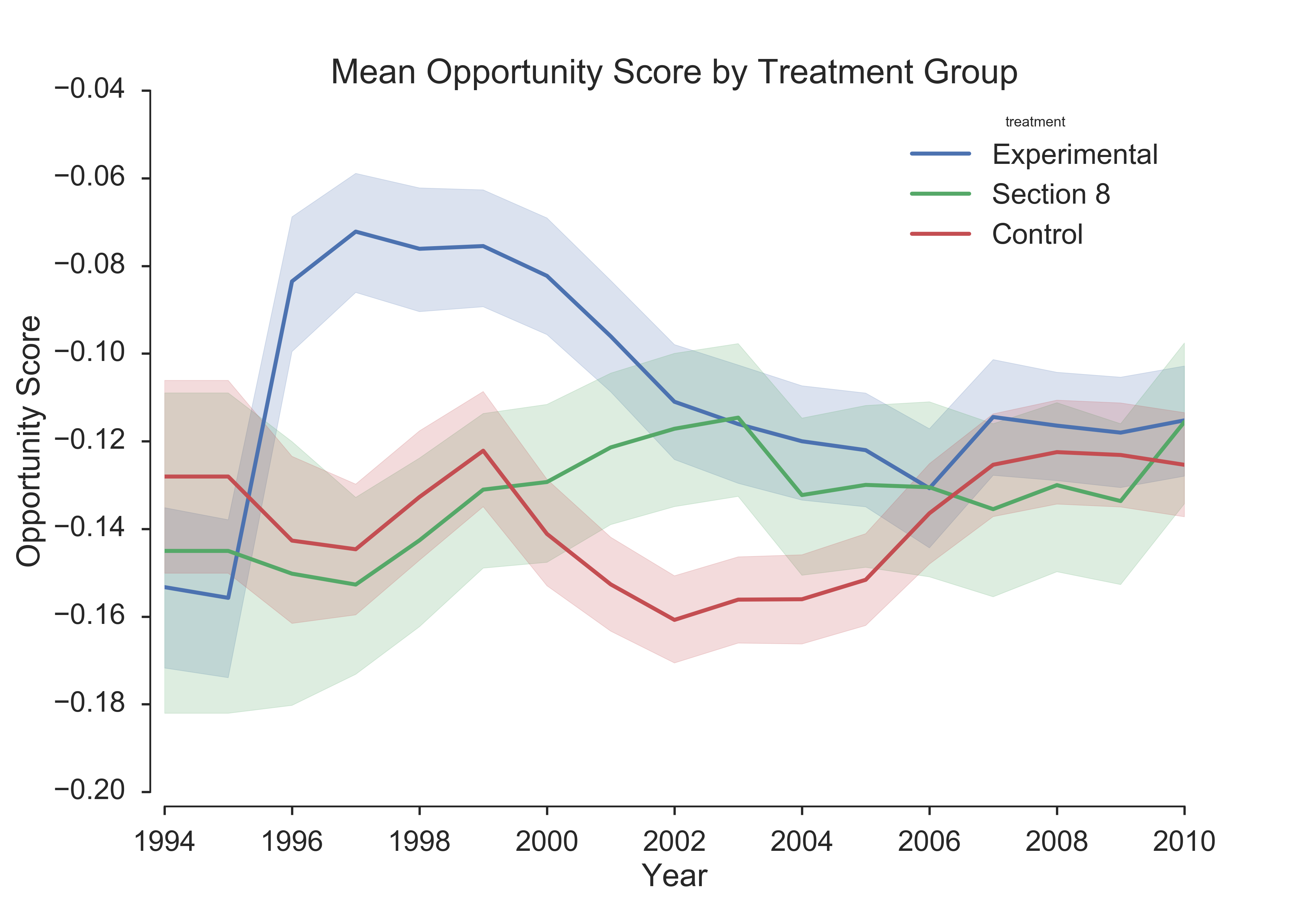
The graph on the left shows the average neighborhood opportunity score for households that participated in the Baltimore site of the Moving to Opportunity experiment. The blue line represents households in the treatment group who received vouchers that could only be used in low poverty areas, the green line represents the section 8 group who received unrestricted vouchers, and the red line represents the control group who didn't receive vouchers and instead remained in project-based public housing (there was, however, substantial residential mobility among this group due to the demolition and redevelopment patterns caused by HOPE VI). What's immediately apparent from this graph is that, early in the program, families in the treatment group moved to neighborhoods with much higher levels of opportunity than the other two groups, but over time these locational advantages diminished. Treatment group families were only required to stay in low poverty neighborhoods for one year, and many scholars have documented the program's relatively short location intervention
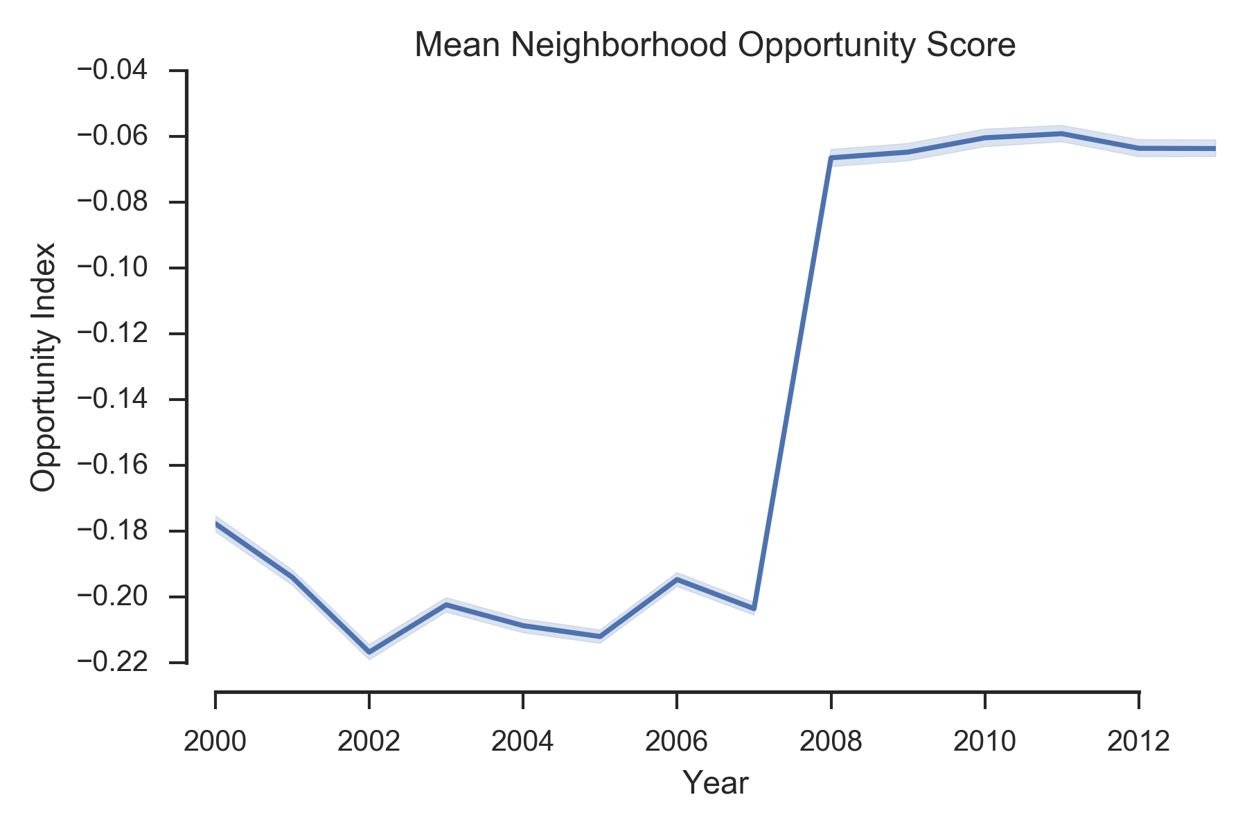
The graph on the right shows the average neighborhood opportunity scores for the general population of voucher holders in the Baltimore region. The most noticeable feature of this graph is the enormous spike in opportunity that occurs in 2007, which is likely a direct result of the Baltimore Housing Mobility Program (BHMP). Unlike the treatment effect in MTO, the opportunity spike from BHMP doesnt fade over time, suggesting that the program has had an important and durable impact on the location outcomes of its participants
If you're looking at the graphs closely, you may have noticed that there are only negative numbers along the y-axis. Without going deeply into the opportunity index methodology (indices are based on z-scores), it's sufficient to say that negative scores represent opportunity levels below the regional average. In absolute terms, this means that most voucher holders live in neighborhoods with below average opportunity scores (consistent with the maps, which show hotspots in low opportunity areas). In relative terms though, the gain is substantial. The average opportunity score for Baltimore voucher holders is hovering around -0.4, which is in the "moderate" range, close to the regional average. "Average" may not seem like a fantastic outcome at first glance, but compared to the "Low" and "Very Low" opportunity scores that were dominant previously, this is a huge gain.
In light of these findings, its important to consider what kinds of outcomes can be expected from housing mobility programs. Program design and administration has improved over time, helping low income families relocate to neighborhoods with higher levels of opportunity, but structural factors still impede further improvements. Fair Market Rent limits set at the regional level ignore important variations in housing submarkets, resulting in constraints on the neighborhoods where vouchers can be used; exclusionary zoning forbids the development of multifamily units in many high opportunity neighborhoods, reducing the supply of units in these areas; some landlords refuse to accept housing vouchers.
As an inequality scholar, I think it’s easy to be cynical about the types of assistance offered to low income families. From a housing perpective, though, it’s important to appreciate the strong progress that has been made over the last several years.
The rest of my dissertation focuses on building statistical models that examine (a) how and why voucher holders move into neighborhoods with different levels of opportunity over time, and (b) how different housing and neighborhood characteristics influence the choice to rent a particular unit. If you have questions about any part of this work, feel free to shoot me an email