Measuring Urban Segregation with Spatial Computation
A brief tour of segregation dynamics in American cities, by way of PySAL’s new(ish) segregation package
tl;dr:
segregationcalculates over 40 different segregation indices, including state-of-the-art measures that incorporate local street networks- it can simulate null distributions using a variety of techniques to test whether segregation measures are statistically significant
- it can test whether segregation is significantly more prevalent in one city than another (or the same city over time)
- it allows decomposition of comparisons to see whether differences arise from demographic structure or spatial structure
- it supports analysis of space, time, and space-time dynamics
- analysis of America’s metro regions shows that segregation has changed pretty dramatically over the last 40 years, though that change is heterogenous
Last week, we released version 1.1.0 of the PySAL segregation
module, part of a suite of open source software we’re developing for our projects on
scalable spatial analytics,
the space-time dynamics of neighborhoods,
and
comparative regional inequality dynamics. Independence Day seems like an opportune time for reflection on American politics, particularly as they relate to things like freedom, equality, and race relations, so I spent some of the holiday (and the rest of the weekend) writing a brief post (ok, not super brief) about how segregation has changed in American cities over the last half century as a way of demonstrating some of the new features in segregation (plus, I’m bummed to be missing scipy this year, so consoling myself by writing about scientific computing with python :P)
Comparative Segregation Analysis
Among the primary motivators for building segregation are papers and reports like this one from my friends at the Urban Institute, where segregation indices are calculated for a bunch of cities/metros/commuting areas, then ranked in a long list from most segregated to least1. This is important work because it provides the beginning of a framework for comparing segregation levels between cities, but it would be useful if we could go a bit further with the statistics. Segregation rankings can tell us that the dissimilarity statistic for Detroit is larger than New Orleans—but how much larger? And does that magnitude matter? Is the difference between Detroit and New Orleans significant enough that it couldn’t happen by chance? segregation lets you answer those questions through computational inference. The three maps below show the tract-level proportion of non-Hispanic black residents in the Washington DC, New Orleans, and Miami metropolitan regions2. Aside from the fact that New Orleans is a cartographer’s nightmare in this map, with those giant swampy tracts on the periphery dominating the display (you might want to zoom in on that map), all three metro areas look pretty segregated from here—but in considerably different ways. In Miami, the black population is concentrated into several subcenters, some of which are hard to distinguish from one another at further scales; DC essentially splits east-west; New Orleans shows a lot of nuance at the regional scale, and if you zoom into the city of where most of the population lives, there’s even more going on, with lots of distinct patterning, especially in the south.
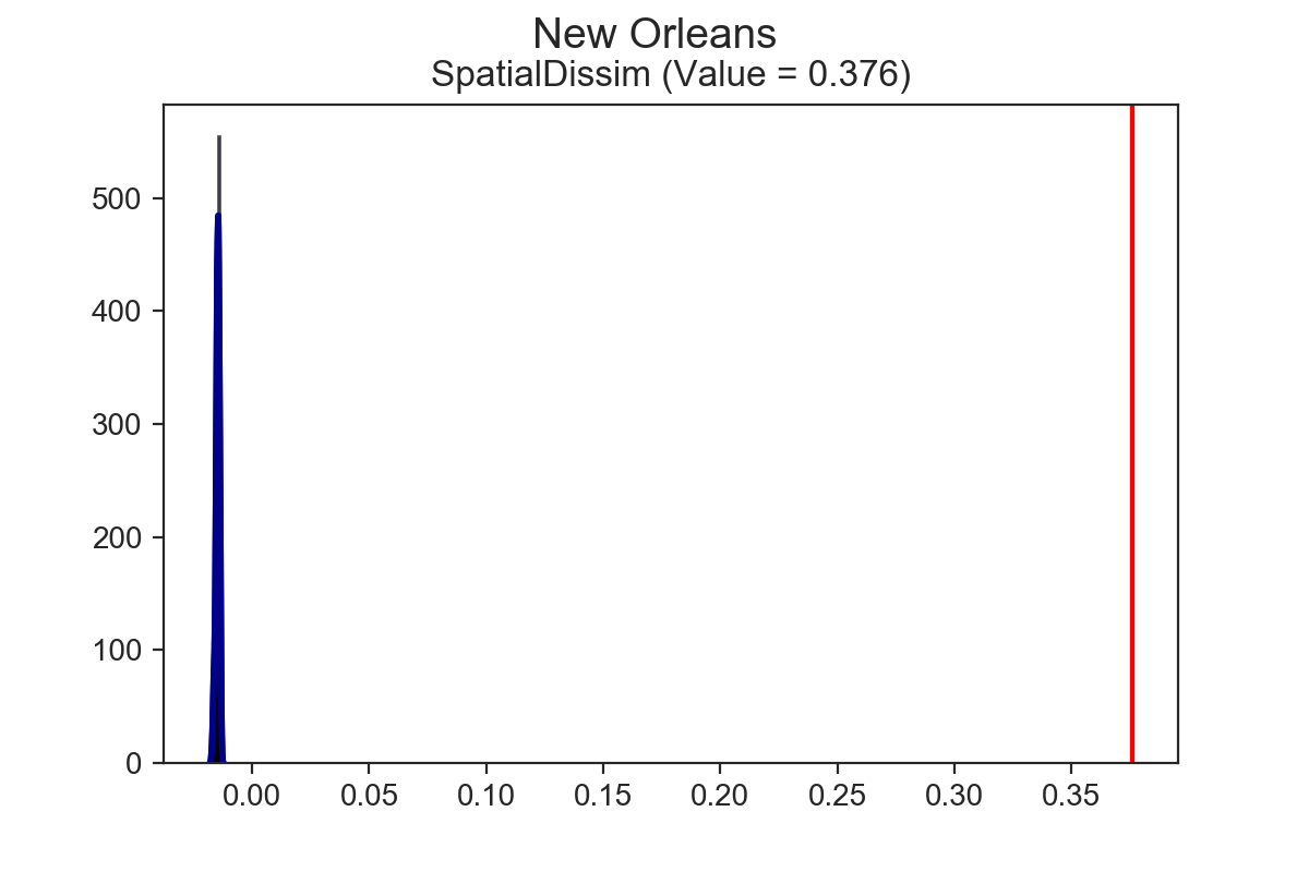
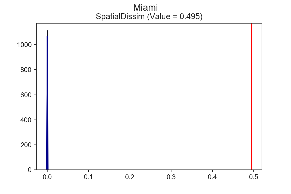
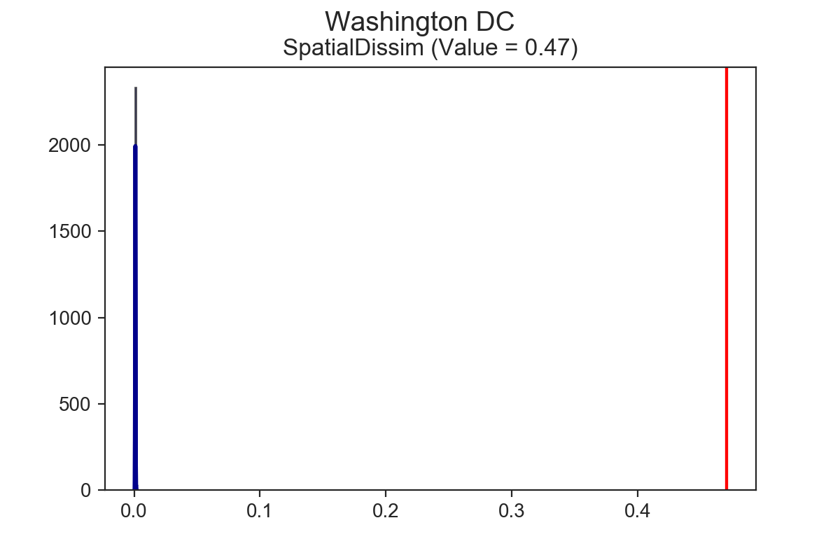
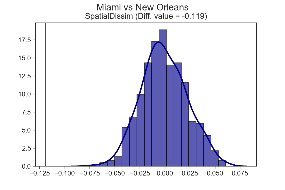
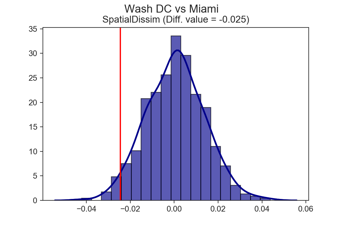
Miami has the highest spatial dissimilarity index vaue at 0.495, followed by DC at 0.47, then New Orleans at 0.376. Having established the ordinal ranks, the next natural questions are, “are these indices significant?” and “are any of these indices significantly different from one another?” Now it’s possible to answer those questions.
Using the SingleValueTest function, we can test whether these estimates are statistically significant. To do so, we implement a few different computational approaches, such as taking random draws from a multinomial population distribution, assigning them to tracts, and calculating the resulting segregation index. After lots of iterations, we’re left with a simulated null distribution, against which we can test our sample statistic3. All of the cities above are significantly segregated, according to the spatial dissimilarity index and the systematic test.
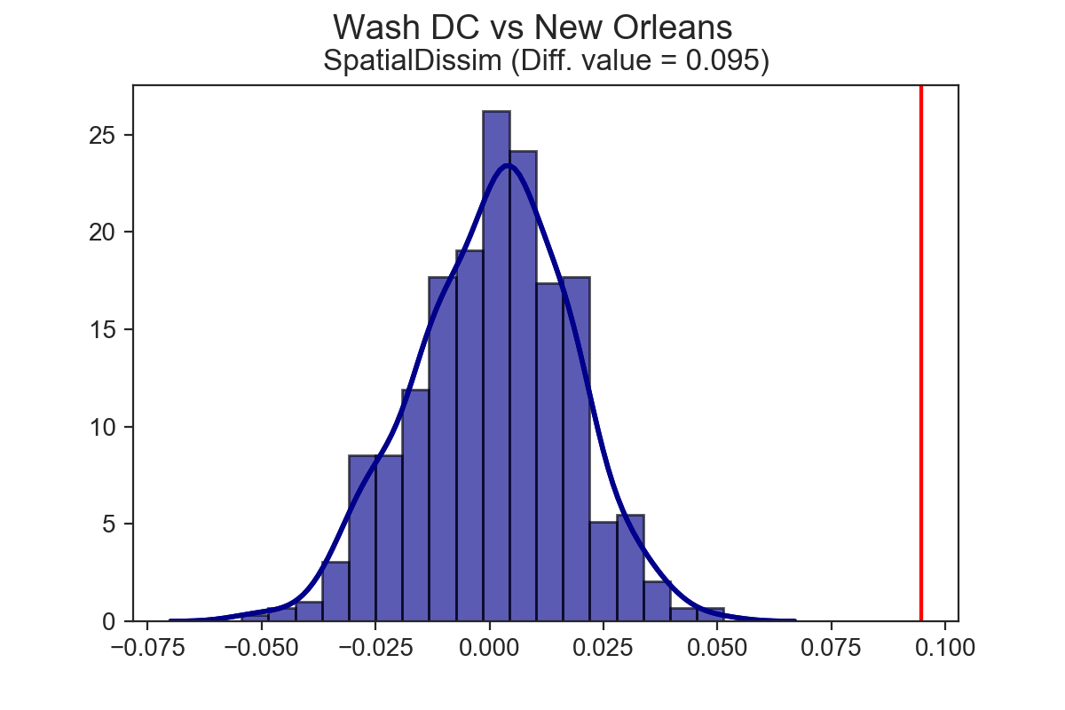
Using the TwoValueTest function, we can also test whether differences between two measures are statistically significant.
This is where things start to get interesting.
With the TwoValueTest, we take a similar approach as above, generating a set of synthetic observations for each city, calculating segregation statistics for each city, and building a distribution of the differences in measured segregation levels from the synthetic populations against which we can test our observed difference (again, we provide a couple different approaches for how the synthetic observations are generated).
Both DC and Miami are significantly more segregated than New Orleans, but Miami is not significantly more segregated than DC.
Finally, using the DecomposeSegregation function, we can examine which factors contribute to the difference between two measures. Part of the difficulty in comparing segregation levels between two different cities is that cities have different shares of demographic groups and they have different spatial structures. Lots of academic work has made clear that segregation indices can be highly sensitive to population structure (i.e. the smaller minority population in city A, alone, makes city A appear more segregated than city B).
With segregation, we provide insight into how these differences are realized using a Shapley decomposition approach.
We take the population CDFs from each city and impose them on the spatial structure of the other city to generate “counterfactual cities” then we recalculate each segregation index.
This process yields four segregation statistics:
- population city A, spatial structure city A
- population city B, spatial structure city A
- population city A, spatial structure city B
- population city B, spatial structure city B
Then we apply the Shapley decomposition to the four statistics to see which is the greater driver of differences between City A and City B. Continuing the empirical example, differences between Miami and the other two cities are typically due to different population structures. The difference between New Orleans and DC, however, is overwhelmingly due to the spatial structure of the two metros. The plot below shows DC and New Orleans with their empirical data, and what the cities would look like with each other’s population CDF imposed upon it.
DC vs. New Orleans
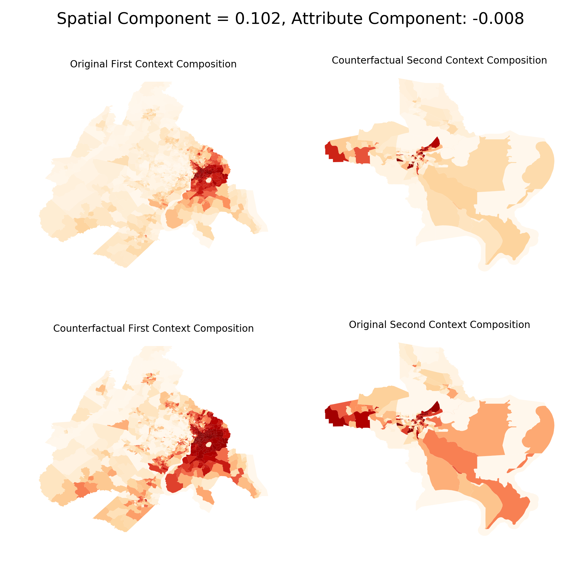
Miami vs. DC
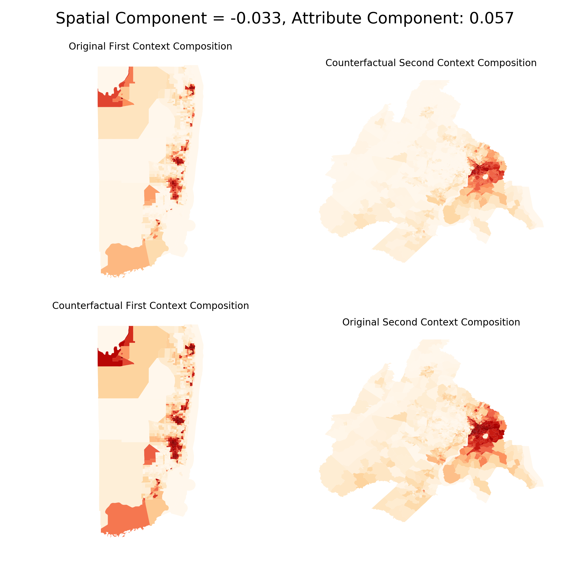
It’s a bit tough to see at this scale (and shame on me for displaying unprojected maps) but in the lefthand comparison between DC and N.O., the “counterfactual city” doesn’t look too different from the empirical city (i.e. the top maps are close to the bottom maps). In the righthand comparison between Miami and DC, there’s a larger difference between the top and bottom maps because the demographic makeup of Miami and DC is less similar than DC and New Orleans. This is reflected in the Shapley decomposition as well. The absolute value for the spatial component is far larger than the attribute component for the lefthand maps, whereas they’re nearly equal in absolute value in the righthand maps.
Temporal Segregation Dynamics
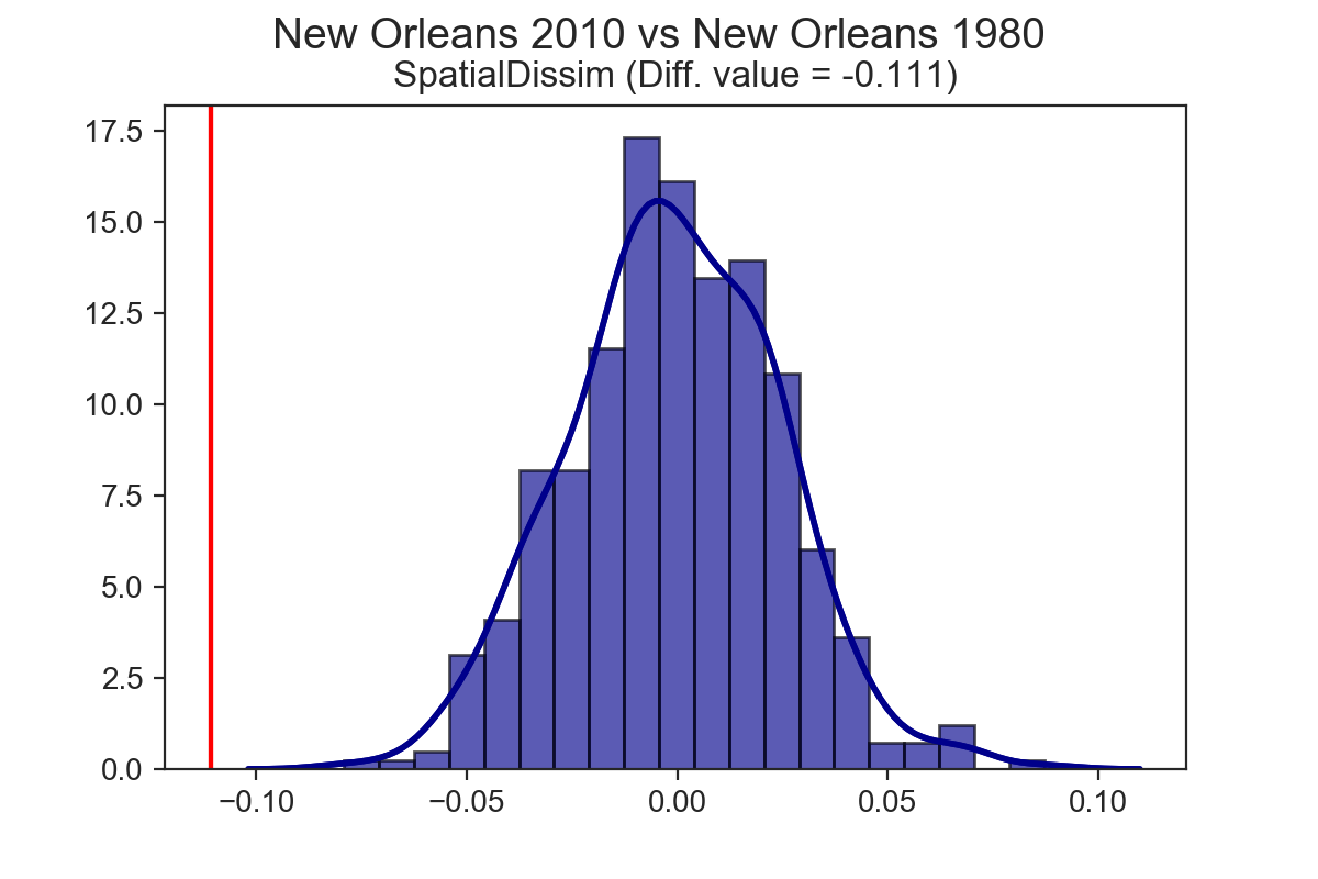
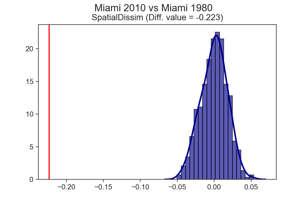
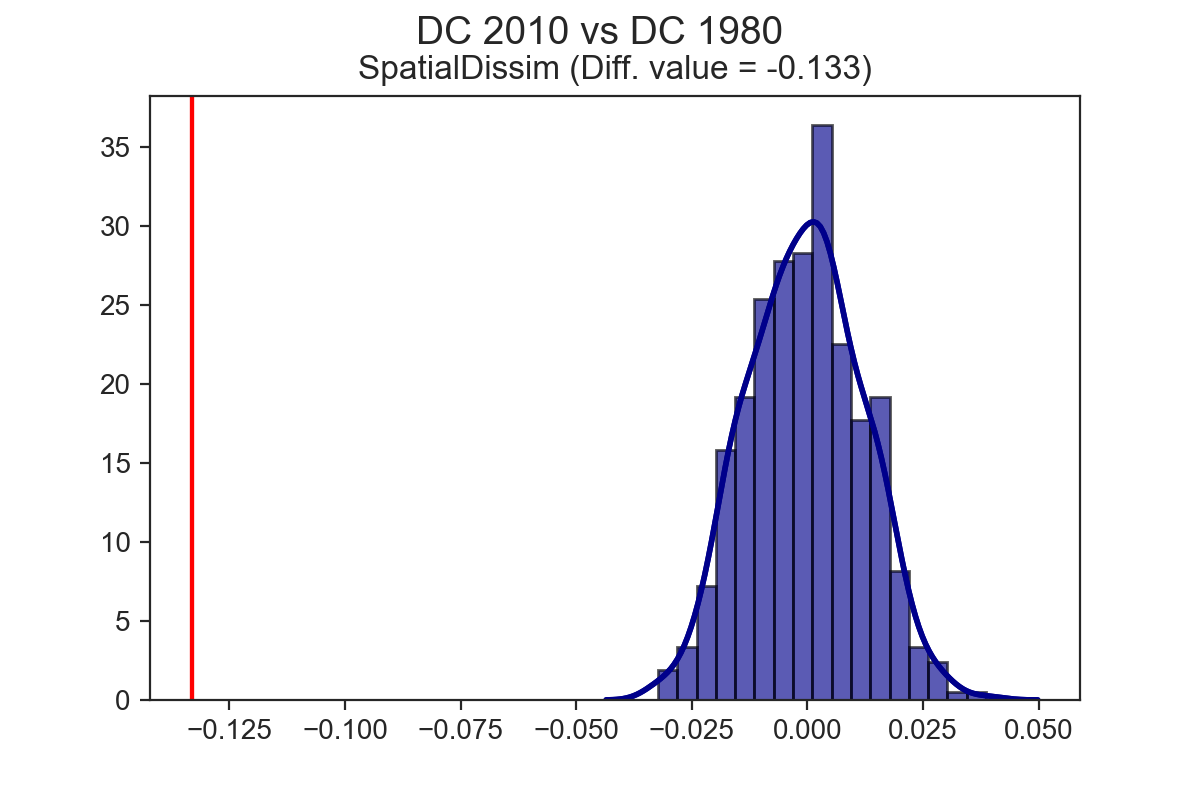
If you apply the TwoValueTest to the same city at two points in time, rather than two different cities at the same point in time, you can explore temporal dynamics, and test whether a given city has become more or less segregated over time. It turns out that each of the three cities explored above have experienced a significant drop in segregation over the last 40 years (at least, as measured by the spatial dissimilarity index)
Spatial Segregation Dynamics
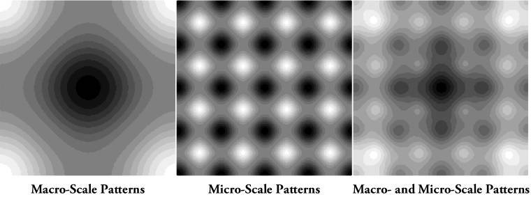
One shortcoming of the existing software for estimating segregation indices is that most packages don’t provide tools to analyze how segregation changes over time or across spatial scales. That’s a big omission, since the methods exist to do so. For that reason, another new feature is the ability to calculate multiscalar segregation profiles introduced by Reardon et al. The multiscalar profile is a way to understand the spatial scale of segregation in a given locale. The idea underlying most segregation indices is to assess the degree to which people from different population groups share the same local environment. Which of course begs the question, “what is a local environment?” In times past, the local environment was defined typically as the boundaries of a given census tract (i.e. your local residential environment is the census tract you live in). Modern segregation indices typically relax that assumption, and treat the local environment as a continuous function of space, and in continuous space, segregation can manifest over different scales, as shown by Reardon et al’s figure below4.
Mapping these onto the examples above, you could argue that DC is characterized by a macro segregation pattern, New Orleans is more micro scale, and Miami is somewhat mixed.
We can test whether this intuition is correct by plotting segregation profiles and examining the slopes.
The segregation profile is a way of capturing which of these patterns characterizes the
region under study by calculating multiple segregation statistics with increasingly large spatial scales.
Plotting the resulting measures and connecting the lines between successive distances yields the segregation profile, with the shape of the profile line describing how segregation levels change over space.
More specifically, “the slope of the profiles… tells us to what extent micro-scale
segregation is attributable to macro-scale segregation patterns” (p.497). To calculate
these profiles using the segregation package, you need only a single function called compute_segregation_profile()
One important distinction between the original methodology outlined in the Reardon et al
paper is that with the segregation package, several spatial indices can use local street networks
to measure distance between members of different population groups5.
This addition helps bring the indices closer to the conceptual metal, since the purpose of
many indices is to capture the likelihood of interaction between different population
groups.
If your backyard abuts a gated community, then euclidian measures would suggest you live “close” to your neighbors, and have reasonable opportunities for interaction.
But that’s not really the case, since you’re literally walled-off from the folks who live in the gated community (this is not an abstract example, I know of several places like this in both Riverside where I live now and the DC suburbs where I grew up). If, instead, you measure the distance between these homes via a walk along the pedestrian street network from your house into the gated neighborhood’s entrance, the distance will increase considerably.
Now, thanks to segregation it’s trivial to incorporate this conceptual realism into spatial segregation indices at scale. The real workhorse here is pandana, which we use to calculate street network-based egohoods with a distance decay. That means that any generalized spatial segregation index can use street network accessibility as its measure of a local spatial environment. OpenStreetMap network data is available for download using the get_osm_network() function (or you can use from our quilt bucket one of the metropolitan-scale extracts we’ve already downloaded and processed). For complete flexibility, spatial measures can also use PySAL spatial weights objects, common in spatial econometric applications, to define egohoods (this means you could, for instance, test how sensitive each segregation measure is to different concepts of egohoods).
In the graph below, I’ve plotted the multiscalar segregation profiles for the metro regions in the US that were the 20 most segregated in 20106. I’m calculating the Spatial Information Theory (H) using four mutually exclusive racial groups (white non-Hispanic, black non-Hispanic, Hispanic, and Asian) and a pedestrian network-based definition of the egohood. Tracts along the boundary have egohoods that extend beyond the metro area, so that data is included as well to avoid edge effects. You can see right away that there’s quite a bit of variation in the shape of each profile—i.e. the spatial dynamics of segregation are pretty different in regions throughout the country, with some places like Daphney-Fairhope-Foley, Alabama whose profiles are mostly flat while others like Alexandria, Louisiana have a steep slope. Spaghetti plots like this can be a little hard to read sometimes with so many colors and crossing lines, so the plot is interactive; you can click on the cities in the legend to turn the lines off and on, in case you want to isolate a single or handful of profiles. If you turn off all the lines except Miami and New Orleans (DC isn’t in the top 20), you can see our impressions above were correct: New Orleans’s profile is considerably steeper than Miami’s indicating greater segregation at micro scales.
Multiscalar Profiles for the Top 20 Most Segregated MSAs in 2010
Unlike in the original paper by Reardon et al, these results show segregation actually increasing over small scales in some metro areas. This is because I’m using tract-level data here, whereas they interpolated census data down to a regular grid. Using kernel weights on a regular lattice will result in the same number of neighbors for each observation, since every cell is the same size. But census tracts are irregular and variable in size and shape, which means that kernel weights on tract centroids will result have number of neighbors. Since tract size is a function of population density, small, dense, urban tracts will get grouped together with small kernel bandwidths, but large tracts won’t. You can see this in the figure of Washington DC below, where a line connects two observations if they fall in the same egohood7.
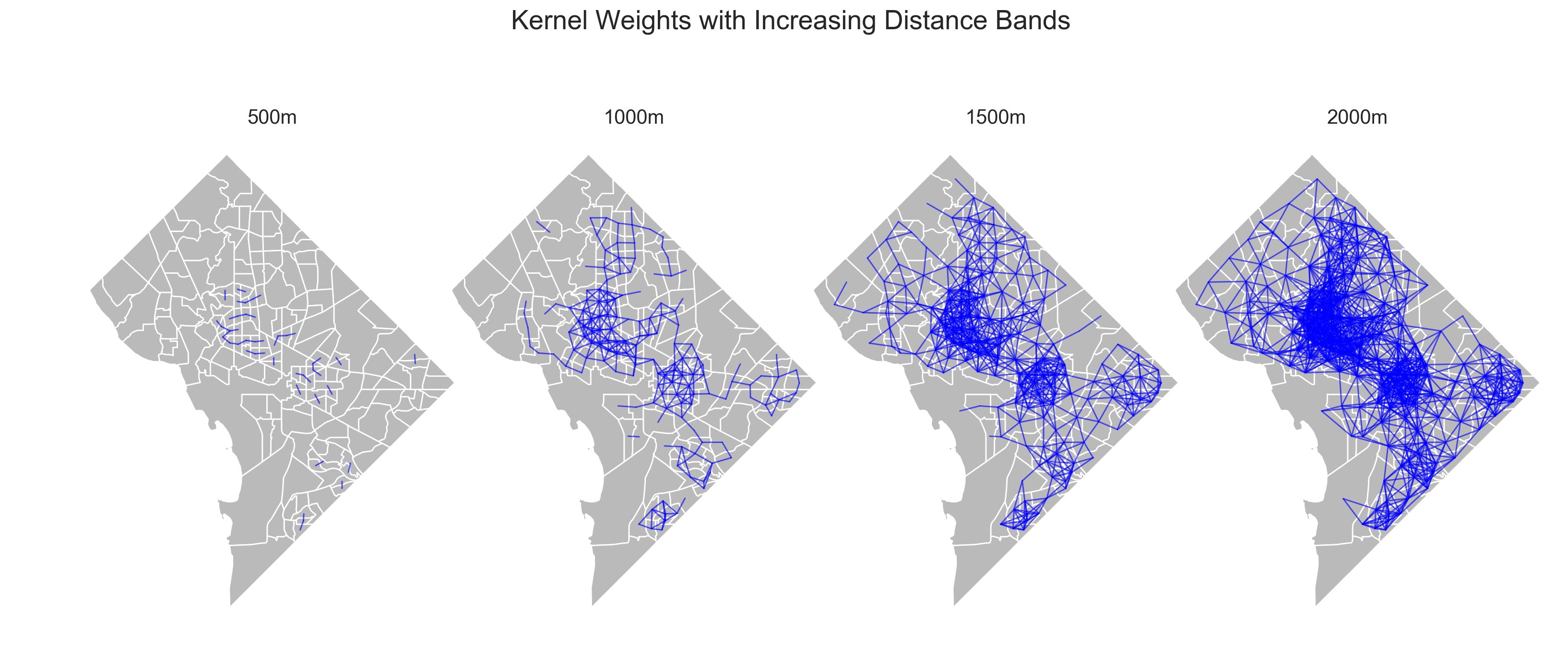
As Reardon et al explain in a footnote, “it is possible that measured segregation could increase with scale, but only if the proximity function were irregular—meaning that it was not a nonincreasing function of Euclidean distance”. In the results above, that’s indeed the case, since both the structure of the street network and the placement of the observations is irregular, which allows for the increase over certain scales. Tracts with larger populations have a bigger effect on the estimated segregation statistic, so these results make sense when you consider that the most populous and deeply segregated tracts are getting grouped together at small scales, but large, sparsely populated (possibly more integrated) tracts do not. I think this is actually a useful and interesting aspect of this analysis, rather than an artifact of poor assumptions, but we can argue about that ;). It’s also worth pointing out here that interpolating to a regular grid doesn’t overcome the underlying issue of irregularly shaped tracts, it just masks the issue in unknown error (we’re working on that, too). It’s less of an issue if you use blocks instead.
Spatio-Temporal Segregation Dynamics
You might also ask how these patterns have changed over time. Reprising a different paper from Reardon et al, we can also look at the space-time dynamics of segregation. As with above, the shape of the line describes how segregation levels change across space. But now, with several time periods plotted on each graph, the distance between the curves describes how much segregation has changed over time. This is a good illustration of the space-time dynamics of segregation in America’s metro areas since we can see how the H index varies along both dimensions for each city. Below are a handful of cities that I know relatively well or find interesting (a priori, but I don’t think the results let me down either).
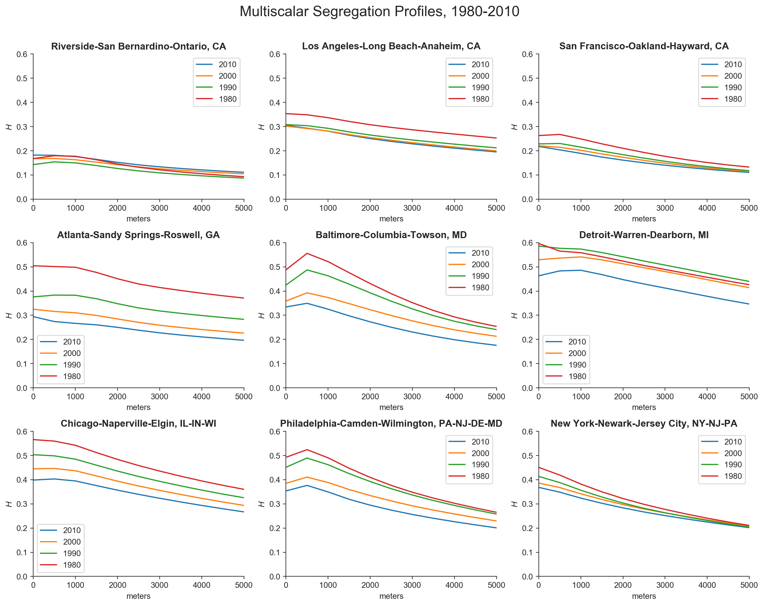
Los Angeles had a modest reduction in segregation during the 80s, but hardly any change since then in either absolute levels or macro/micro configuration. San Francisco is similar in some ways, with the largest decrease in the 80s but less change thereafter. The SF curve is also flattening over time, with micro segregation falling slightly over time but macro segregation mostly stagnant over time, around H=0.13. After falling during the 1980s, segregation in Riverside-San Bernadino has actually increased at every scale with each successive decade, though it’s difficult to see in the plots at this resolution.
Atlanta had a massive drop in segregation through the 80s, and it has continued to fall in every decade since, albeit by a decreasing rate. Baltimore had its largest drop in the 1990s, and its curve is flattening slightly over time. Interestingly, macro-level segregation is decreasing at an increasing rate in Baltimore. In Detroit segregation increased during the 1980s, fell through the 90s, and fell much more in the 2000s. The slope is basically constant over time meaning micro and macro segregation is changing together.
In Chicago, segregation has decreased at a constant (and quite substantial rate, compared to the others here) in every decade, and at every scale. It’s the only metro here for which that is true. Philly didn’t change much in the 80s, but desegregated more through the 90s and 2000s. New York is an interesting case because it has been declining in micro segregation—but only in micro segregation. So although NYC’s curves are getting flatter, macro level segregation has remained essentially unchanged for 40 years
Summing that up, my takeaways are that LA, SF, and ATL changed a lot during the 80s. ATL is still desegregating but it’s slowing down, and LA and SF aren’t doing much anymore. Chicago is still really segregated, but it’s arguably on the best track, if it can keep its trend toward integration moving. You could probably say much of the same about Detroit… According to the Spatial Information Theory index, Detroit was the most segregated metro in the country in 2010, but has made a lot of progress lately at every scale. Riverside, by contrast, is the only place in this example that continues to get more segregated over time. It would be a good idea to calculate segregation profiles for each race to see if this trend is driven by a particular variety of segregation. NYC’s results are also disappointing (and a bit surprising). It’s making some progress at smaller scales, but shows no indication of desegregating at larger scales. That’s a problem.
Wrapping Up
Ok, that was a lot of ground to cover. If you’re still here, thanks for hanging in.
We’re really happy to introduce the segregation module, which is available now as a standalone package on both pypi and conda-forge and will be incorporated into the PySAL metapackage in its next release later this month.
Hopefully this post gives a brief overview of the functionality we think is unique to segregation, though it has only scratched the surface of what the library can do.
Everything demonstrated here has an analogous detailed walkthrough available in the example notebooks, so please go take a look if you find this interesting.
I should also mention briefly that while I used racial segregation in the U.S. as the set of examples here, the library is capable of measuring any kind of segregation anywhere in the world, so if you want to understand occupational segregation in Sweden, be our guest—and show us the results!
If you have any questions or comments, you can find us on github, or reach out to Renan, Serge, Levi or me on twitter.
One last thing… if you like segregation, you may also be interested in our forthcoming package geosnap for modeling the the space-time dynamics of urban neighborhoods :)
Happy hacking
To be clear, I am not criticizing in any way the contributions of this report. This piece is awesome and does way, way more than calculate and rank segregation indices. I’m using it here because it happens to be a well-done, recent example of segregation analysis that comes readily to mind, and I want to know how significant the results are in Appendix A. That wasn’t possible when they wrote it, but it is now. ↩︎
Data are 2008-2012 ACS, and I’m going to use city and metro interchangeably throughout. It’s easier. ↩︎
The approach described here is what we term “systematic”. We also include bootstrap, permutation, and evenness approaches, all of which are described in this notebook. ↩︎
This figure is Copyright © 2008 Population Association of America (the original publication). I’m not sure whether I’m allowed to repost it here, so if I’m in violation, someone please let me know so I can remove it. ↩︎
In a great paper recently, Roberto branded this type of analysis the “spatial proximity and connectivity method”. But I eschew that terminology for two reasons. First, a different distance metric doesn’t amount to a new method in my opinion. The index is calculated with same equation regardless of how you choose to parameterize $dp$ so treating this as a new method seems strange. Second, treating network distance as novel ignores a decades old tradition in regional science and urban economics. I lament that sociology and regional science don’t intertwine much, so I appreciate this linkage and rather pay homage to the origins of the concept (yes, I know it’s the economists’ fault for never citing anyone else). ↩︎
One thing to note is that I’m using the current street network for every calculation here and only the demographic data are variable across decades. Pedestrian transport networks typically don’t change too dramatically over a few decades, but certainly there will have been some change, particularly in newer metros. Take from that what you will. ↩︎
For convenience I used
libpysal’s kernel distance weights for this figure, but I usedpandananetworks to calculate the H measures in the graph above. Either way, you get the same patterns. ↩︎