Code
schools.avg_score.describe()count 6078.000000
mean -0.681208
std 1.459946
min -4.116623
25% -1.793010
50% -0.946118
75% 0.247189
max 4.915018
Name: avg_score, dtype: float64For a more detailed look at the geography of educational achievement in California, we can conduct a similar analysis at the school level rather than the district level.The school-level data from SEDA only contain achievement information averaged over all grade levels and subjects. This means we cannot examine math achievement, specifically, due to data suppression, however an examination of overall achievement still reveals important insight at a higher geographic scale.
The median school in california is nearly one grade behind the national average. But the best school is nearly 5 grade levels above average. When consuming the map, it is important to keep in mind that these scores are scaled relative to the national average, and the distribution of scores in California is shifted to the left.
We can see this by looking at the descriptive statistics for the schools in the state. Of the 6087 schools in our dataset (note, not all schools in the state have full achievement data), the mean score is -0.68 and the median score is -0.946. This means the median school in california is .946 grades behind the national average
schools.avg_score.describe()count 6078.000000
mean -0.681208
std 1.459946
min -4.116623
25% -1.793010
50% -0.946118
75% 0.247189
max 4.915018
Name: avg_score, dtype: float64The histogram shows the number of schools at each score threshold. The bulk of the observations are to the left of the zero (which represents the national average), demonstrating again that California lags behind other regions of the country.
schools.avg_score.hist()But the distribution of achievement is not geographically even, which can be seen by plotting the average achievement score as a choropleth map, where each school is colored according to its score
schools.explore(
"avg_score",
scheme="quantiles",
k=8,
cmap="PRGn",
tiles="Stamen Toner Lite",
marker_kwds={"radius": 7},
tooltip=["NAME", "avg_score"],
)Again, we can examine statewide patterns using the Global Moran’s \(I\) statistic, and again we have strong statistical evidence that the average achivement levels at each school are similar to the levels of nearby schools. In this case, the relationship is even stronger than for districts as the value of the \(I\) statistic has increase from 0.43 to 0.61
w_school = weights.KNN.from_dataframe(schools, k=8)
moran = esda.Moran(schools.avg_score.values, w_school, permutations=99999)
print(f"School-level Moran's I coefficient: {np.round(moran.I,3)}")
print(f"p-value of Moran's I: {np.round(moran.p_sim, 5)}")School-level Moran's I coefficient: 0.608
p-value of Moran's I: 1e-05esplt.plot_moran(moran)(<Figure size 1000x400 with 2 Axes>,
array([<AxesSubplot:title={'center':'Reference Distribution'}, xlabel='Moran I: 0.61', ylabel='Density'>,
<AxesSubplot:title={'center':'Moran Scatterplot (0.61)'}, xlabel='Attribute', ylabel='Spatial Lag'>],
dtype=object))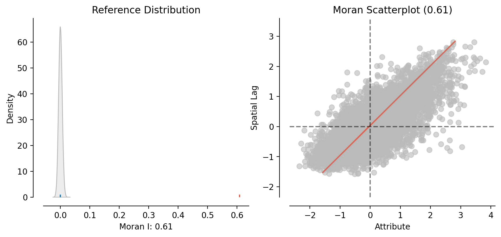
moran_trend = esda.Moran(schools.ach_trend.values, w_school, permutations=99999)
print(f"School-level Moran's I coefficient (trend): {np.round(moran_trend.I,3)}")
print(f"p-value of Moran's I (trend): {np.round(moran_trend.p_sim, 5)}")School-level Moran's I coefficient (trend): 0.227
p-value of Moran's I (trend): 1e-05esplt.plot_moran(moran_trend)These results suggest that the change in school-level achievement has a less dramatic spatial patterning than achievement itself. That is, schools tend to have similar achievement levels as their neighbors, but when these scores change over time, the role of geography appears to be a little less important. Note, it is still important! The value for the global Moran’s \(I\) statistic is still dramatically significant, (so space still matters), but the value of \(I\) itself is lower, showing that the relationship between a school and its neighbors is smaller.
As with districts, we can look at local spatial patterns in student achievement. Moving to this higher spatial resolution lets us examine high and low performing clusters of schools within districts. This provides a much more ganular view of the geography of educational opportunity, as there is often considerable variation in school-level achievement within a district
Beginning with the average achievement score in at each school, the LISA analysis shows significant evidence of spatial clustering in school-level achievement. Red dots indicate significant clusters of high-performing schools and blue dots indicate significant clusters of low-performing schools. The orange dots indicate high performing schools, with low-performing neighbors. These are places worthy of additional investigation, as they have significantly high achievement scores, relative to the expectation of their spatial context.
esplt.plot_local_autocorrelation?lisa_school_avg = esda.Moran_Local(schools.dropna(subset=['avg_score']).avg_score.values, w_school)
esplt.plot_local_autocorrelation(lisa_school_avg, schools, 'avg_score')Since the school observations are so dense, an interactive map is particularly helpful in this case. Although the map is presented at the statewide scale, zooming into different metropolitan regions of the state reveals some obvious patterning that conforms with expectations. In particular, we can see some of the urban-rural disparities in large metros like Los Angeles and San Diego, whose coastal and outlying schools often form “hotspots”, whereas the inner cores often form “coldspots”. A similar dynamic is visible in San Jose, as well as the stark patterns that divide the San Francisco Bay.
Many inland cities, including places like Bakersfield, San Bernadino, Moreno Valley, Stockton, and Indio, which are well known for being significantly poorer than coastal cities, appear as notable coldspots, reinforcing the impression of coastal vs inland disparities that characterize many other statewide phenomena. These patterns are often masked at larger scales, as school districts can encompass large areas of metropolitan regions. Undertaking the analysis at the school-level helps uncover these geographies of inequality that exist within large districts
explore_local_moran(
lisa_school_avg,
schools,
"avg_score",
crit_value=0.01,
explore_kwargs={
"marker_kwds": {"radius": 7},
"tooltip": ["NAME", "avg_score"],
"tiles": "Stamen Toner Lite",
},
)Repeating the analysis for trends in school-level achievement reveals many of the same patterns, however in this case the value for Moran’s I is much lower.
lisa_school_trend = esda.Moran_Local(schools.dropna(subset=['ach_trend']).ach_trend.values, w_school)explore_local_moran(
lisa_school_avg,
schools,
"avg_score",
crit_value=0.01,
explore_kwargs={
"marker_kwds": {"radius": 7},
"tooltip": ["NAME", "avg_score"],
"tiles": "Stamen Toner Lite",
},
)Mapping the results of the LISA analysis, many of the patterns from the average achievement analysis are also present in the achievement trend analysis. That is, many of the spatial clusters of high-performing schools are also the spatial clusters of schools trending upward. This is unsurprising, given the correlation between average achievement and achievement trend shown in section one, but the result is nevertheless troubling, as it suggests that existing spatial inequalities may be widening over time as these patterns become further entrenched.