21  Ecometrics and Composite Indices

Code
import os

import geopandas as gpd
import matplotlib.pyplot as plt
import pandana as pdna
import pandas as pd
import quilt3 as q3
import requests

from esda import Moran_Local
from factor_analyzer import ConfirmatoryFactorAnalyzer, ModelSpecificationParser
from folium import LayerControl
from geosnap import DataStore
from geosnap import analyze as gaz
from geosnap import visualize as gvz
from geosnap import io as gio
from libpysal.graph import Graph
from mapclassify import classify
from IPython.display import Image
from scipy.stats import zscore
from semopy import Model, calc_stats, semplot
from segregation.local import LocalDistortion, MultiLocalEntropy
from tobler.area_weighted import area_interpolate
from zipfile import ZipFile
OMP: Info #276: omp_set_nested routine deprecated, please use omp_set_max_active_levels instead.
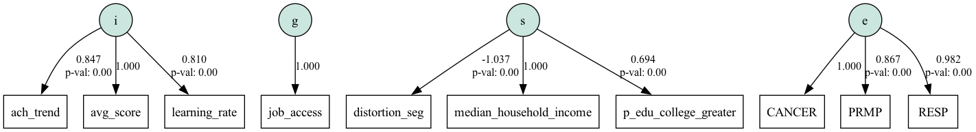
It is well established in the social sciences that neighborhoods and social contexts influence a wide variety of individual outcomes (e.g. in education, health, socioeconomic status, etc.), and that these spatial influences are multidimensional (Galster, 2019). Thus a large literature in the U.S. focuses on outcomes driven by the notion of “concentrated disadvantage”, and similarly in the U.K. on “multiple deprivation” both of which represent multivariate indices of social and environmental context. In their general form, these indices are designed support researcher’s efforts to quantify the “geography of opportunity” (Galster & Killen, 1995), and a growing literature explores the benefits of drawbacks of developing various opportunity indices, particularly for use in policy evaluation efforts (Balachandran & Greenlee, 2022; Brazil et al., 2023).

One branch of the literature treats the issue of composite index construction as a latent variable problem, drawing from the tradition of “psychometrics” in psychology. This approach is especially valuable because it allows researchers to assess the validity of a particular index, and test hypotheses about whether the selected collection of variables combine to measure what the researcher supposes they measure. In a seminal contribution to this literature, Raudenbush & Sampson (1999) outline a theory of “ecometrics” designed to capture the social-ecological context as a way to help measure the latent construct of collective efficacy. A key to the original methodology is that it relies on actual observations of social interaction as measured by an intentionally-designed survey. These data are combined with others gathered via systematic social observation.

This idea has been expanded to include new forms of data like google street maps and VGI (boston stuff). We usually don’t have SSO data, but we do have lots of other data like 411 reports, google street view, and satellite imagery and we may be able to substitute these data for SSO–if we believe they accurately capture the social process under investigation (i.e. if we believe that some social process like “disorder” is the underlying driver of the observed data) (Friche et al., 2013; O’Brien et al., 2015; O’Brien & Montgomery, 2015).

The key distinction between ecometrics and earlier methods like factor ecology is the reliance on a formal theoretical model underneath. We’re not allowing the data to speak for themselves; instead we are specifying a set of theoretical social processes which are unobservable directly, but might be inferred to exist if we treat them as latent variables. We then fit a model and test whether these latent constructs appear as specified. Using this approach we can try and capture the geography of opportunity following the theory outlined by Galster (2008), who argues that individual-level outcomes are a function of individual characteristics, as well as spatial characteristics (at multiple scales). \[O_{it} = \alpha + \beta[P_{it}] + \gamma[P_i] + \phi[UP_{it}] + \delta[UP_i] + \theta[N_{jt}] + \mu[M_{kt}] + \epsilon\]

where

The poignancy of this framework is its ability to distinguish between individual characteristics and (multiscalar) location characteristics, each of which have static and time-variant components. In the effort to understand the influence of place, then it is critical to distinguish between the individual-level factors and those population-level attributes conceived as components of the local community (Knaap, 2017)1. A place with a large share of structurally-disadvantaged people is not the same as a structurally-disadvantaged place, and it’s important to care about each distinctly. Places with high risk of wildfire (a spatial disadvantage) are especially dangerous for low-income populations (a population disadvantage) but only the former transmits risk by virtue of location. Although it is tempting to include population vulnerability measures into composite indices of spatial (dis)advantage, it’s important to keep the sources distinct (even though they are correlated!) to maintain conceptual integrity of the measurement.

To capture the geography of opportunity, then, our focus is on the \(M\) and \(N\) components of the equation, and according to Galster (2013), the key vectors of these terms are composed of four categories:

These categories are well supported by the empirical literature, and are theoretically grounded in causal processes that generate socioeconomic outcomes, yet each can also be measured in multiple ways, with each measurement providing additional useful information. Following Knaap (2017), we can combine Galster’s theoretical framework with the ecometric technique to (a) test whether the proposed structure holds, and (b) develop composite indices that represent each of the dimensions.

One way to address this problem is to treat the quantification of opportunity as a measurement error problem. Through a liberal interpretation, this may be viewed as an extension of ecometrics, a methodology concerned with developing measures of neighborhood social ecology (Mujahid et al., 2007; O’Brien et al., 2015; Raudenbush & Sampson, 1999). In this framework, opportunity and its subdimensions are viewed as latent variables that cannot be measured directly, but can be estimated by modeling the covariation among the indicators through which they manifest.

This effectively places the \(N_t\) and \(M_t\) terms on the other side of the equation, and we use observable variables like poverty rates and pollution exposure to estimate their values. Ignoring the time dimension (and focusing on the neighborhood scale), our framework says that the relevant \(N\) is composed of mechanistic pathways:

\[ N = \{S, E, G, I\}, \]

where S, E, G, and I are the neighborhood mechanism categories specified above, and a single composite index such as the environmental component would estimated as \[\mathbf{x} = \tau + \Lambda\text{E}+ \Psi,\]

where \(x\) is the set of measurable environmental characteristics like particulate matter, ozone concentration, proximity to superfund sites, lead paint, or contaminated water, etc, \(\Lambda\) is a vector of factor loadings, and \(\text{E}\) is the latent Environmental mechanism, and \(\Psi\) a vector of error terms (Levy & Mislevy, 2016). While we will not have access to all the ideal measurements, we can try to estimate a theoretically-sound index using the best available information.

21.1 Datasets & Geoprocessing

It would be best to use the ecometric framework with hyperlocal and bespoke data (e.g. 311 calls or local crime data), however in this case we can demonstrate using the datasets we have worked with in the prior examples. To get the data in the correct shape, we also need to leverage the same processing and analysis skills developed earlier. For the sake of presentation, we will use census blockgroups as proxies for neighborhoods, then convert all of our measurements to that geography.

21.1.1 social data

As usual, our only option for social data at this scale comes from the Census, and we will use blockgroup geometries to narrow down the spatial scale as much as possible. This will cost us a few variables that are avaialble at the tract level, so you could also re-do this analysis by moving up a level. The variables in this category are designed to capture the ways that social interactions help you get ahead. Historically, the focus has been on the negative consequences of being in the bottom of the distribution (the negative effects of concentrated poverty), though some have also called for increasing attention on the other end, and the importance of concentrated affluence which helps those in privilege remain there.

Here, we will say that socioeconomic status increases local opportunity, with SES measured by income and educational attainment for adults. We will also say that racial integration promotes opportunity, so we include the local distortion segregation measure.

Code
datasets = DataStore()

balt = gio.get_acs(datasets, msa_fips="12580", years=[2019], level="bg")
crs = balt.estimate_utm_crs()
balt = balt.to_crs(crs)

distortion = LocalDistortion(
    balt, groups=["n_nonhisp_white_persons", "n_nonhisp_black_persons"]
)
entropy = MultiLocalEntropy(
    balt, groups=["n_nonhisp_white_persons", "n_nonhisp_black_persons"], distance=2000
).statistics
balt["distortion_seg"] = distortion.statistics.values
balt["entropy"] = entropy
balt[["geometry", "distortion_seg"]].explore(
    "distortion_seg",
    scheme="quantiles",
    style_kwds={"weight": 0.5},
    tiles="cartodb positron",
)
Make this Notebook Trusted to load map: File -> Trust Notebook

Since the CFA model is designed to model the covariation among the set of input variables, we can also check to see how correlated our chosen set looks.

Code
svars = ["median_household_income", "p_edu_college_greater", "distortion_seg"]
balt[svars].corr()
median_household_income p_edu_college_greater distortion_seg
median_household_income 1.000000 0.716603 -0.453186
p_edu_college_greater 0.716603 1.000000 -0.297634
distortion_seg -0.453186 -0.297634 1.000000

And this looks as we would expect; income and education are positively correlated, whereas segregation has a weaker negative correlation with the other two.

21.1.2 institutional data

For institutional data, we rely solely on achievement data provided by SEDA. In this case, we have three measures at our disposal, each of which represents a different measure of “achievement”. The average score is often used as a public indicator of school quality but widely criticized in the education literature because it tends to measure student SES more than institutional quality. Alternatively, SEDA provides two additional measures: the rate of change between student cohorts (improvement within the school over time) and the rate of change within a student cohort (improvement within the same set of students), the latter of which is often viewed as a good measure of the school’s value-addition. In this case, we will assume all three measures have important information we can use.

To keep things simple, we will use only data for elementary schools, and we will convert all observations to the blockgroup level using areal interpolation, which uses the school catchment boundaries to assign data to each polygon. This approach works for our purposes, but also ignores private schools (ok in this case, since we are focused on the capacity of public institutions) and things like charter schools or open enrollment policies. If moving up a level (i.e. using middle school or high school data), this would become more of an issue, since Baltimore City has city-wide open enrollment at these levels, forcing an analyst to make strong decisions about students attending their nearest schools (i.e. using voronoi polygons, as we did back in Chapter 1), or using some other allocation technique.

Code
# get school achievement data
seda = datasets.seda(accept_eula=True)
seda["learning_rate"] = seda.gcs_mn_grd_eb - 1
seda["avg_score"] = seda.gcs_mn_avg_eb - seda.gradecenter
seda["ach_trend"] = seda.gcs_mn_coh_eb
seda["math_diff"] = seda.gcs_mn_mth_eb

# get attendance boundaries
sabs = gio.get_nces(datasets)
sabs = sabs[sabs.intersects(balt.to_crs(sabs.crs).unary_union)]
sabs = sabs.merge(seda, left_on="ncessch", right_on="sedasch")
# limit to elementary schools with defined boundaries
sabs = sabs[(sabs.level == "1") & (sabs.openEnroll == "0")]
sabs = sabs.to_crs(crs)

# convert attendance boundaries to census geometries
edu = area_interpolate(
    source_df=sabs,
    target_df=balt.set_index('geoid'),
    intensive_variables=["learning_rate", "avg_score", "ach_trend"],
)
balt = balt.merge(edu.drop(columns=['geometry']), left_on='geoid', right_index=True)

# balt[['geometry', 'learning_rate']].explore(
#     "learning_rate",
#     scheme="quantiles",
#     style_kwds={"weight": 0.5},
#     tiles="cartodb positron",
# )
/Users/knaaptime/Dropbox/projects/geosnap/geosnap/_data.py:255: UserWarning: Streaming data from SEDA archive at <https://exhibits.stanford.edu/data/catalog/db586ns4974>.
Use `geosnap.io.store_seda()` to store the data locally for better performance
  warn(msg)
/var/folders/j8/5bgcw6hs7cqcbbz48d6bsftw0000gp/T/ipykernel_42646/4010206863.py:10: DeprecationWarning: The 'unary_union' attribute is deprecated, use the 'union_all()' method instead.
  sabs = sabs[sabs.intersects(balt.to_crs(sabs.crs).unary_union)]
/Users/knaaptime/miniforge3/envs/urban_analysis/lib/python3.12/site-packages/tobler/util/util.py:60: UserWarning: nan values in variable: learning_rate, replacing with 0
  warn(f"nan values in variable: {column}, replacing with 0")
/Users/knaaptime/miniforge3/envs/urban_analysis/lib/python3.12/site-packages/tobler/util/util.py:60: UserWarning: nan values in variable: ach_trend, replacing with 0
  warn(f"nan values in variable: {column}, replacing with 0")

And again, these variables are intercorrelated in the expected ways, with moderately positive associations among all three.

Code
ivars = ["avg_score", "learning_rate", "ach_trend", ]
balt[ivars].corr()
avg_score learning_rate ach_trend
avg_score 1.000000 0.640657 0.611934
learning_rate 0.640657 1.000000 0.708358
ach_trend 0.611934 0.708358 1.000000

21.1.3 environmental data

For measures of the environment, we draw on the EPA’s environmental justice screening data (Which, unfortunately, has been removed from the EPA’s website, but is still available from archive websites and the geosnap DataStore.). We will focus on measures that measure ambient air pollution, including exposure to respiratory illness and cancer risk, as well as diesel particulate matter and particulate matter greater than 2.5 micrometers (PM25).

Code
ej = gio.get_ejscreen(datasets, msa_fips="12580", years=[2019])

balt = balt.merge(ej.drop(columns=["geometry"]), on="geoid")
# balt[["geometry", "CANCER"]].explore(
#     "CANCER", scheme="quantiles", style_kwds={"weight": 0.5}, tiles="cartodb positron"
# )
Code
evars =  ["CANCER", "RESP", "DSLPM"]
balt[evars].corr()
CANCER RESP DSLPM
CANCER 1.000000 0.984608 0.934857
RESP 0.984608 1.000000 0.950610
DSLPM 0.934857 0.950610 1.000000

21.1.4 geographic data

For the ‘geographic’ dimension, we will rely solely on access to employment. For additional measures, we could also include things like access to hospitals, healthy food, or some other place-based resource, but we will take the simple route for now.

Code
lodes = gio.get_lodes(datasets, msa_fips="12580", years=[2019])
lodes = lodes.to_crs(crs)


if not os.path.exists("12580.h5"):
    b = q3.Bucket("s3://spatial-ucr")
    b.fetch("osm/metro_networks_8k/12580.h5", "./12580.h5")
baltnet = pdna.Network.from_hdf5("12580.h5")
baltnet = gio.project_network(baltnet, crs)

# set job variable onto the network
lodes["node_ids"] = baltnet.get_node_ids(lodes.centroid.x, lodes.centroid.y)
baltnet.set(lodes["node_ids"], lodes.total_employees.values, name="jobs")

# get blockgroup-level access (up from *blocks*)
balt["node_ids"] = baltnet.get_node_ids(balt.centroid.x, balt.centroid.y)
job_access = baltnet.aggregate(2000, name="jobs")  # linear decay

balt = balt.merge(job_access.rename("job_access"), left_on="node_ids", right_index=True)
# balt[["geometry", "job_access"]].explore(
#     "job_access", scheme="quantiles", style_kwds={"weight": 0.5},
#     tiles='cartodb positron')
Generating contraction hierarchies with 16 threads.
Setting CH node vector of size 694573
Setting CH edge vector of size 1106629
Range graph removed 340606 edges of 2213258
. 10% . 20% . 30% . 40% . 50% . 60% . 70% . 80% . 90% . 100%
Generating contraction hierarchies with 16 threads.
Setting CH node vector of size 694573
Setting CH edge vector of size 11209189
Range graph removed 20545726 edges of 22418378
. 10% . 20% . 30% . 40% . 50% . 60% . 70% . 80% . 90% . 100%
Removed 20165 rows because they contain missing values

21.2 A Factor Model of Spatial Opportunity

Unlike factor ecology and exploratory factor analysis demonstrated in the previous section, confirmatory factor analysis (CFA) requires the specification of variables onto their latent factors; we could do this specification using a dictionary of variable names, then pass the dict to the factor_analyzer package. But this process will run up against some limitations of factor_analyzer which is modeled after the R psych package (namely that we don’t have fit indices or a way to specify factor correlations). Following, we will fit the CFA model using semopy, which is designed to work like R’s lavaan package. If you prefer the Bayesian approach, you could also use PyMC. The semopy package provides a lavaaan-like interface for structural equation modeling (SEM) in Python. Since measurement models are one component of SEM, semopy is a perfect toolkit for our purposes.

21.2.1 Specification

Code
model_df = (
    balt.set_index("geoid")[
        [
            "median_household_income",
            "p_edu_college_greater",
            "p_owner_occupied_units",
            "p_edu_hs_less",
            "distortion_seg",
            "entropy",
            "p_nonhisp_white_persons",
            "avg_score",
            "learning_rate",
            "ach_trend",
            "CANCER",
            "RESP",
            "DSLPM",
            "PM25",
            "PNPL",
            "PRMP",
            "PTSDF",
            "job_access",
        ]
    ]
    .dropna()
    .apply(lambda x: zscore(x, ddof=1, nan_policy="omit"))
)


spec = """
s =~ median_household_income + p_edu_college_greater +  distortion_seg
i =~ avg_score + learning_rate + ach_trend
e =~ CANCER + RESP + PRMP 
g =~ job_access


s ~~ i
s ~~ e
s ~~ g
i ~~ e
i ~~ g
e ~~ g

"""

m = Model(spec)
m.fit(model_df)
ins = m.inspect()
ins[ins.op == "~"]
WARNING:root:Fisher Information Matrix is not PD.Moore-Penrose inverse will be used instead of Cholesky decomposition. See 10.1109/TSP.2012.2208105.
lval op rval Estimate Std. Err z-value p-value
0 median_household_income ~ s 1.000000 - - -
1 p_edu_college_greater ~ s 0.848372 0.023929 35.453918 0.0
2 distortion_seg ~ s -0.600190 0.025638 -23.410109 0.0
3 avg_score ~ i 1.000000 - - -
4 learning_rate ~ i 0.831640 0.022384 37.153815 0.0
5 ach_trend ~ i 0.819488 0.022544 36.350323 0.0
6 CANCER ~ e 1.000000 - - -
7 RESP ~ e 0.992848 0.005204 190.782743 0.0
8 PRMP ~ e 0.671458 0.017595 38.16277 0.0
9 job_access ~ g 1.000000 - - -

The resulting factor loadings look pretty good. All of the loadings are large with intuitive signs; the only negative loading is distortion segregation, which has a negative association with the social factor (the more segregated a location, the less opportunity it provides). While the environmental factors all load positively onto the e measure, we can view this as measuring toxic exposure, or the inverse of opportunity, so its simple to reverse the sign of the estimated factor, if necessary. As a convenience, we can also plot the model as a path diagram.

Code
semplot(m, "opp_factors.png")
Image("opp_factors.png", retina=True)
WARNING:root:Fisher Information Matrix is not PD.Moore-Penrose inverse will be used instead of Cholesky decomposition. See 10.1109/TSP.2012.2208105.

21.2.2 Goodness-of-Fit Indices

While the factor loadings all support our prior hypotheses about how to measure each factor, the real benefit of CFA is the ability to assess the total model fit (i.e. test whether our model works). Toward this end, a wide variety of fit statistics have been developed, for example the “Goodness-of-Fit Index” (GFI):

The GFI quantifies how much better the proposed model fits the data compared to a null model as a baseline model (i.e., a model that can be described as a “no-factor null model”—it can also be interpreted similar to a coefficient of determination as the proportion of the variance/covariance that can be explained by the model, for more information on this and different versions of the GFI, see Mulaik et al., 1989). A value of one indicates that the proposed model provides the biggest improvement possible over the baseline model and is able to fit the data perfectly, while a value of zero means that the proposed model has no explanatory value. (Goretzko et al., 2024, p. 126).

To generate fit statistics for inspection in semopy, we use the calc_stats function which returns a dataframe of the estimated indices. For the sake of presentation, it is easier to transpose the dataframe.

Code
calc_stats(m).T
Value
DoF 29.000000
DoF Baseline 45.000000
chi2 1748.196739
chi2 p-value 0.000000
chi2 Baseline 15555.293437
CFI 0.889158
GFI 0.887614
AGFI 0.825608
NFI 0.887614
TLI 0.828003
RMSEA 0.179643
AIC 50.097718
BIC 193.524984
LogLik 0.951141

Ideally we would like to meet some cutoff criteria for these metrics to assess the quality of the model, however like p-values, cutoff criteria do not have objective rules. Instead, the following are suggested as general guidelines (Hu & Bentler, 1999; Marsh et al., 2004).

  • IFI, CFI, NFI, TLI >= 0.9
  • RMSEA <= 0.1

Unfortunately, our model fails to meet any of these criteria, and psychometricians would probably view this as a poor outcome. It’s not a perfect CFA model, though I don’t think it’s necessarily a bad one2. First, the enterprise of ecometrics is new, with only a handful of published studies adopting the method and nearly none reporting fit indices3, and as Marsh et al. (2004) describe, model fit should be interpreted in a field’s context. Second, this is in many respects an unconventional application of CFA, because many of these indicators are highly intercorrelated, but technically stem from different sources (e.g. cancer risk exposure and respiratory toxin exposure) even though we want them to capture the same concept (ambient risk exposure). Further, some dimensions are correlated in the opposing direction; more jobs (positive opportunity) bring more automobile trips and more pollution (negative opportunity), so it is reasonable to expect neighborhood-scale measurements from both sources to have trouble loading onto distinct factors.

Finally, the goal of this exercise is not to develop the perfect structural equation model, but to get reasonable estimates of the four underlying latent variables (social, institutional, environmental, geographic). The factor loadings suggest we have done a good job of assigning variables onto factors, and the fit indices (e.g. the GFI), while imperfect, show the model explains nearly 90% of the covariation among variables. Toward these ends, we might say the model is doing what we want it to do.4

Recently, Goretzko et al. (2024) argue

The common assumption that each indicator can be assigned one latent factor and substantial cross-loadings do not exist is quite appealing to researchers as it facilitates the interpretability of the factor model. However, this focus on overly simplified models is typically one reason why measurement models that were developed using exploratory factor analysis cannot be successfully replicated in subsequent CFAs (e.g., Hopwood & Donnellan, 2010; Sellbom & Tellegen, 2019). Hence, researchers should probably consider “imperfect” measurement models with substantial cross-loadings, this might hamper the interpretability of their models because a model with poor fit to the data potentially yields severe misinterpretations.

In which case, we might reconsider the model above, allowing cross loadings. This is tough, because our purpose from the start is to develop indices that can serve as measures to understand the spatial distribution of opportunity, but we can explore a bit. Since automobile trips to urban centers will also generate pollution, we can let diesel particulate matter to load onto both the geographic and environmental factors. This is weird, because these things (job access and auto emissions) are correlated, but they exert opposite effects on wellbeing (one gives you a job, the other gives you asthma) and as a result they will both load positively onto the geographic factor. I don’t think this is a good way to measure this dimension of “opportunity”, but it will probably boost the model fit.

Code
spec = """
s =~ median_household_income + p_edu_college_greater +  distortion_seg
i =~ avg_score + learning_rate + ach_trend + p_edu_college_greater
e =~ CANCER + RESP + DSLPM + PM25 
g =~ job_access + DSLPM


s ~~ i
s ~~ e
s ~~ g
i ~~ e
i ~~ g
e ~~ g

"""

crossm = Model(spec)
crossm.fit(model_df)
metrics = calc_stats(crossm)
print(metrics[['RMSEA', "CFI"]])
         RMSEA       CFI
Value  0.15803  0.921756

As expected, this fit is better, though it does not necessarily serve our purpose quite as well. We could also treat each dimension entirely separately, as though there is no other information in the system, just to see what happens.

Code
s = "s =~ median_household_income + p_edu_college_greater + distortion_seg"
i = "i =~ avg_score + learning_rate + ach_trend + p_edu_college_greater"
e = "e =~ CANCER + RESP + DSLPM + PM25"

gof = []
for mod in [s, i, e]:
    temp = Model(mod)
    temp.fit(model_df)
    metrics = calc_stats(temp)
    gof.append(metrics[["RMSEA", "CFI"]])
gof = pd.concat(gof)
gof['factor'] = ['s', 'e', 'i']
gof.set_index('factor', drop=True)
RMSEA CFI
factor
s inf 0.991105
e 0.232368 0.934081
i 0.134054 0.994741

Here we can see the relative fit indices for each dimension, independently, are excellent, so maybe we have some evidence that each of the sole factors we have specified explains variance in the latent variable the way we assume it does.

21.2.3 Estimated Factors

If we find this model tentatively acceptable, we can use it to estimate the latent variables representing the different dimensions of opportunity, then plot and examine them. This works a little differently than the last chapter because semopy does not have a scikit-style API, but it is still simple.

Code
factors = m.predict_factors(model_df)
factors.head()
e g i s
0 -0.501978 -0.271726 1.170987 1.451912
1 -0.501060 -0.303040 0.672905 0.481168
2 -0.504766 -0.461626 0.729464 0.018018
3 -0.501637 -0.244099 1.151008 1.514947
4 -0.762310 -0.389256 0.896581 0.692161

Finally, we can join this dataframe of the estimated factors back onto the geometries and plot each dimension.

Code
# The sign of the environmental intex is backwards (it really measures pollution, not lack thereof)
factors["e"] = -factors["e"]
factors["composite"] = factors.mean(axis=1)
factors["geoid"] = model_df.index.values
opp = balt[["geoid", "geometry"]].merge(factors, on="geoid")

f, ax = plt.subplots(2, 2, figsize=(8, 10))
ax = ax.flatten()

for i, v in enumerate(["s", "i", "e", "g"]):
    opp.plot(v, scheme="quantiles", cmap="PRGn", ax=ax[i])
    ax[i].axis("off")
    ax[i].set_title(v)
plt.suptitle("Opportunity Sub-Dimensions")
plt.tight_layout()

Clearly the factors are related, but each has a distinct spatial pattern. Unsurprisingly, environmental opportunity is highest in the rural an exurban portions of the region, which are free from polluting factories and highways, whereas the urban places are those with the best access to jobs (obviously). The social factor tends to prioritize Baltimore’s inner suburbs, though both the “wedge” and the inner harbor show up as bright spots as well. The institutional factor measuring school quality tends to skew exurban, like the environmental factor, though less dramatically.

Depending on the outcome in question, the relative contribution of these factors will differ (i.e. the environmental index is probably more important for determining respiratory illness outcomes than the social factor), however lacking a definitive outcome at this point in the analysis, we can treat all \(\theta\)s as equal and average the different dimensions into a single overall composite ‘opportunity score’.

21.3 Fair Housing Opportunity

In public policy, one of the primary reasons for measuring, modeling, and visualizing the geography of opportunity is to evaluate the efficacy of some public policy initiative in its ability to provide equal access to opportunity. In recent years, this has become increasingly important given the courts’ recognition of the need to use policy to affirmatively further protections guaranteed under the constitution. Housing, in particular, is one area where these analyses are both feasible and increasingly required to receive federal funding5.

One of the original motivations for conceptualizing and measuring multivariate “opportunity” is to assess the equitable distribution of housing resources, given the centrality of housing in ensuring civil rights (Powell, 2005). This is important because the location of place-based affordable housing is a policy decision made by someone apart from the family occupying the unit itself, and as such there is a policy mandate to ensure fair housing choice. This basic premise is the foundation of many successful civil rights litigation efforts over the decades which have demonstrated a historical practice of concentrating affordable housing (particularly public housing, sited by the federal government) into highly segregated and deeply impoverished neighborhoods.

Code
zfilename = "lihtcpub.zip"
headers = {
    "Content-Type": "application/json",
    "User-Agent": "Mozilla/5.0 (platform; rv:gecko-version) Gecko/gecko-trail Firefox/firefox-version",
}
# download the zip file onto the local disk
z = requests.get("https://lihtc.huduser.gov/lihtcpub.zip", headers=headers)
with open(f"./{zfilename}", "wb") as f:
    f.write(z.content)

# read the CSV inside the zip archive without extracting
with ZipFile(f"{zfilename}") as z:
    with z.open("LIHTCPUB.CSV") as zfile:
        lihtc = pd.read_csv(zfile)
lihtc = lihtc[lihtc.proj_st == "MD"]
lihtc = gpd.GeoDataFrame(
    lihtc,
    geometry=gpd.points_from_xy(lihtc.longitude, lihtc.latitude),
    crs=4326,
)
lihtc = lihtc.to_crs(crs)
lihtc = lihtc[lihtc.intersects(balt.union_all())]

m = opp[['composite', 'geometry']].explore('composite', scheme='quantiles', style_kwds={"weight": 0.5}, cmap='PRGn', tiles="cartodb positron", tooltip=['composite'])
lihtc.explore(m=m, color='red')
m
/var/folders/j8/5bgcw6hs7cqcbbz48d6bsftw0000gp/T/ipykernel_42646/1707880330.py:14: DtypeWarning: Columns (72) have mixed types. Specify dtype option on import or set low_memory=False.
  lihtc = pd.read_csv(zfile)
Make this Notebook Trusted to load map: File -> Trust Notebook

The visualization is as stark as it was in the original analysis done for the Thompson v. HUD case. The vast majority of LIHTC units are spread through neighborhoods occupying the lowest quintile of ‘opportunity,’ and providing a specific set of spatial resources and externality to residents of these units. For a family choosing among affordable units, these red dots represent nearly the entire choice-set, which helps clarify the importance of providing equitable distribution.

Does affordable housing look equitable in the Baltimore region?

Code
opp["opp_quintile"] = classify(opp["composite"], scheme="quantiles", k=5).yb
results = gpd.overlay(lihtc, opp, keep_geom_type=True)
counts = results.groupby("opp_quintile").size()
counts = counts / counts.sum()
counts.plot.bar()
counts
opp_quintile
0    0.500000
1    0.198895
2    0.132597
3    0.113260
4    0.055249
dtype: float64

If LIHTC units were distributed equitably across opportunity categories, the distribution would be uniform and each bar the same height. Instead, we see a power distribution, where the number of affordable units decreases as the opportunity quantile increases; half of all LIHTC units fall into the bottom quintile of the ‘composite opportunity’ measure, whereas only five percent fall into the top quintile. As a final look at concentration effects, we could do another LISA on the resulting factors and plot hotspots and coldspots of opportunity.

Code
g = Graph.build_contiguity(opp)

f, ax = plt.subplots(2, 2, figsize=(8, 8))
ax = ax.flatten()
for i, m in enumerate(["s", "i", "e", "g"]):
    lisa = Moran_Local(opp[m].values, g).plot(opp, ax=ax[i])
    ax[i].set_title(m)
    ax[i].axis('off')
plt.tight_layout()

Code
m = Moran_Local(opp["composite"].values, g).explore(
    opp, style_kwds={"weight": 0.5}, tiles="cartodb positron"
)
lihtc.explore(m=m, color="yellow")
Make this Notebook Trusted to load map: File -> Trust Notebook

The city versus suburb dynamic in the Baltimore region is dramatic. Whereas the majority of the jobs remain in the urban core, so too does the city of Baltimore (with the largest job center) remain deeply segregated, impoverished, and lacking resources. Nevertheless, these are the same places the majority of the place-based subsidized affordable units have been constructed. To provide equal access to residents of the Baltimore region, it would be possible to develop an alternative “qualified allocation plan” that helps distribute affordable housing by considering spatial opportunity as an important criteria.


  1. In spatial econometric terms (discussed in Chapter 28), we want to distinguish between \(X\) variables that contribute significantly toward an individual-level outcome versus \(WX\) variables. My own income (\(X\)) is important, and the average income in the local neighborhood (\(WX\)) might be significant/important too. Age may also be important. A neighborhood with a large share of elderly residents may be particularly vulnerable to different shocks, but dropping a random person into this neighborhood (with age=\(x\)) does not mean they become vulnerable by virtue of being near elderly neighbors (i.e. a nonsignificant \(WX\))↩︎

  2. Dear psychometricians, please let me know how wrong I am about this! There are not enough folks working on this stuff.↩︎

  3. To my knowledge, only O’Brien et al. (2015) and Knaap (2017) report CFA fit indices with RMSEA both near the conventionally “acceptable” limit of 0.1.↩︎

  4. Also, prior to this method, the common approach to measuring opportunity was to literally average together z-scores of highly unrelated variables, so I’m thoroughly confident this is doing some of the best estimation possible so far.↩︎

  5. There was a strong effort to institutionalize these ideas under both the Obama and Biden administrations, but AFFH requirements have likely been gutted by the current administration’s attack on social equity writ large.↩︎