import contextily as cximport geopandas as gpdimport geoviews as gvimport hvplot.pandasimport mapclassify as mcimport matplotlib.font_manager as font_managerimport matplotlib.pyplot as pltimport numpy as npimport pandas as pdimport pydeck as pdkimport seaborn as snsfrom geosnap import DataStorefrom geosnap import io as giofrom matplotlib import cmfrom matplotlib.colors import Normalizefrom matplotlib_scalebar.scalebar import ScaleBarsns.set_context("paper")%load_ext jupyter_black%load_ext watermark%watermark -a 'eli knaap'-iv
OMP: Info #276: omp_set_nested routine deprecated, please use omp_set_max_active_levels instead.
When we make maps, we need to combine ideas from Stevens (1946) and Bertin (1983). Basically Stevens (1946) provides a taxonomy of measurement scales: nominal, ordinal, interval, ratio (NOIR), and Bertin (1983) maps those onto different “visual variables” which have been extended to include location size, shape, value, hue, orientation, grain (pattern spacing), transparency, fuzziness, resolution, volume/height. Data visualization experts have spent a long time thinking about the best ways to use each variable to visualize each measurement scale, for example the lovely Table 3.1 is from the wikipedia article on visual variables and describes the recommended ways to encode measurement scales into visual variables.
Table 3.1: Measurement Scales and Visual Variables
Level
Distinction
Preferred Variables
Marginal Variables
Examples
Nominal
Same or different
Color Hue, Shape
Pattern Arrangement, Orientation
Owner, Facility type
Hierarchical
Degree of qualitative difference
Color Hue
Shape, Arrangement
Languages, Geologic formation
Ordinal
Order
Color value, Color saturation, Transparency, Crispness
Size, Height, Color Hue, Pattern Spacing
Socioeconomic status (rich, middle class, poor)
Interval
Amount of quantitative difference
Color value
Size, Color saturation, Opacity, Hue
Temperature, Year
Ratio
Proportional difference
Size, Height, Color value
Transparency, Pattern Spacing
Population growth rate, population density
Cyclical
Angular difference
Color hue, orientation
Day of the year, Aspect of terrain
So our primitive units for visualization are points, lines and polygons, each of which may be associated with a NOIR measurement that can be used to style it via a visual variable. That seems like a lot, but since we’re mapping, almost all the features will already be represented by arrangement and orientation. We need to make critical decisions about the rest, though. If you are coming from R and are used to thinking about this as a Grammar of Graphics, check out plot9 which gives a ggplot API in Python.
Since we’re only doing visualization in this notebook, not any spatial analysis, it is convenient to reproject the dataset into a coordinate system ready for cartography. The most useful CRS in this case is “web mercator” also known as EPSG 3857, which is the system used by google maps and by every other web map tile provider thereafter.
Code
gdf = gdf.to_crs(3857)
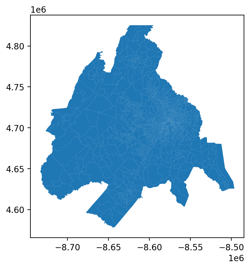
The dead simple way to create a map is by using the plot method on the geodataframe, which returns an outline of the study area
Code
gdf.plot()
As a first cut, geopandas makes it very easy to plot a map quickly. If you know the area well, this may do fine for quick exploration. If you don’t know a place extremely well (or you want to make a figure easy to understand for those who don’t) it’s often a good idea to add a basemap for context. We can do that easily using the contextily package which uses the package xyzservices to collect a basemap from a web-based tile provider.
Imagine we wanted to visualize toxic release emissions from point-source polluters in the U.S. That only takes a few lines: we start by collecting data from the Environmental Protection Agency (EPA), then use the included lat/long columns to turn the CSV into a geodataframe.
Code
epa_tri = pd.read_csv("https://data.epa.gov/efservice/downloads/tri/mv_tri_basic_download/2022_US/csv/2022_us.csv", low_memory=False,)# print a few columns to see what we needepa_tri.columns[:20]
Index(['1. YEAR', '2. TRIFD', '3. FRS ID', '4. FACILITY NAME',
'5. STREET ADDRESS', '6. CITY', '7. COUNTY', '8. ST', '9. ZIP',
'10. BIA', '11. TRIBE', '12. LATITUDE', '13. LONGITUDE',
'14. HORIZONTAL DATUM', '15. PARENT CO NAME', '16. PARENT CO DB NUM',
'17. STANDARD PARENT CO NAME', '18. FOREIGN PARENT CO NAME',
'19. FOREIGN PARENT CO DB NUM', '20. STANDARD FOREIGN PARENT CO NAME'],
dtype='object')
Code
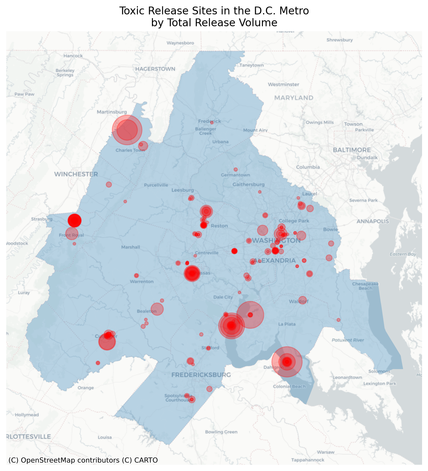
# convert lat/long to Point geoms in a geodataframeepa_tri = gpd.GeoDataFrame( epa_tri, geometry=gpd.points_from_xy(epa_tri["13. LONGITUDE"], epa_tri["12. LATITUDE"]), crs=4326,)# keep only the sites in the DC regionepa_tri = epa_tri[epa_tri.intersects(gdf.to_crs(4326).union_all())]epa_tri = epa_tri.to_crs(gdf.crs)# create a plot and store resulting `ax`ax = gdf.plot(alpha=0.3, figsize=(6, 6))# plot the other dataframe to the same axepa_tri.plot(ax=ax, color="red")ax.axis("off")# add a basemap with contextilycx.add_basemap(ax=ax, source=cx.providers.CartoDB.Positron)
Toxic Release Sites in the D.C. Region
Now we have shown the locations of each toxic release site along with a nice unobtrusive basemap from CARTO. We also added some transparency to the polygons because we only want to highlight the extent of the region. By presenting all the TRI sites in exactly the same style, it implies that they are all the same. But they are probably different in many ways, so we could style them using a variety of variables:
the name of the site (nominal)
the type of the largest emission (nominal)
the volume of emissions (ratio)
the rank in the distribution of emitters (ordinal)
One measure that seems important is '65. ON-SITE RELEASE TOTAL', so lets visualize that below.
# re-order so smaller dots draw on topepa_tri = epa_tri.dropna(subset=["65. ON-SITE RELEASE TOTAL"]).sort_values("65. ON-SITE RELEASE TOTAL", ascending=False)# only show emitting facilitiesepa_tri = epa_tri[epa_tri["65. ON-SITE RELEASE TOTAL"] >0]ax = gdf.plot(figsize=(6, 6), alpha=0.3)epa_tri.plot( ax=ax, color="red", markersize=epa_tri["65. ON-SITE RELEASE TOTAL"].apply(lambda x: 10+ (x**0.6)), legend=True, alpha=0.3,)ax.axis("off")ax.set_title("Toxic Release Sites in the D.C. Metro\nby Total Release Volume")cx.add_basemap(ax=ax, source=cx.providers.CartoDB.Positron)
Figure 3.1: Encoding Emission Volume with Size
Here, we scale the size of the point to reflect the amount of emissions given off. This works well (though we will eventually need to create the legend by hand). We could also treat this like an interval variable, but since the origin is technically being treated as a point-source, then the total is a ratio since the denominator is constant across units. We also use transparency because it reveals that some locations are in exactly the same place (and as an additional effect, we have induced an intensity gradient when points overlap, corresponding to the increased exposure).
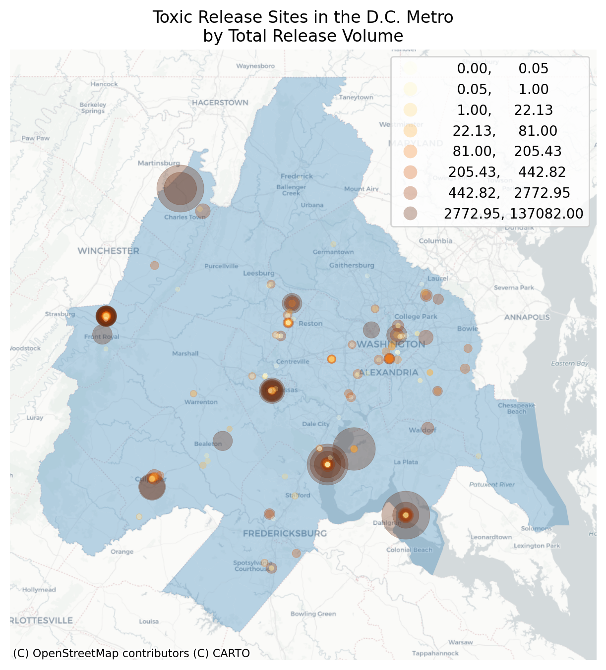
But we could also use color (or size and color) to convey the same information
Figure 3.2: Encoding Emission Volume with Size and Color
This does not work as well. We have used two visual variables (size and color) to encode the same measurement (total realase volume) which is less effective than using size alone. In this case, the eye is drawn to the lighter-colored points, which are actually the smaller emittors. Including multiple hues also disrputs the intensity gradient created by the transparency. But as an alternative, we could use color to encode a different variable like dollars spent in sequestration or something, which would let us look at bivariate correlation in space.
3.2 Static Choropleths
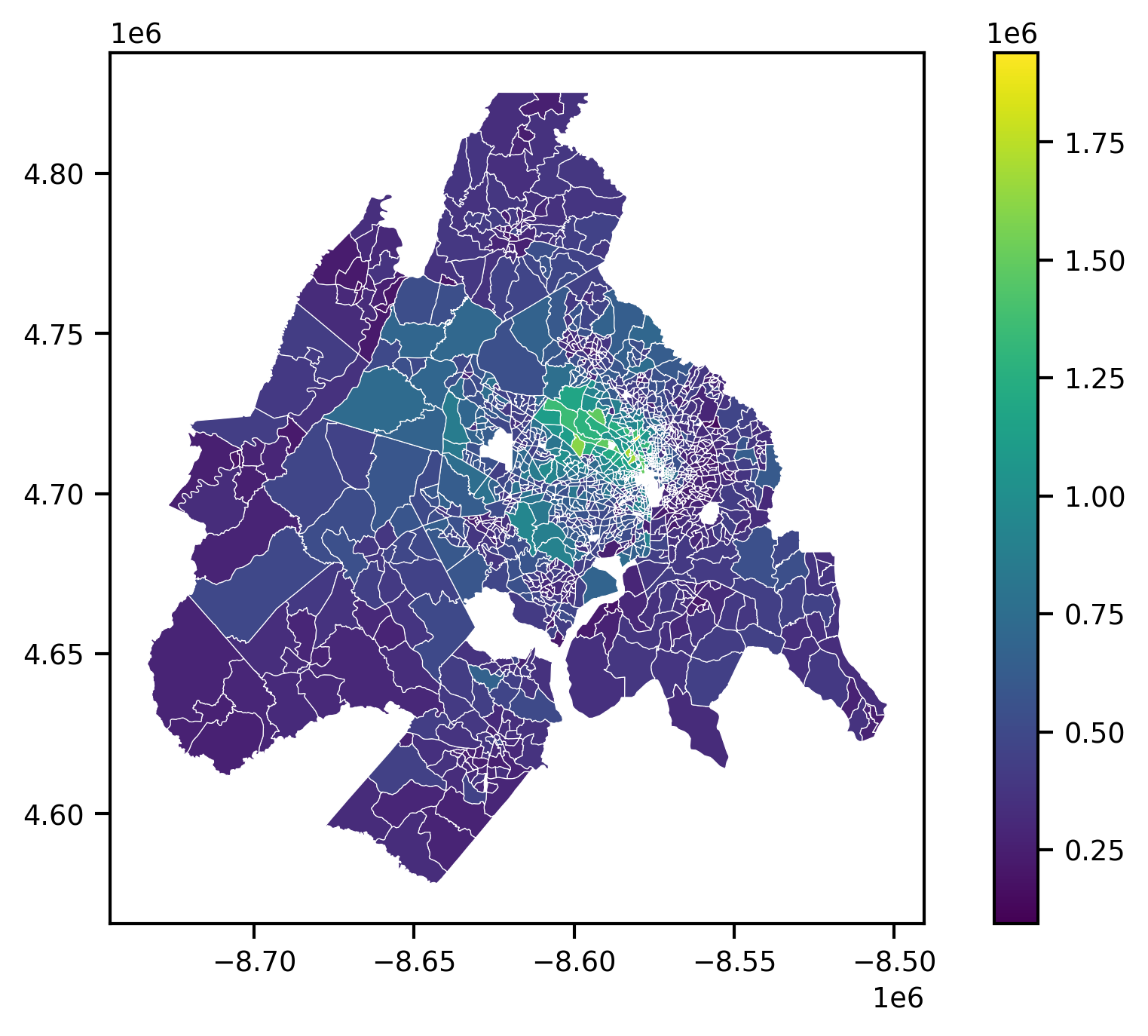
For a review on choropleth maps, particularly map classifiers, see Rey et al. (2023). Usually, we want to convey more information, e.g. by creating a choropleth map which shades each polygon according to some value associated to it. Choropleths are easy with geopandas; all we need to do is provide the column we want to visualize, the binning scheme we use to assign colors, and any additional parameters that make the map more aesthetically pleasing.
Gross. This map is uninformative for several reasons. First the thick white border obscures most of the visualization, there is hardly any color variation in the map, and the scientific notation in the scalebar make it impossible to read. We do not know what variable we are visualizing or even where in the world we are. With a bit more code, we can make this visualization much better.
Code
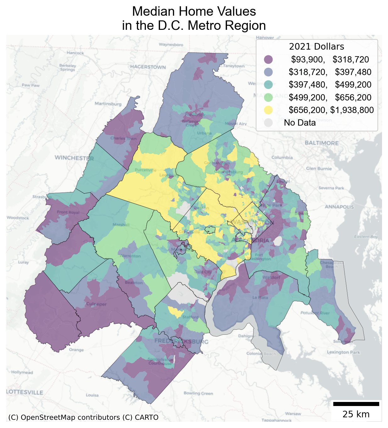
# set a different font for the legendlegend_font = font_manager.FontProperties(family="Arial", style="normal", size=10)# options for a better legendlegend_kwds = {# add a dollar sign and suppress decimals"fmt": "\${:,.0f}","title": "2021 Dollars","prop": legend_font,"loc": "upper right",}# options for displaying missing (NaN) datamissing_kwds = {"color": "lightgray","label": "No Data",}# select out counties in the DC metrodc_counties = counties[counties.geoid.str[:5].isin(gdf.geoid.str[:5].unique())]# instantiate an interface onto which we'll plotf, ax = plt.subplots(1, figsize=(12, 8))# plot the map into the interface we created using the `ax` argumentgdf.to_crs(gdf.estimate_utm_crs()).plot( column="median_home_value", scheme="quantiles", k=5, alpha=0.5, ax=ax, legend=True, legend_kwds=legend_kwds, missing_kwds=missing_kwds,)# layer on county boundaries for contextdc_counties.to_crs(dc_counties.estimate_utm_crs()).plot( ax=ax, facecolor="none", linewidth=0.2, edgecolor="black")# add a basemap to the same `ax`cx.add_basemap(ax, source=cx.providers.CartoDB.Positron, crs=gdf.estimate_utm_crs())# add a titleax.set_title("Median Home Values\nin the D.C. Metro Region", font="Arial", fontsize=15)# add a scalebarax.add_artist(ScaleBar(1, location="lower right"))# turn the axis/labels off because they're not usefulax.set_axis_off()
This map is not perfect, but it has most of the things cartographers like to see:
an informative title for the figure and legend,
a nicely formatted legend with explicit units of measurement and no trailing decimals
a clean basemap underneath (appropriately credited) and county boundaries overlaid on top for context
a scalebar for additional reference
There are also obvious ways it could be improved. For example, there is no north arrow (though there are simple solutions for that), and it is not immediately intuitive (to me, at least) that yellow means more expensive. You might also wonder why the size of the last bracket is more than 6x the size of the first.
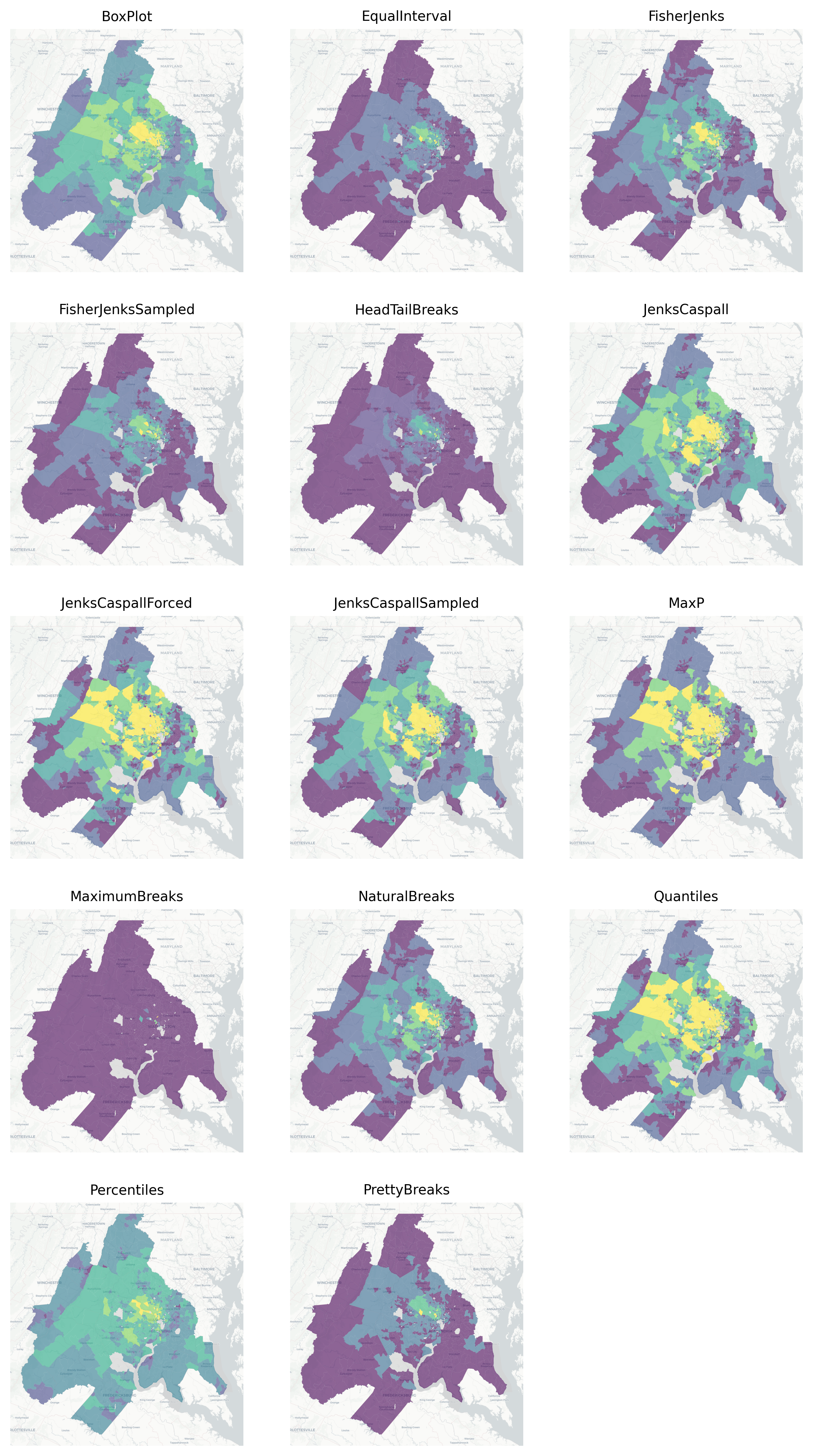
3.2.1 Map Classifiers
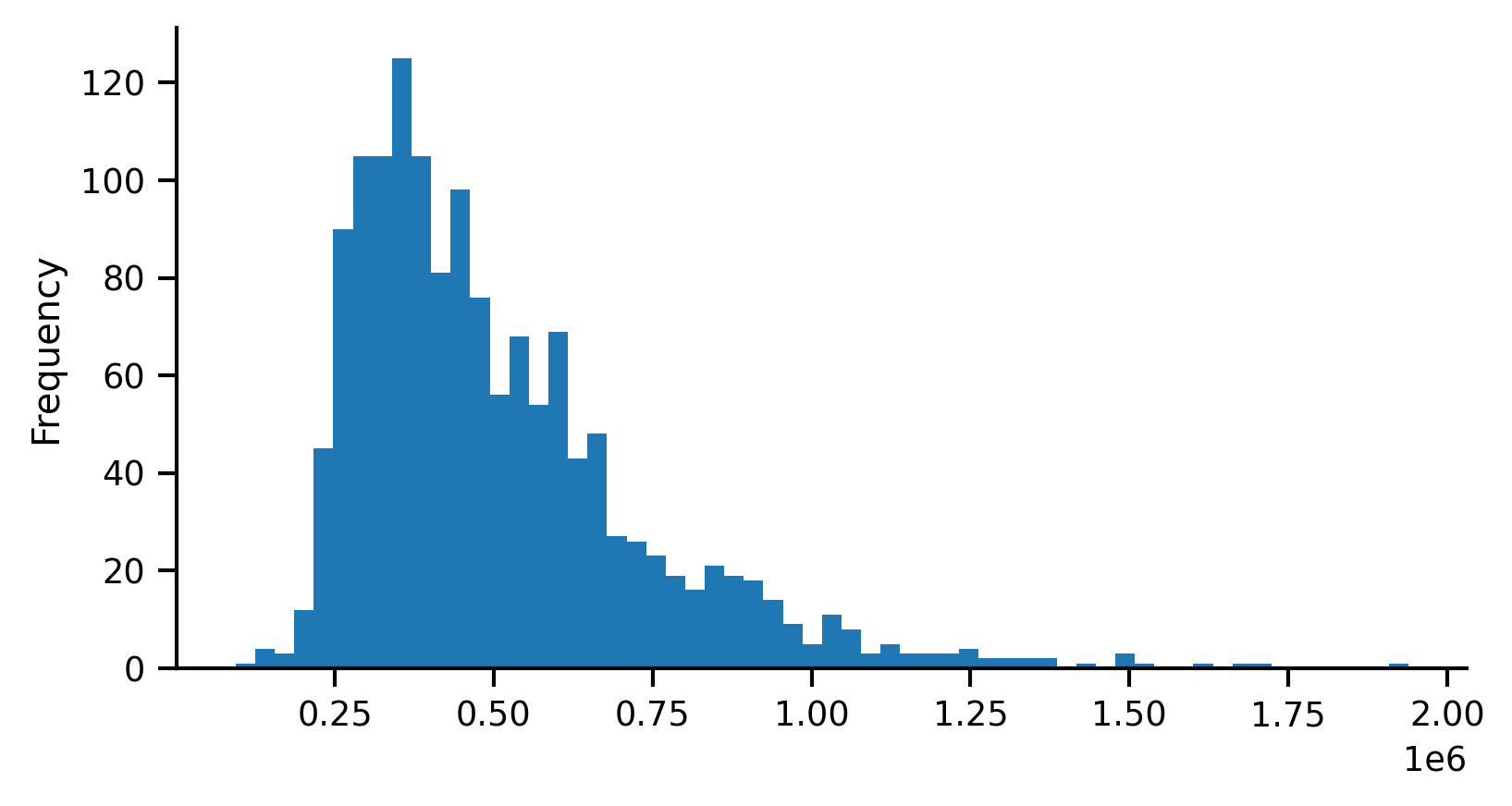
In the map above, the scheme argument defines the classification scheme used to assign each tract’s median home value to the appropriate color. In this example we used the ‘quantile’ classifier scheme='quantiles with five classes k=5 (i.e. quintiles). Under the hood, geopandas is generating this binning scheme using the mapclassify package. To see what it is doing, we can classify the median_home_value variable directly. For convenience, we will assign that Series on the geodataframe to the hv variable.
Generating a quantile classification with five classes (again, quintiles), produces the following, which shows the minimum and maximum values for each class (also called “bin”) and the number of observations (count) assigned to each class:
To create deciles (i.e. ten classes with a quantile classification), we use k=10. Note that although we are using quantiles, the number of observations assigned to each bin is not strictly equal since there are a number of duplicate values in the dataset.
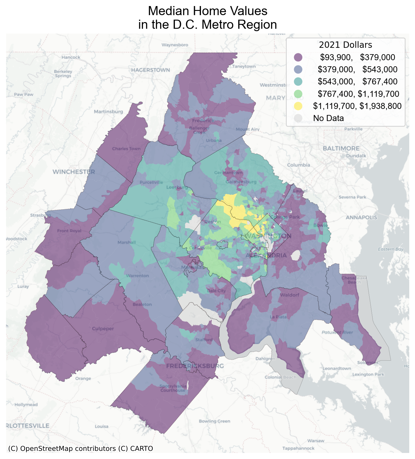
Alternatively, we could have used the Fisher Jenks classifier instead of the Quantile classifier. To compare the difference, we can classify the hv data again using jenks also with 10 classes.
f, ax = plt.subplots(1, figsize=(6, 6))gdf.plot( column="median_home_value", scheme="fisher_jenks", ax=ax, alpha=0.5, legend=True, legend_kwds=legend_kwds, missing_kwds=missing_kwds,)dc_counties.to_crs(gdf.crs).plot( ax=ax, facecolor="none", linewidth=0.1, edgecolor="black")cx.add_basemap(ax, source=cx.providers.CartoDB.Positron)ax.set_axis_off()ax.set_title("Median Home Values\nin the D.C. Metro Region", font="Arial", fontsize=15)plt.show()
Figure 3.4: Home Values using Fisher Jenks
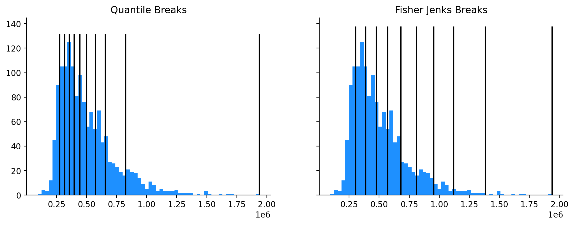
The Fisher jenks classifier highlights different patterns than the quantile classifier in Figure 3.3. What really sticks out in this version is the region of concentrated affluence along the Potomac river where median home prices range from ~1.1M to 2M. Using the Classifier object, we can use the bins attribute to plot how each classification scheme breaks the distribution into pieces
(a) Histograms Classified by Quantiles and Fisher Jenks
(b)
Figure 3.5
As we know from Rey et al. (2023), Fisher Jenks is an optimimal classifier that prioritizes homogeneity within each class. Thus for the same value of k, Jenks should always have a better “fit” score than Quantiles. For example the ‘absolute deviation from class mean’ (ADCM) should always be lower for the jenks classifier, and the ‘goodness of absolute deviation of fit’ (GADF) should always be higher.
Code
fj10.adcm
np.float64(37204900.0)
Code
fj10.gadf
np.float64(0.8481319216904772)
Code
q10.adcm
np.float64(43187300.0)
Code
q10.gadf
np.float64(0.8237121384985082)
Code
fj10.adcm < q10.adcm
np.True_
Code
fj10.gadf > q10.gadf
np.True_
In some cases, existing classification schemes just are not adequate, for example if you want to show distinctions between critical cutoff values or generate breaks with nicely rounded numbers that resonate more clearly with an audience. In those cases, it is simple to create a classifier using manually-specified breaks
Comparison of the Same Variable with Different Classification Schemes
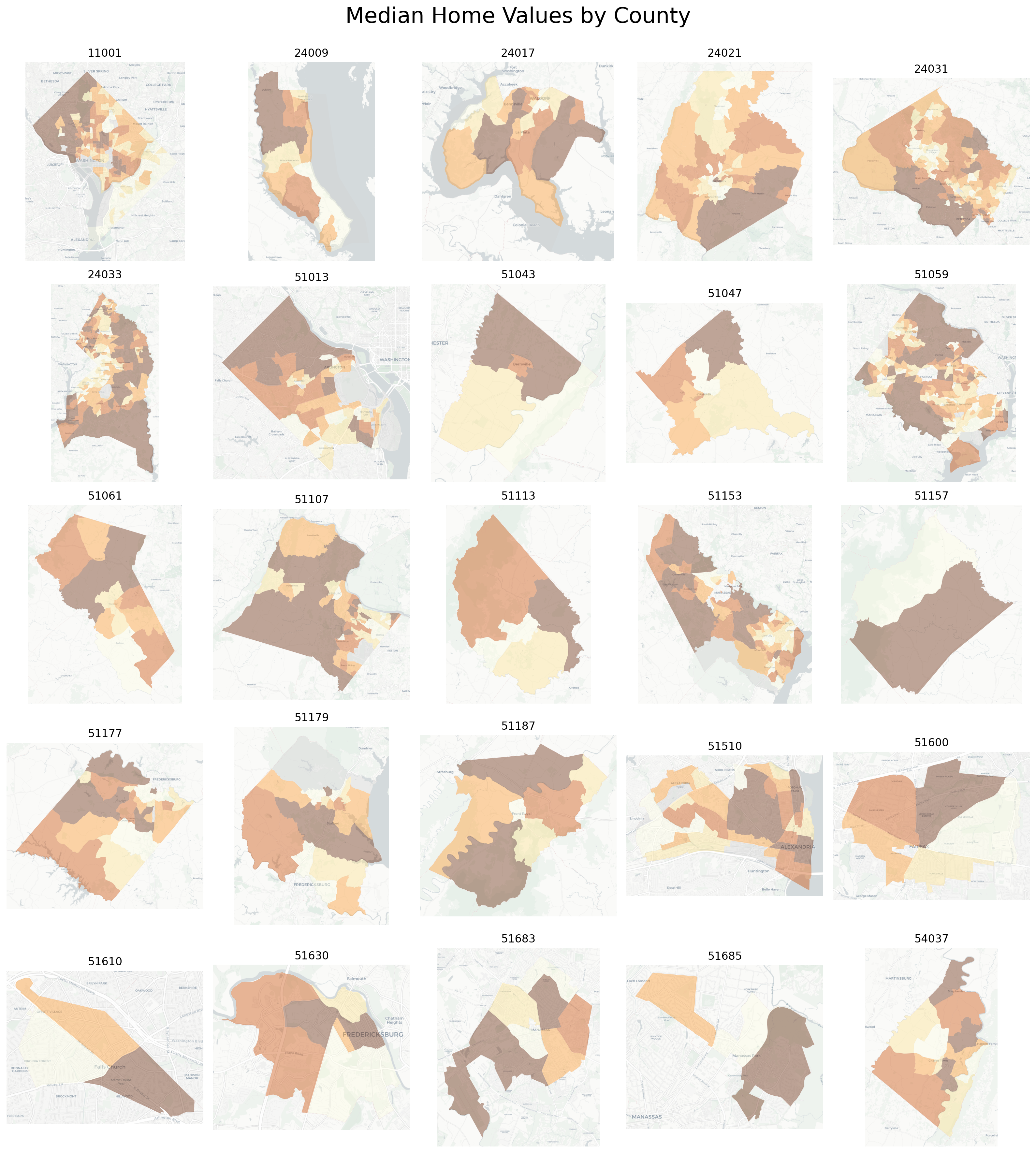
Using the Tuftian principle of small multiples (Tufte, 1983), we can also look at the intra-county variation in home prices by plotting each map independently but presenting them all together. First, we create a list of county FIPS codes, which are the first five characters of the geoid field.
Code
county_list =set([geoid[:5] for geoid in gdf.geoid])len(county_list)
25
Then we need to know how many counties we need to plot so we can create enough axes. With 25 different counties we can create a nice \(5\times5\) square, so those are the dimensions passed off to matplotlib. Then, we iterate through the set of counties and plot each to its respective axes (and set the title appropriately).
Code
f, ax = plt.subplots(5, 5, figsize=(16, 18))ax = ax.flatten()for i, county inenumerate(sorted(county_list)): cgdf = gdf[gdf["geoid"].str.match(f"^{county}")] cgdf.plot( column="median_home_value", scheme="quantiles", ax=ax[i], edgecolor="none", legend=False, cmap="YlOrBr", alpha=0.4, missing_kwds=missing_kwds, ) cx.add_basemap(ax[i], source=cx.providers.CartoDB.Positron, attribution="") ax[i].set_title(county) ax[i].set_axis_off()plt.suptitle("Median Home Values by County\n", fontsize=24)plt.tight_layout()
Median Home Values by County in California
Here, each subpanel is independent, so the color scheme is relative to the county itself rather than the MSA as a whole; this gives us a sense for how home values vary within each county (rather than being washed out by inter-county variation). As a person from the D.C. region, I have to admit that I have a different impression of this figure now that it has been produced. Technically there is only one ‘county or county equivalent’ in Washington D.C. (11001) so it shows up in the first row, first column. And D.C. is tiny, about the same size as many counties in its metropolitan region, so it would be an easy thing to overlook. But in the D.C. metro, equating the District with a county would be wildly disrespectful… D.C. has all the powers of a state except representation (and self-determination), so in respect, we treat it as a state until it achieves statehood. Apologies for the title.
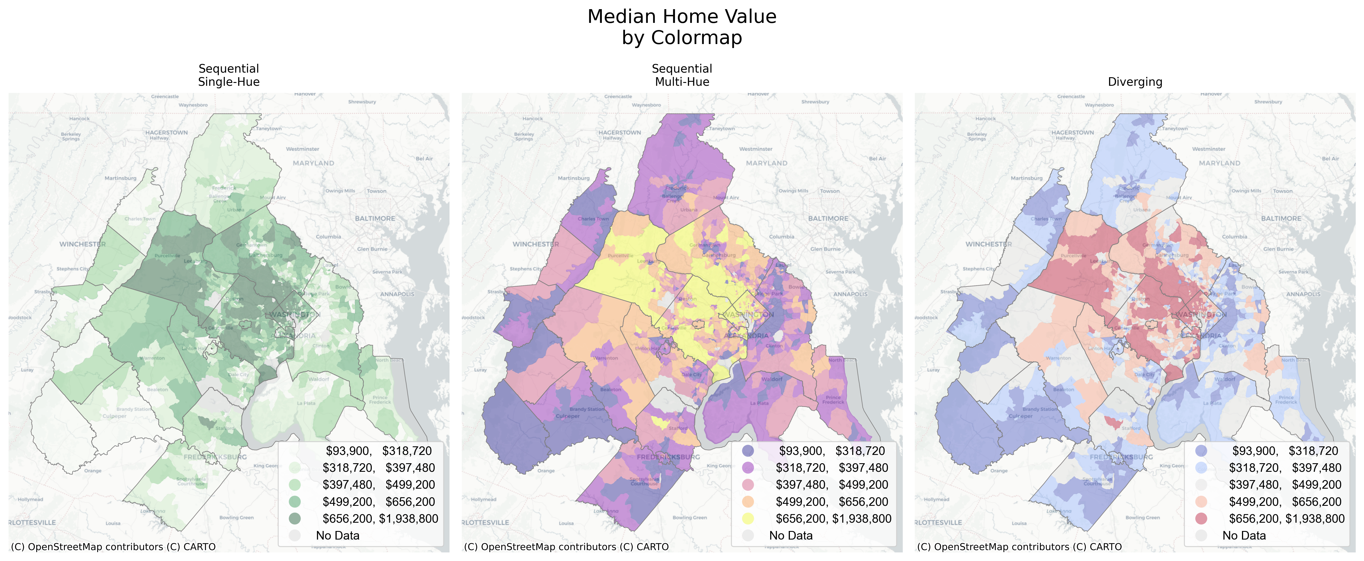
3.2.2 Colormaps
Choosing a colormap for shading a choropleth map is a science unto itself (Brewer, 1997, 2003; Harrower & Brewer, 2003). According to Tufte, “the map exemplifies the”first rule of color composition” of the illustrious Swiss cartographer, Eduard Imhof:
Pure, bright or very strong colors have loud, unbearable effects when they stand unrelieved over large areas adjacent to each other, but extraordinary effects can be achieved when they are used sparingly on or between dull background tones. “Noise is not music . . . only on a quiet background can a colorful theme be constructed,” claims Windisch.3
Home Values in the D.C. Region Using Different Colormaps
These maps all show the same variable (home values) with the same classification scheme (quintiles) but use different colormaps to achieve different effects. See the matplotlib documentation for more information in built-in colormaps. For an extended set of colors, see also palettable and colorcet
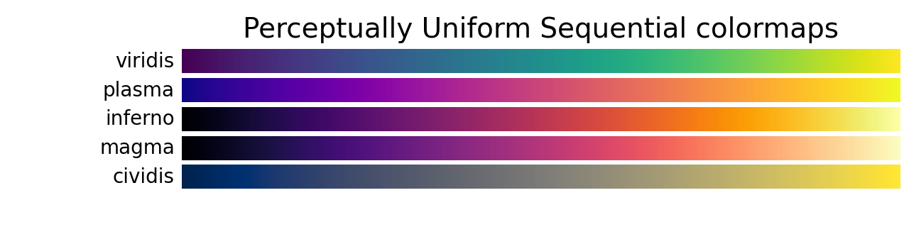
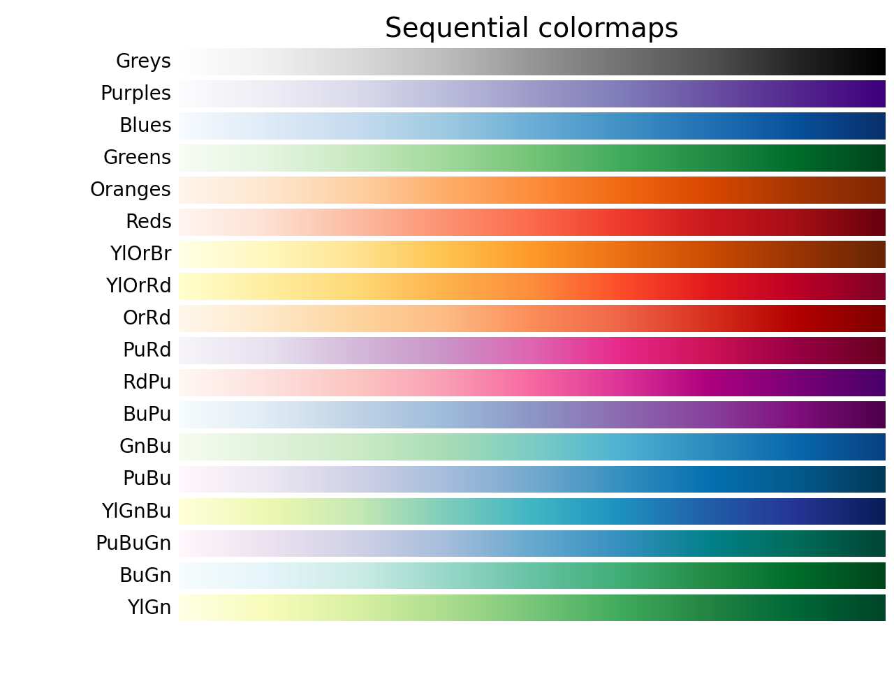
3.2.2.1 Sequential
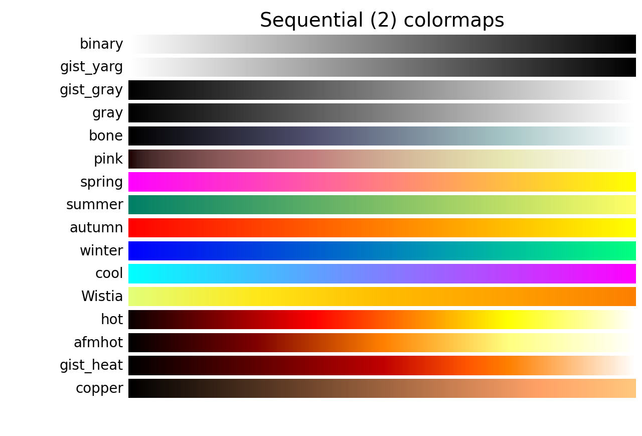
Sequential colormaps are ordered from light to dark (or the reverse. In matplotlib, you can reverse most colormaps with the _r suffix, e.g. YlGnBu_r). Sequential maps come in two varieties: single-hue, which step through the range of a single color from light to dark, and multi-hue, which step through a range of two or more colors that vary in intensity.
Apart from pleasing aesthetics, one of the central concerns when choosing a colormap is how humans perceive differences between colors. That is, does the move from light green to dark green mean the same thing as the move from yellow to purple? Sometimes it can also be difficult to intuit immediately which end of the color palette maps onto higher values; that is, does the brighter color represent high values? or does the dark color represent high values?
Another question is how many classes (k) to use. The short answer is, the human eye cannot distinguish between ultra-fine differences in color, so choropleth maps using greater than 10 classes have rapidly diminishing returns to larger k.
Perceptually Uniform
Sequential Colormaps
More Sequential Colormaps
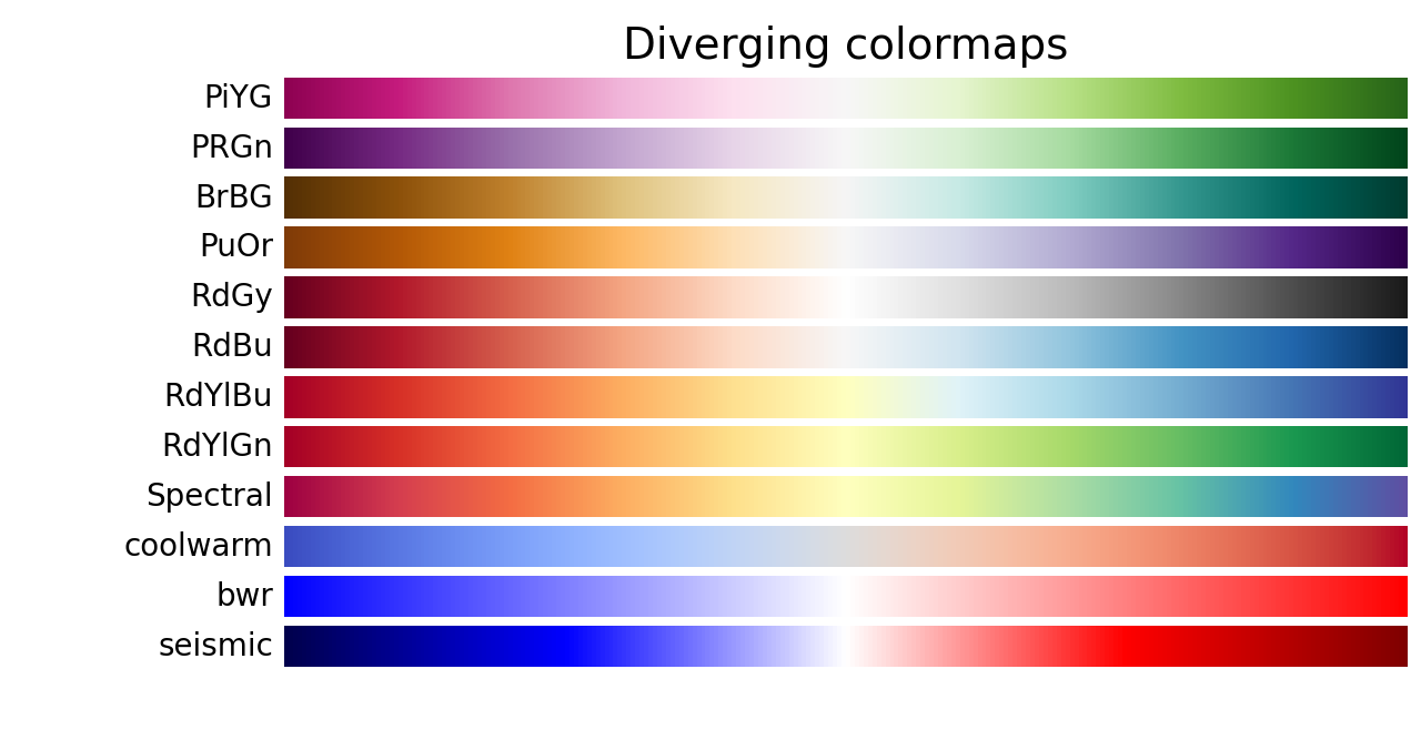
3.2.2.2 Diverging
Diverging colormaps are useful for displaying departure from a central tendency. A diverging map is essentially a pair of complementary sequential maps with one map inverted then stuck on the end of the other. For that reason it is important to choose a classification scheme that centers on a meaningful value (an odd number of quantiles is a good choice), otherwise the color scaling can give a skewed perception of the high and low values. It is also important to ensure that the paired colormaps (a) work well together, and (b) are equally-accessible for all audiences.
The following pairs of hues for use on thematic maps suited to diverging color schemes: red/blue, orange/blue, orange/purple, and yellow/purple. These recommendations are robust because they may be communicated verbally and require no particular color charts or color measurements for use. These color pairs will aid in producing maps of differences and of changes that can be read accurately by all map users.
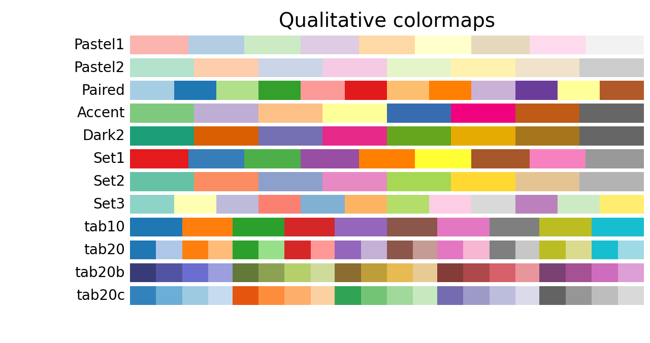
Categorical colormaps are used to show discrete or nominal data and are designed to emphasize difference in kind rather than degree. There is no natural ordering to a categorical set, so when displaying discrete data it is quite important to choose a categorical colormap to avoid the perception that a color gradient implies a numerical change. One other important concern is ensuring that there are enough colors in the colormap to exhaust the unique discrete values in the dataset. Otherwise, the same color may be placed randomly next to another observation of the same color so they are impossible to distinguish from one another.
Categorical Colormaps
Code
ax = gdf.assign(county=gdf.geoid.str[:5]).plot("county", cmap="tab20b", categorical=True, figsize=(7, 7), alpha=0.6)ax.axis("off")ax.set_title("Tracts by County in the D.C. MSA")cx.add_basemap(ax, source=cx.providers.CartoDB.Positron)
Plotting Counties as Categories in Greater D.C.
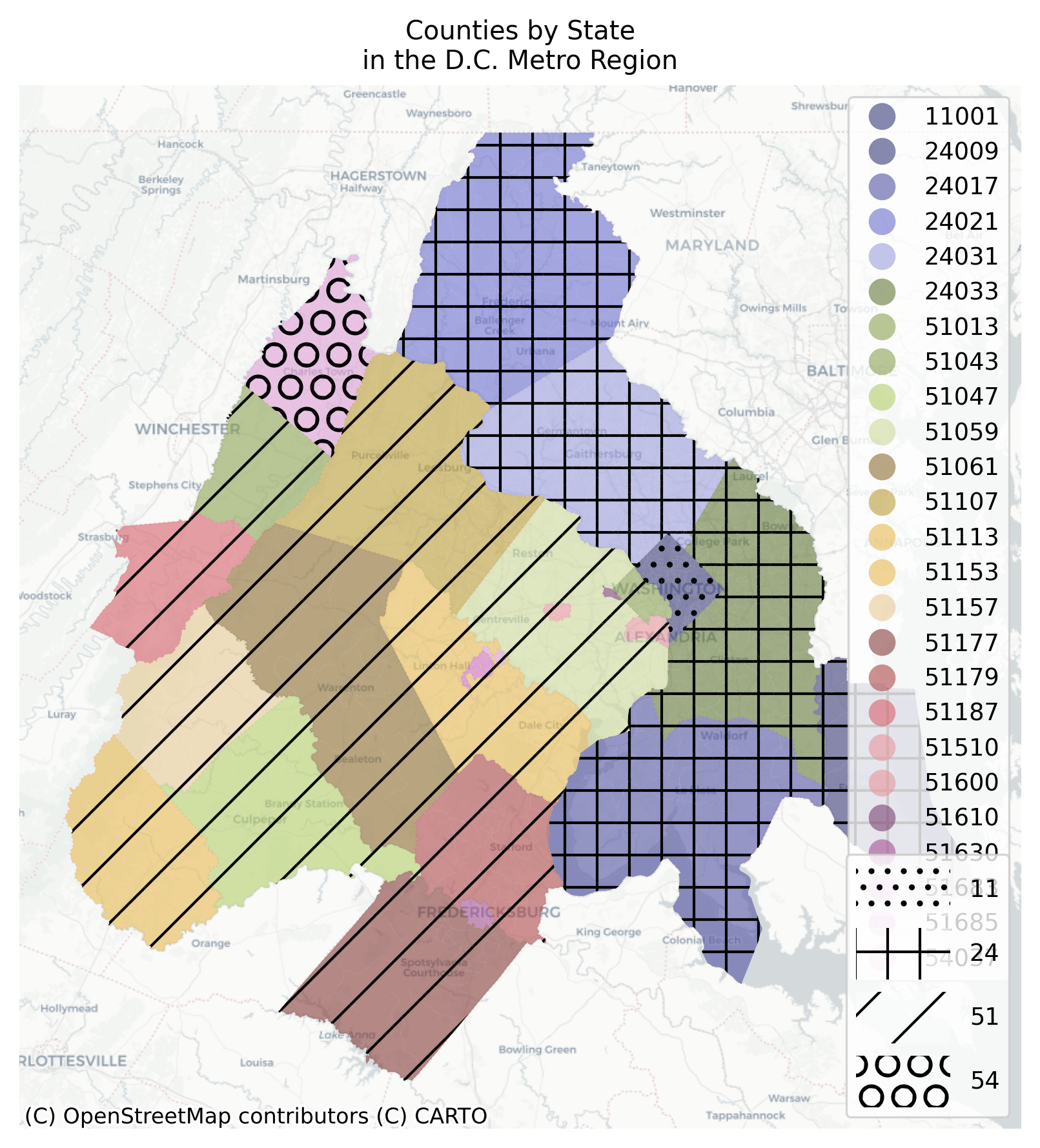
3.2.3 Hatching
You can also use matplotlib’s hatching to denote different categories, particularly if you need to create a choropleth with an additional categorical overlay.
Code
import matplotlib.patches as mpatches
Code
gdf.geoid.str[:2].unique()
array(['11', '24', '51', '54'], dtype=object)
Code
states = gdf.geoid.str[:2].unique()[:6]hatches = ["..", "+", "/", "O"]handles = []# store the county variable back onto the gdfgdf = gdf.assign(county=gdf.geoid.str[:5])f, ax = plt.subplots(figsize=(7, 7))gdf.plot("county", cmap="tab20b", categorical=True, figsize=(7, 7), alpha=0.6, ax=ax, legend=True,)for i, state inenumerate(states):# treat each county as separate but plot to same ax gdf[gdf.geoid.str[:2] == state].plot("county", hatch=hatches[i], facecolor="none", linewidth=0, ax=ax, )# create list of patches for legend handles.append( mpatches.Patch(facecolor="white", alpha=0.4, hatch=hatches[i], label=state) )# store the county legend for latercounty_legend = ax.get_legend()# create a new state legend (but overwrites counties)state_legend = plt.legend( handles=handles, handleheight=3, handlelength=4, loc=4,)# add the county legend backplt.gca().add_artist(county_legend)cx.add_basemap(ax, source=cx.providers.CartoDB.Positron)ax.axis("off")ax.set_title("Counties by State\nin the D.C. Metro Region")plt.show()
Using Texture and Color to Combine Categorical and Continuous Information in the Same Map
This map is not very pretty but it conveys a lot of information. You can change the density of the hatching pattern by adding more symbols (e.g. xxxx instead of x), and you can include variation by mixing the symbols.
3.3 Interactive Visualization
Interactive visualization gives an experience closer to traditional desktop GIS explorer, where you can pan, zoom, inspect, and mouseover different features of the map for more information. For exploratory work (and many other cases) this is extremely useful. One downside is that interactive visualization can be resource-intensive, especially when it is done in a webbrowser with limited access to computational power. For that reason, we will trim the example dataset down to just D.C.
Code
dc = gio.get_acs( datasets, state_fips="11", level="bg", years=["2021"], constant_dollars=False)dc = dc.to_crs(4326)
3.3.1 Folium & explore
The handiest (and therefore one of the best) ways to do interactive visualization is by using the explore method builtin to the geopandas dataframe. Internally, this works almost identically to the plot method, except that it builds a folium-based webmap instead of a static plot using matplotlib. To render the map, Folium passes off the data to leaflet-js, which has been the juggernaut powering open-source webmaps for the last decade or so.
Make this Notebook Trusted to load map: File -> Trust Notebook
The downside to folium/explore is that leaflet, having been built several years ago, is not the most performant rendering engine, and geojson is ultimately the data transfer mechanism. That means when a map is rendered, each individual vertex of every polygon in a dataset is stored in the webpage as text. For complicated features or a large number of features (let alone both), this can slow a browser down significantly and you can easily run out of memory entirely and crash the webpage.
3.3.2 HoloViews and GeoViews
The holoviews and geoviews (and hvplot which gives us a nice API) libraries are part of the pyviz suite and use Bokeh as a backend for rending interactive maps. The great thing about these libraries is (obviously) that they plug into the rest of the pyviz ecosystem to include things like callbacks and interlinking with other ipywidgets. This can make it extremely fast to put together an interactive dashboard for exploring a new dataset of testing a new method at scale.
One handy thing with hvplot is the ability to link two interactive maps together so they pan and zoom at the same time, which can be especially useful for comparative work.
The hvplot syntax uses the + symbol to link maps together so when you pan and zoom in one map, it will have the same effect in the other. One downside to holoviews and hvplot is that there is no passing off to mapclassify under the hood; every variable is shaded on a continuous linear scale. To generate a nice-looking choropleth, that means you need to create a temporary column on the geodataframe that stores bin values, then use that temporary variable to color values using hvplot. Below we will use the Quantiles classifier to create binning columns for median home value and median household income (using only non-NaN values)
PyDeck and Kepler.gl are based on deck.gl a high-performance graphics library built by the Uber team. Using deckgl can be great in some situations because it can handle larger datasets than leaflet (in theory, anyway) and it can render objects in three dimensions, allowing the use of height (the z-dimension) as an additional visual variable (Bertin, 1983). This can be just stylistic, like extruding buildings using their height attribute to create a more realistic visualization, or it can be analytic like using height (in addition to color) as a way of exploring variation in spatial relationships.
But PyDeck’s additional features come at the (relatively small) cost of additional parameterization. Specifically, we need to create a colormapping ourselves, and create an extrusion factor used to visualize the height of each feature (i.e. a variable on the dataset of some function thereof). Both of these can be read as columns from the geodataframe that provides the feature geometry, so we just need to create some simple functions. First, we will set a variable to visualize (still median home value), and use the fisher jenks classifier with six categories but with a new colormap (diverging this time, which is more appropriate for home values).
Code
var ="median_home_value"cmap ="PRGn"classifier ="fisherjenks"k =6
Then we create two functions that create the extrusion values and the generate the color for each observation. The extrusion factor (the height of each polygon) depends on the scale of the input variable and may take some experimentation to work out. The color mapping requires us to define a define a mapclassify classifier (and k) and collect the appropriate color from matplotlib. All we need to do is create a mapping between values of the given variable and colors from the given colormap, using the classifier as our translator (the caveat is we need to translate the list of [r,g,b,a]–that’s red, green, blue, alpha (or transparency), which is a global color specifications–color attributes into the correct 255 scale), and this function exists in the mapclassify.util namespace.
Use option+click to change the camera orientation rather than pan in the map.
In this map we are using two visual variables to encode the same measurement (home values) in two different ways (like Figure 3.2, except here we use height/extrusion rather than size). Color is used to discretize the distribution into categories, and height is used to show the full variation. In this case, color is effectively re-encoding home values from an interval measure into an ordinal measure and height encodes the original (albeit rescaled) interval measure. This is a bit like visualizing Figure 3.5 on the map itself because the height displays the full range of the data in the histogram and the colors show the binning scheme. The variation in height within a single color band represents the variation inside each pair of black bars in the histogram. A more effective example of extrusion is shown in Section 11.3.1
Bertin, J. (1983). Semiology of graphics. University of Wisconsin press.
Brath, R., & Banissi, E. (2018). Bertin’s forgotten typographic variables and new typographic visualization. Cartography and Geographic Information Science, 00(00), 1–21. https://doi.org/10.1080/15230406.2018.1516572
Brewer, C. A. (1996). Guidelines for Selecting Colors for Diverging Schemes on Maps. The Cartographic Journal, 33(2), 79–86. https://doi.org/10.1179/caj.1996.33.2.79
Brewer, C. A. (1997). Spectral Schemes: Controversial Color Use on Maps. Cartography and Geographic Information Systems, 24(4), 203–220. https://doi.org/10.1559/152304097782439231
Brewer, C. A. (2003). A Transition in Improving Maps: The ColorBrewer Example. Cartography and Geographic Information Science, 30(2), 159–162. https://doi.org/10.1559/152304003100011126
Brewer, C. A., MacEachren, A. M., Pickle, L. W., & Herrmann, D. (1997). Mapping Mortality: Evaluating Color Schemes for Choropleth Maps. Annals of the Association of American Geographers, 87(3), 411–438. https://doi.org/10.1111/1467-8306.00061
Brewer, C. A., & Pickle, L. (2002). Evaluation of Methods for Classifying Epidemiological Data on Choropleth Maps in Series. Annals of the Association of American Geographers, 92(4), 662–681. https://doi.org/10.1111/1467-8306.00310
Cairo, A. (2016). The truthful art: Data, charts, and maps for communication. New Riders.
Cairo, A. (2019). How charts lie: Getting smarter about visual information. W.W. Norton & Company.
Eicher, C. L., & Brewer, C. A. (2001). Dasymetric mapping and areal interpolation: Implementation and evaluation. Cartography and Geographic Information Science, 28(2), 125–138. https://doi.org/10.1559/152304001782173727
Harrower, M., & Brewer, C. A. (2003). ColorBrewer.org: An Online Tool for Selecting Colour Schemes for Maps. The Cartographic Journal, 40(1), 27–37. https://doi.org/10.1179/000870403235002042
Harvey, F., & Losang, E. (2018). Bertin’s matrix concepts reconsidered: Transformations of semantics and semiotics to support geovisualization use. Cartography and Geographic Information Science, 00(00), 1–11. https://doi.org/10.1080/15230406.2018.1515036
Jenny, B., Stephen, D. M., Muehlenhaus, I., Marston, B. E., Sharma, R., Zhang, E., & Jenny, H. (2018). Design principles for origin-destination flow maps. Cartography and Geographic Information Science, 45(1), 62–75. https://doi.org/10.1080/15230406.2016.1262280
Olson, J. M., & Brewer, C. A. (1997). An Evaluation of Color Selections to Accommodate Map Users with Color-Vision Impairments. Annals of the Association of American Geographers, 87(1), 103–134. https://doi.org/10.1111/0004-5608.00043
Rey, S. J., Arribas-Bel, D., & Wolf, L. J. (2023). Geographic Data Science with Python (1st edition (May 10, 2023)). Chapman and Hall/CRC.
Roth, R. E., Woodruff, A. W., & Johnson, Z. F. (2010). Value-by-alpha Maps: An Alternative Technique to the Cartogram. The Cartographic Journal, 47(2), 130–140. https://doi.org/10.1179/000870409X12488753453372