29  Spatial Dynamics in Math Achievement

Rather than looking at the pooled data, SEDA also provides a long-form of their grade-corhort-standardized data, which is recommended for public presentation. That dataset contains observations at the district level for each year between 2009 and 2018. Using geosnap we can also examine how educational achievement has evolved over time and space. Here, we focus on math scores.

Code
ca_dists = gpd.read_parquet('data/ca_dists.parquet')

seda_dists = datasets.seda(accept_eula=True, level='geodist', pooling='long', standardize='gcs')

math_dists = seda_dists[seda_dists['subject']=='mth']

math_dists = math_dists.groupby(['sedalea', 'year']).mean() # average over all grades

math_dists = math_dists.dropna(subset=['gcs_mn_all'])

math_dists = math_dists.reset_index()

math_dists['gcs_mn_all']  = math_dists['gcs_mn_all'] - math_dists['grade']  # I think this is how you're supposed to handle averaging over grades

math_dists = gpd.GeoDataFrame(math_dists.merge(ca_dists.drop(columns=['year']), right_on='GEOID', left_on='sedalea'))

math_dists.to_parquet('data/math_dists_long.parquet')

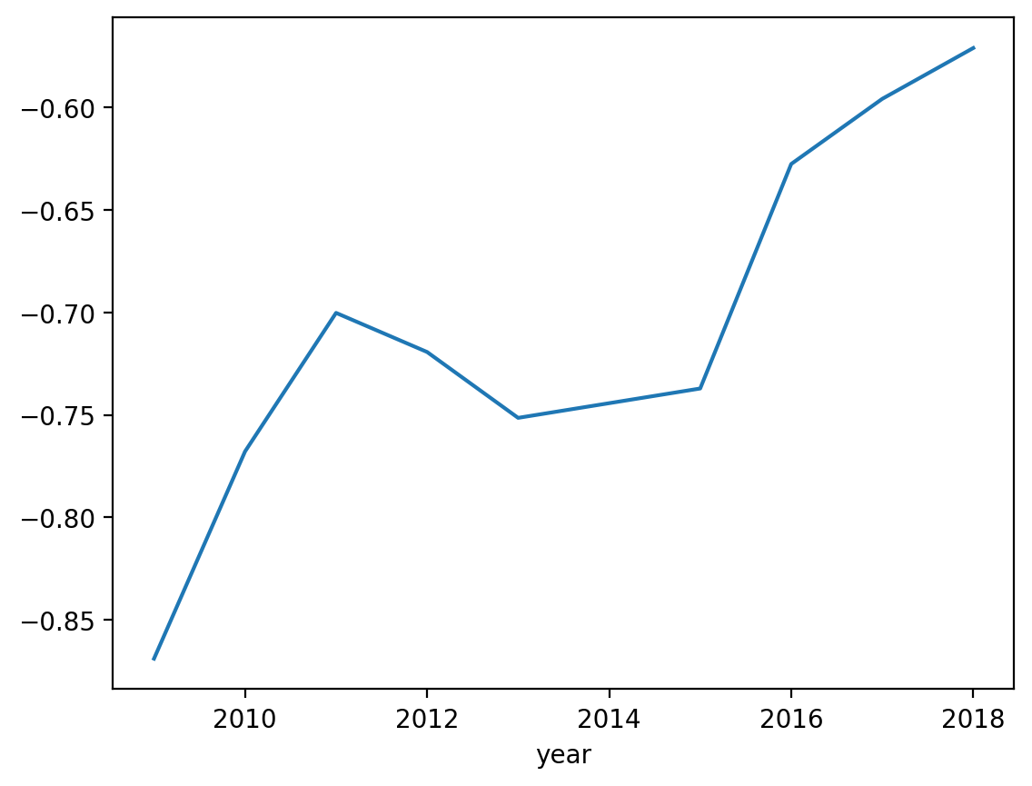
Plotting the average math achievement over time shows a relatively steady increase, though still more than half a grade below the national average (as the line never raises above -0.5 on the Y-axis)

Code
math_dists.groupby('year').mean()['gcs_mn_all'].plot()

For a reminder of the general geography of math achievement, we can plot the data from 2018

Code
math_dists[math_dists.year == 2018][["gcs_mn_all", "geometry"]].dropna().explore(
    "gcs_mn_all",
    scheme="quantiles",
    k=8,
    cmap="PRGn",
    tiles="Stamen Toner Lite",
    style_kwds={"weight": 0.5},
)
Make this Notebook Trusted to load map: File -> Trust Notebook

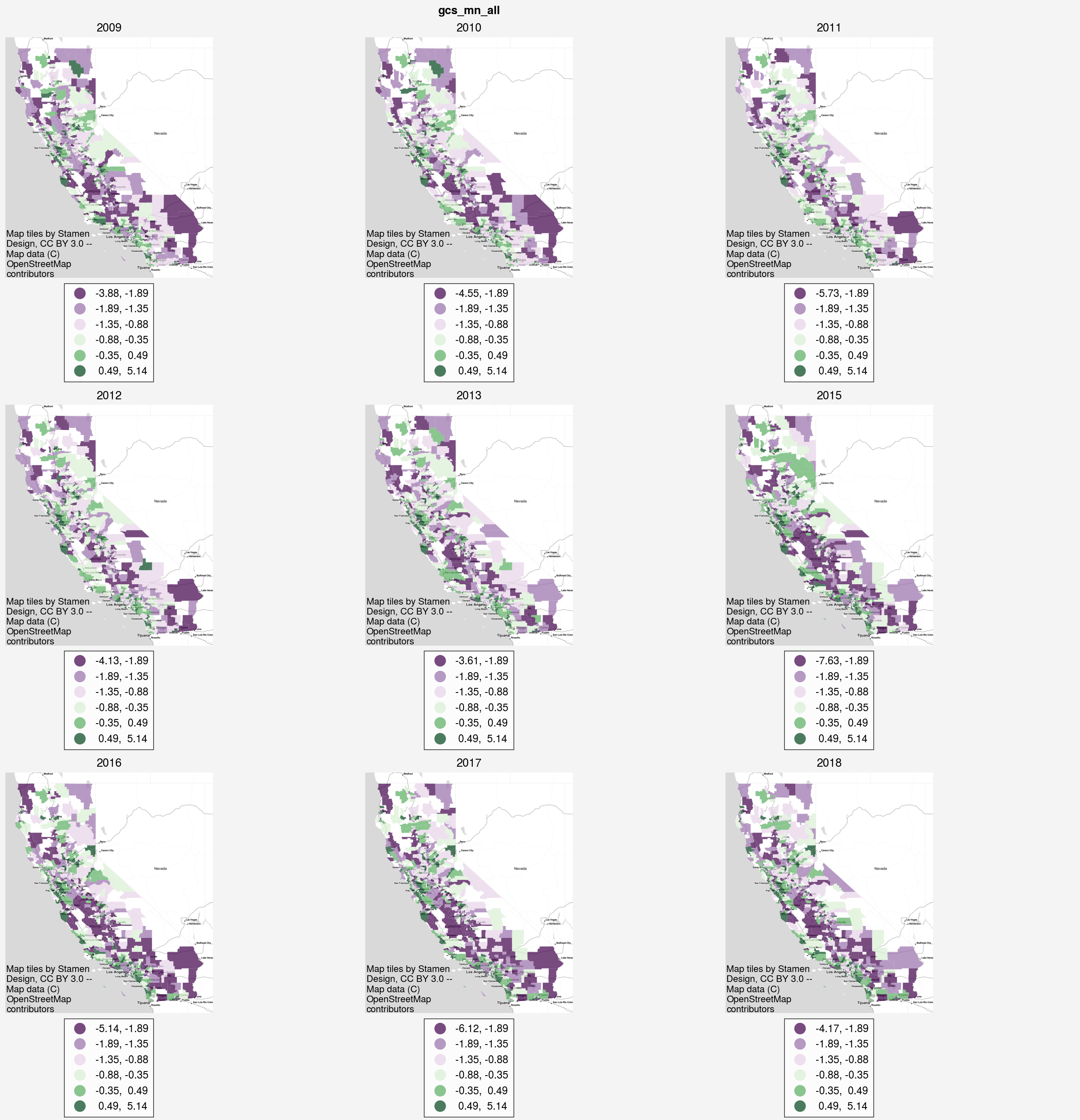
And we can also plot the change over time using “small multiples” of maps to make simultaneous comparisons. This can help give a sense for whether certain regions of the state are changing more or faster than others

Code
gvz.plot_timeseries(math_dists, 'gcs_mn_all',k=6, cmap='PRGn', save_fig='images/math_ts.png')
SubplotGrid(nrows=3, ncols=3, length=9)

The maps help reinforce the notion of coldspots in math achievement trends we observed in the prior section. As the plots move forward in time, we can see the central valley continue to grow more purple in color.

The trouble with these visualizations is that small multiples become difficult to interpret with so many datapoints, so an animation can be helpful in some cases.

Code
gvz.animate_timeseries(math_dists, column='gcs_mn_all',k=6, scheme='quantiles', cmap='PRGn', filename='images/math_transitions.png', fps=1.8, dpi=180)

from IPython.display import Image
Image('images/math_transitions.png', width=600)

<Figure size 2000x2000 with 0 Axes>
<Figure size 1000x1000 with 0 Axes>

The animation can also be overwhelming, so it’s useful to focus on a single place and watch it evolve over time, rather than try and consume the entire map. Even so, it is clear that some places, like the green along the coast change very little over time, wheras other places, typically to the east, tend to decline over time

29.1 Spatial Dynamics

As with before, we can test whether the transitions shown in the animation above are random or respond to spatial structure. That is, we can test whether school districts move up or down the math achievement distribution independent of their neighbors or not.

('WARNING: ', 233, ' is an island (no neighbors)')

To carry out this analysis, we first convert the math scores into quintiles. Then, for each district in the state, our dataset is converted into a sequence of labels representing the quintile for a given time period. If a district has label 0 in 2010, then it is in the 0th quintile, with a math score in the lowest 20% of the state. If that same district moves up to the top quintile in the next time period, it would have a label of 4 (where the labels are arranged 0,1,2,3,4).

With this new dataset, we can model district-level changes in math scores as a spatial Markov process, which lets us examine whether these transitions are independent in space. The test for spatial dependence, in this case, compares the overall transition rates against transitions that occur when

That is, we observe how often a unit moves from the first quintile to the second quintile in the general case, and we compare that to the number of times the same transition occures (first quintile to second) when our units have neighbors in different quintiles. In other words,

  • how often do we observe transition 0–>4?
  • how often do we observe transition 0–>4 when the neighbors are 4?
  • how often do we observe transition 0–>4 when the neighbors are 3?

etc.

If these transition rates differ under different conditions of spatial context, then we have evidence that space matters in the evolution of math scores over time.

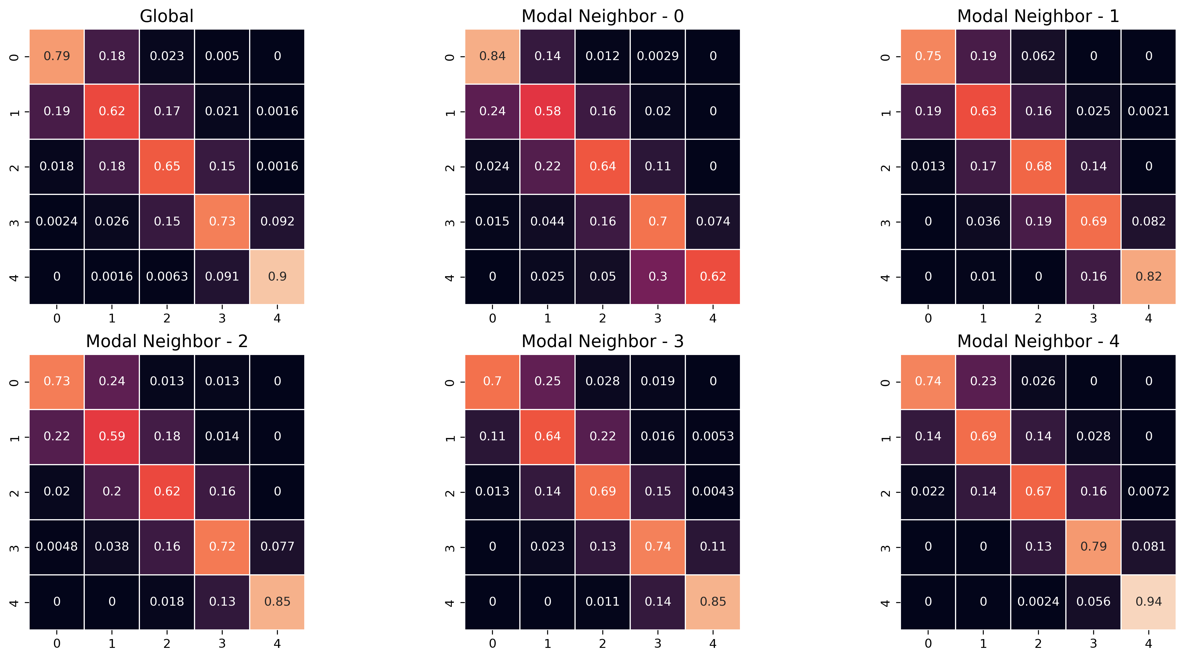
We can also plot the transition rates to give a better visual understanding of these dynamics. In the figure below, the transition rates are visualized as heatmaps, with origins on the rows and destinations on the columns. The cells are colored according to the size of the transition rate. Each heatmap represents a set of transition rates under different contexts, such as when the most common neighbor is in the first quintile (’Modal Neighbor 0), the second quintile (Modal Neighbor 1), etc. The global heatmap shows the overall transition rates, regardless of spatial context.

The strong diagonal in all the matrices shows that math scores are relative stable over time. The most likely transition for any school district is to remain in the same quintile it occupied in the last time period. For example, looking at the global transitions, the probability that a district in the first quintile remains in the first quintile (0–>0) is .78. This means in our dataset, when comparing districts in successive time periods, those in the first quintile remain in the first quintile 78% of the time. Within the global heatmap but moving over one column, we can see the transition from the first quintile to the second (0–>1) is 0.18. This means that there is an 18% chance that a school district with math scores in the lowest 20% will move up to the next quintile in the next time period. The chances that these districts will move into higher quintiles then dwindles dramatically (2.9% for the next, then less than 1% for the final two quintiles).

Comparing results across heatmaps tells us how space enters the picture. For example comparing the global heatmap to the “Modal Neighbor 0” heatmap tells us how transitions differ for districts with very low-performing math scores. This shoes that a low-performing district (i.e. math scores in the lowest quintile) is even more likely to remain a low-performing district when its neighbors are also low-performing districts. The 0–>0 transition changes from 0.78 in the global case to 0.82 in the case of low-performing neighbors. Conversely, when a low-performing district has very high performing neighbors (i.e. the heatmap for “Modal Neighbor 4”), it has a much higher chance of moving up the ladder. A low-performing district only has a 66% chance of remaining low-performing when its neighbors are mostly high-performing districts (that is, the transition rates from 0–>0 change from .82 when the Modal Neighbor is 0, down to .66 when the Modal Neighbor is 4.

Code
gvz.plot_transition_matrix(math_dists, cluster_col='math_quintile', unit_index='sedalea_x', savefig='images/math_transmat.png', dpi=200, figsize=(15,12))
('WARNING: ', 233, ' is an island (no neighbors)')
array([<AxesSubplot:title={'center':'Global'}>,
       <AxesSubplot:title={'center':'Modal Neighbor - 0'}>,
       <AxesSubplot:title={'center':'Modal Neighbor - 1'}>,
       <AxesSubplot:title={'center':'Modal Neighbor - 2'}>,
       <AxesSubplot:title={'center':'Modal Neighbor - 3'}>,
       <AxesSubplot:title={'center':'Modal Neighbor - 4'}>,
       <AxesSubplot:>, <AxesSubplot:>, <AxesSubplot:>], dtype=object)

Visually, we can see these dynamics differ, and the formal statistical tests also confirm that the transitions are not homogenous across different spatial contexts:

Code
print(f"the p-value for LR test is {np.round(t.LR_p_value,5)}")
print(f"the p-value for Q test is {np.round(t.Q_p_value,5)}")
the p-value for LR test is 0.0
the p-value for Q test is 0.0

From a policy perspective, the combined results from the exploratory spatial analysis and the examination of spatial dynamics suggest that space is an important consideration for any potential policy intervention. Both cross-secitonally and temporally, our results show that achievement in one district or school is related to achievement in nearby districts (schools), and this suggests at a possible spatial spillover mechanism. In that case, an intervention in one school district (such as increased funding or a newly-developed curriculum, etc) could also affect nearby school districts. In these cases, it could be particularly effective to invest in the coldspots revealed earlier, with the anticipation that improvements may spill over into neighboring districts.

Code
from geosnap.analyze.dynamics import draw_sequence_from_gdf
from libpysal.weights import Rook

wdist = Rook.from_dataframe(math_dists[math_dists.year==2018].reset_index())
Code
predicted = draw_sequence_from_gdf(
    math_dists[math_dists.year == 2018].reset_index(),
    w=wdist,
    time_column="year",
    label_column="math_quintile",
    smk=t,
    time_steps=10,
    increment=1,
    start_time=2018
)
Code
gvz.animate_timeseries(predicted, categorical=True, column='math_quintile', cmap='PRGn', filename='images/math_predictions.png', fps=1.8)
<Figure size 2000x2000 with 0 Axes>
<Figure size 1000x1000 with 0 Axes>

If we think these spatiotemporal trends are likely to persist, then we can use this model to simulate what math achievement could look like in future time periods. Note this is not a causal model that helps inform policy analysis by explaining how, for example an investment in X dollars would be expected to raise achievement in Y grade levels. Rather, it is closer to a Schelling-style model that helps us think through space-time relationships in a complex system.

Below, we use the transition model we built above to simulate math scores at the district level into 2028

Code
Image('images/math_predictions.png')

Using this framework, it would be simple to simulate for example, how raising the math score in one district such as the middle of a coldspot might spill over into nearby districts.

:::