Much attention is now being given to the construction of models of urban structure of a type which are statistical and computerised and which are contributing the first wave of generalised urban models since those produced by the American school of human ecology in the 1920’s and 1930’s. This new interest in model-making is however, paralleled by a series of attempts at formulating new methods of analysis for the study of urban structure. These again have their analogies in the interwar Chicago school, where the production of the general ecological models was preceded by extensive social investigation and the mapping of social data.
Combining the scholarship on spatial structure and segregation, urban scholars have long recognized the value of studying multi-dimensional segregation, i.e. how cities partition into smaller communities along the lines of race, ethnicity, socioeconomic status, family structure, etc. Work in this tradition develops and applies methods to identify patterns like Burgess’s concentric zones model, and asks (a) which “dimensions” are most important for understanding residential sorting, and (b) whether cities in different regions, countries, or political/economic systems follow similar patterns.
Before the Geography of Opportunity (Galster & Killen, 1995), there was the Ecology of Inequality (Massey & Eggers, 1990), and prior to that, a massive literature on ‘factor ecology’ which adopts exploratory factor analysis to analyze residential differentiation(Rees, 1971). An important vestige of this tradition is the focus on neighborhood differentiation as an outcome of social processes. Thus, the goal is to collect neighborhood data and conduct factor analysis to understand which neighborhood variables seem to measure the same “underlying construct”. That is, while the ultimate result is a dimensionality-reduction technique, the ‘factors’ uncovered by the researchers are viewed as [partial] measurements of different segregating processes.
In this section we explore comparative factor ecology (and extend it) using the canonical examples of Los Angeles and Chicago. These two cities (metropolitan regions, actually) serve as a useful comparison because they are two large and well known cities, but also because the conceptual research design and empirical examples were developed in these places (Shevky & Williams, 1949). Further, some have argued that L.A. and Chicago represent two distinct traditions of urban research, both focused on community scholarship albeit with different lineage (Dear, 2002).
The original idea concept behind social area analysis and factorial ecology is to summarize urban data along its primary axes, then classify areas according to these axes. Although both SAA and FE drew considerable criticism for being atheoretical, the formalization of the method was intended directly to address several hypotheses about social and spatial structure (Arsdol et al., 1958; Bell, 1955; Bell & Greer, 1962; Schmid et al., 1958; Van Arsdol et al., 1961, 1962). This predates the inception of confirmatory factor analysis, so the hypothesis testing was less stringent, but the hypotheses were explicit nonetheless.
The first testable hypothesis is that American cities divide themselves along three principal axes related to economic status, family status, and ethnic status, which together provide the foundation for location choice and multidimensional segregation (Bell, 1955). The second set of hypotheses focus on the relationship between the revealed dimensions and social behaviors for populations in different areas. This is an early forerunner to neighborhood effects research (Green, 1971; Greer, 1960; Johnston et al., 2004).
Shevky, Williams, and Bell [301, 3022] argued that most of the social differentiation and stratification of the population in the United States can be summarized in three primary social “dimensions”:
an index of social rank measuring socioeconomic status,
an index of urbanization measuring family status,
and an index of segregation measuring ethnic status
And as decribed above, these measures of social differentiation were viewed as outcomes of unobservable social processes (i.e. segregation by age and family size). Following, scholars used these variables to test other hypotheses, such as whether having a larger family resulted in different community-level behaviors like voting turnout or civic participation (Greer, 1956; Morgan, 1984).
Factorial ecology and social area analysis endured a great deal of criticism before being essentially abandoned by the 1990s, however these two hypotheses–especially the first–are probably among the most replicated findings in empirical urban research. At its core, factor ecology is fundamentally an exploratory method that assumes residential sorting in the urban system follows a number of empirical patterns; following, “accepting the systemic assumption, factorial ecology asks the question ‘how does the system cohere and pattern?’ The answer is sought by trying to identify repetitive sequences of spatial variation present in many observable attributes of area” (Berry, 1971). In other words, given a variety of data in spatial form, our goal is to uncover and compare the primary axes of urban differentiation. These factors measure the primary dimensions of residential differentiation and are powerful descriptors of the regions under study, but can also be used to generate further hypotheses and test other behavioral differentiation as described above.
20.1 Exploratory Factor Analysis
For an overview of the factorial ecology method, see Rees (1971). Methodologically, factorial ecology relies on exploratory factor analysis (EFA), a decomposition technique designed to recover latent processes that lead to the observed variables, and is used heavily in psychological personality theory Velicer & Jackson (1990). For this purpose, we will again rely on the factor_analyzer package, and will begin by collecting data for the Los Angeles and Chicago metropolitan regions (blockgroup level for ACS 2017-2021). Since we need to perform the same handful of operations to two different datasets, its easiest to define a quick function that handles both. The original factor ecology work also includes an isolation segregation measure, so we will adopt the recent local distortion index here.
/Users/knaaptime/miniforge3/envs/urban_analysis/lib/python3.12/site-packages/geosnap/io/util.py:273: UserWarning: Unable to find local adjustment year for 2021. Attempting from online data
warn(
/Users/knaaptime/miniforge3/envs/urban_analysis/lib/python3.12/site-packages/geosnap/io/constructors.py:218: UserWarning: Currency columns unavailable at this resolution; not adjusting for inflation
warn(
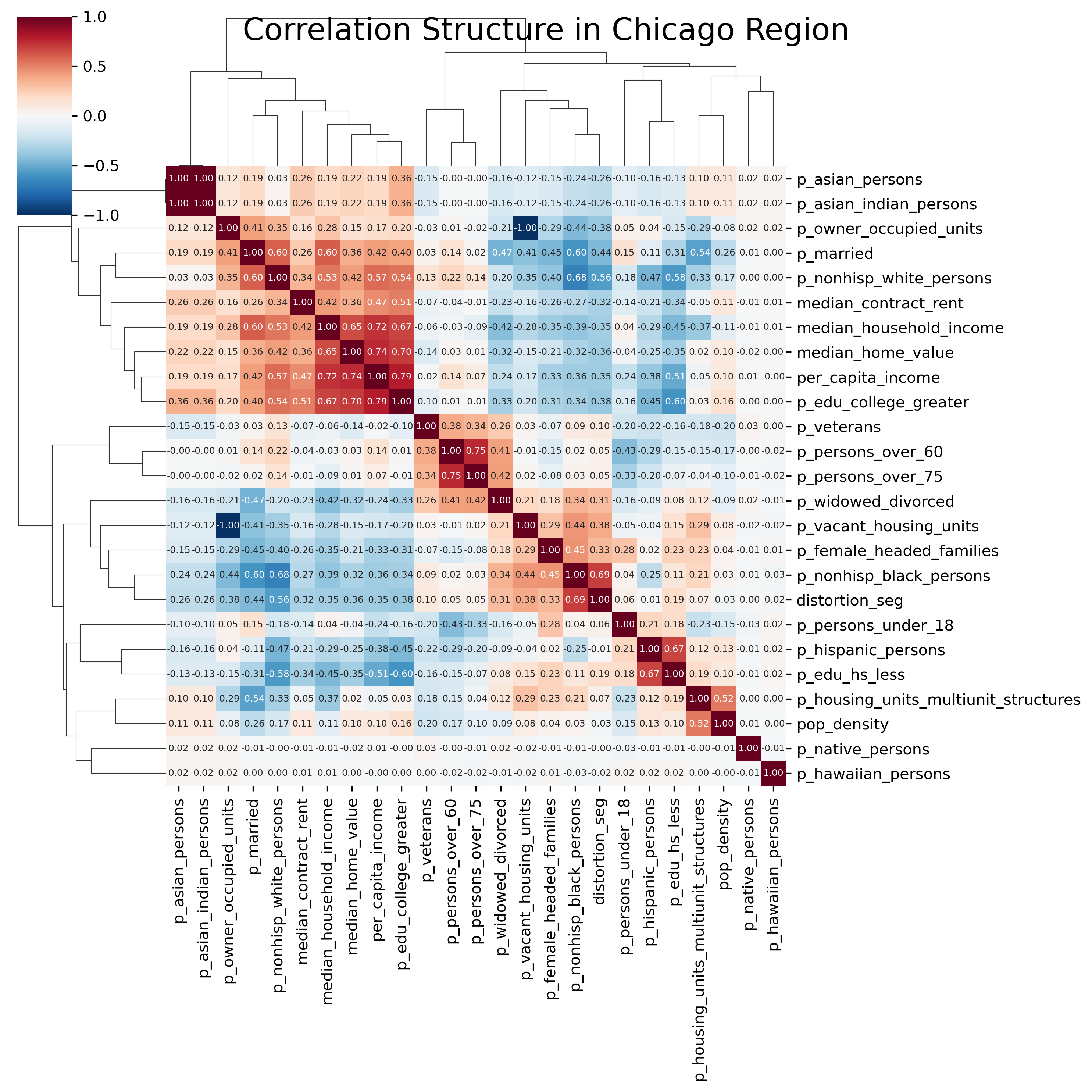
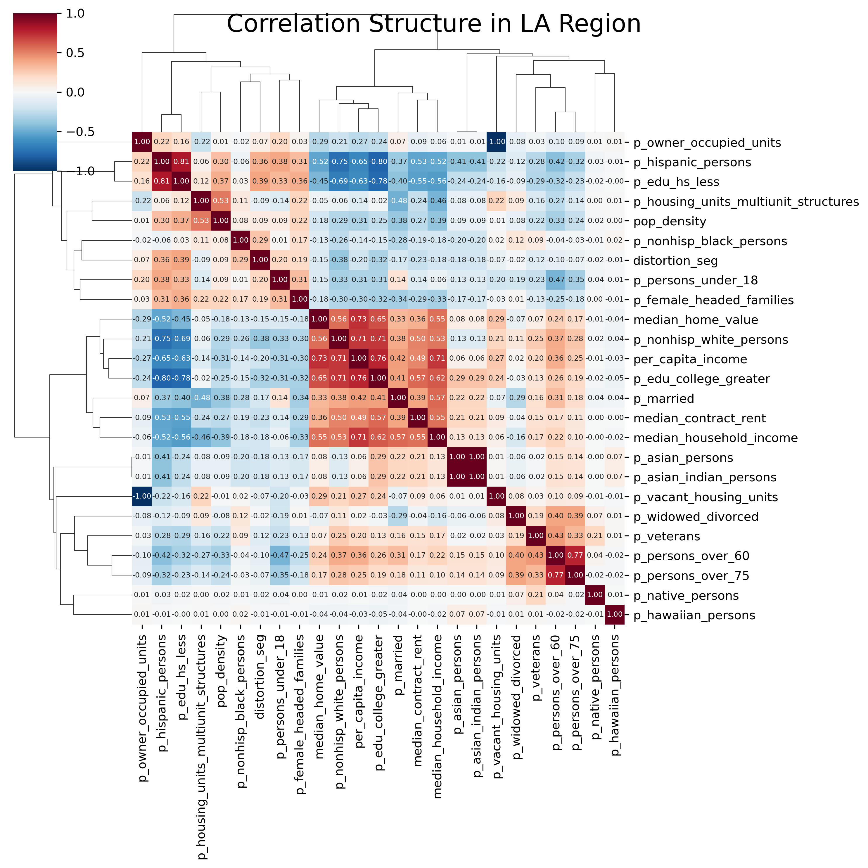
20.1.1 Correlation Structure
As in Chapter 16, a useful visualization to begin a factor analysis with is a heatmap of the pairwise correlation matrix of our input variables, and groups of variables that form blocks along the main diagonal are likely to load onto the same factor. Since we have only 25 variables in our dataset, we can plot the heatmaps for both regions for a quick comparison. Rather than stick to the variables in the original factor ecology literature, we will just throw everything in our dataset at the factor analysis and see what comes back; our variables include a relatively small of socioeconomic and demographic measures like race, age, income, educational attainment, and marital status.
Code
sns.clustermap( chi_corr, cmap="RdBu_r", annot=True, fmt=".2f", figsize=(10, 10), annot_kws={"size": 6},)plt.suptitle("Correlation Structure in Chicago Region", fontsize=20)# plt.tight_layout()plt.show()
Heatmap of Correlation Structure in Chicago Region
Code
sns.clustermap( la_corr, cmap="RdBu_r", annot=True, fmt=".2f", figsize=(10, 10), annot_kws={"size": 6},)plt.suptitle("Correlation Structure in LA Region", fontsize=20)plt.show()
Heatmap of Correlation Structure in LA Region
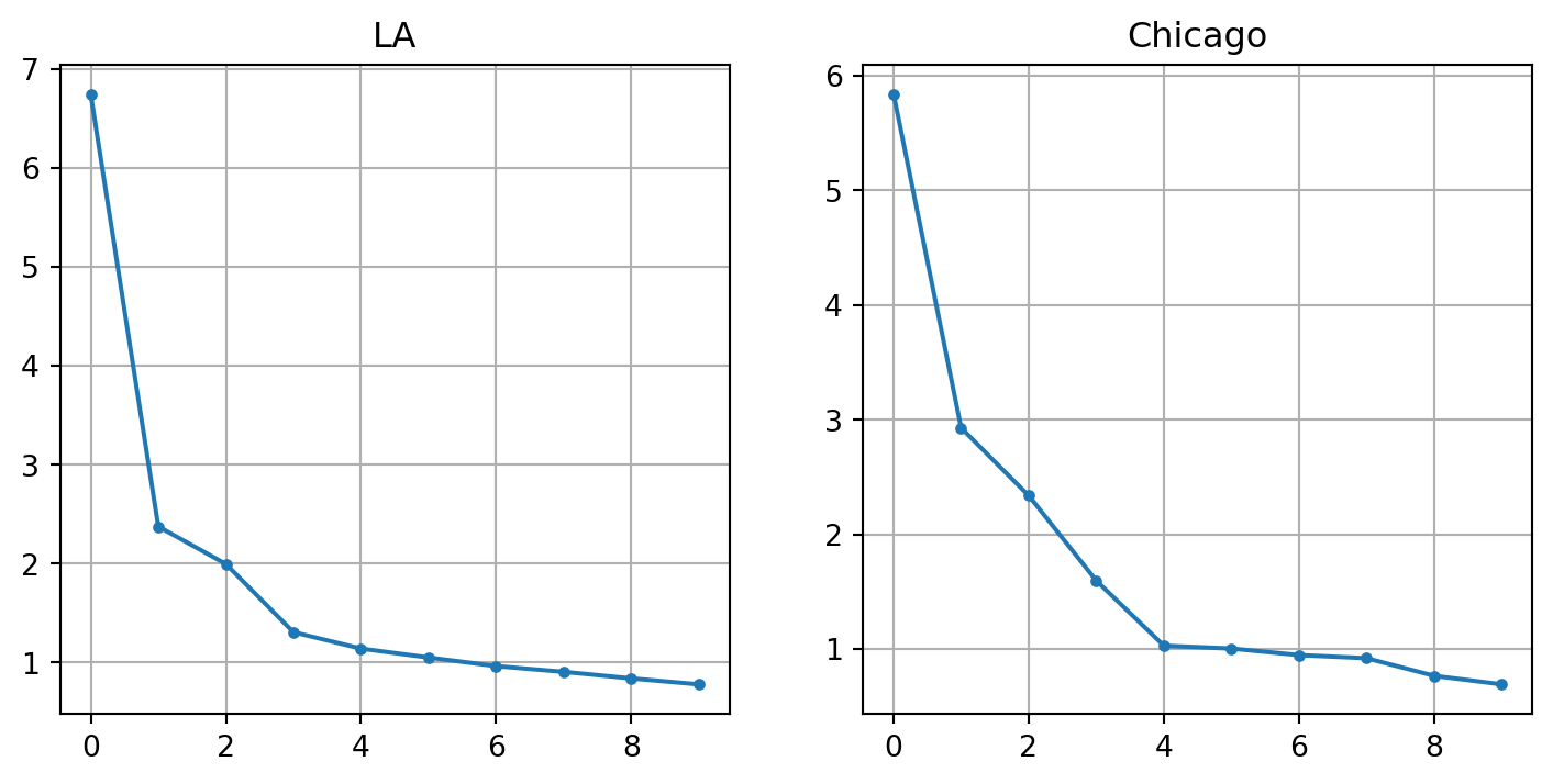
A common way to explore the appropriate number of factors to extract is to create a so-called “scree plot”, which is a line plot that shows the amount of variance explained by the factor on the y-axis, and the number of factors on the x-axis. To determine the appropriate number of factors, we look for the ‘elbow’, where the plot kinks and begins to level horizontally. There is no function to create a scree plot in the packages at our disposal, but it is easy to create one by hand. First we fit a factor analysis on each dataset with n_factors equal to the number of variables in our dataset. Then, we plot the eigenvalues, which describe the total variance explained by each factor.
Code
# collinearla_corr = la_corr.drop( columns=["p_asian_indian_persons","p_vacant_housing_units","p_nonhisp_white_persons", ])chi_corr = chi_corr.drop( columns=["p_asian_indian_persons","p_vacant_housing_units","p_nonhisp_white_persons", ])cols = chi_corr.columns# create and fit factor analysis on z-standardized data# using as many factors as there are variablesfa_la = FactorAnalyzer(rotation="oblimax", n_factors=la_corr.shape[1])fa_la.fit(la[cols].apply(lambda x: zscore(x, ddof=1)))fa_chi = FactorAnalyzer(rotation="oblimax", n_factors=chi_corr.shape[1])fa_chi.fit(chi[cols].apply(lambda x: zscore(x, ddof=1)))# collect the factor measures and store then as pandas Seriesevla = fa_la.get_eigenvalues()[0]evla = pd.Series(evla, index=range(1, len(evla) +1))evla = evla / evla.sum()evchi = fa_chi.get_eigenvalues()[0]evchi = pd.Series(evchi, index=range(1, len(evchi) +1))evchi = evchi / evchi.sum()# scree plot for each regionf, ax = plt.subplots(1, 2, figsize=(4, 2), sharey=True)evla.iloc[:10].plot(grid=True, style=".-", ax=ax[0])ax[0].set_title("LA")ax[0].set_ylabel("% of Variance")evchi.iloc[:10].plot(grid=True, style=".-", ax=ax[1])ax[1].set_title("Chicago")
/Users/knaaptime/miniforge3/envs/urban_analysis/lib/python3.12/site-packages/sklearn/utils/deprecation.py:132: FutureWarning: 'force_all_finite' was renamed to 'ensure_all_finite' in 1.6 and will be removed in 1.8.
warnings.warn(
/Users/knaaptime/miniforge3/envs/urban_analysis/lib/python3.12/site-packages/sklearn/utils/deprecation.py:132: FutureWarning: 'force_all_finite' was renamed to 'ensure_all_finite' in 1.6 and will be removed in 1.8.
warnings.warn(
Text(0.5, 1.0, 'Chicago')
Scree Plots for Ecological Factors in Chicago and L.A.
In these data, the scree plots show a clear elbow at four factors in L.A., but five factors in Chicago. Since the original work focuses on three factors, we will fit four here in both cases.
20.1.2 Los Angeles
Knowing how many factors we want to extract, we can re-fit the model and examine the factor loadings, which describe how each input variable is related to each factor. In a good factor model, we want to represent “simple structure,” where (ideally) each variable loads strongly onto a single factor (Thurstone, 1954). One important choice for generating simple structure is the choice of factor rotation used by the analyst; rotations can either be orthogonal (meaning factors are forced to be uncorrelated) or oblique (meaning they can assume any position and my correlate with one another). A full treatment of rotation methods is beyond the scope of this text (though see chapters 10-12 of Mulaik (2009) for an extremely thorough discussion), however it is sufficient to say that oblique rotation is typically preferred today because strictly uncorrelated factors are unlikely for many conceptual problems.
For most work Direct Oblimin is to be recommended. Actually it is a good check to use one other method of rotation, since any one method can be caught out occasionally by particular configurations of data. In most instances, however, there will not be considerable differences. If orthogonal simple structure is preferred then all authorities agree that Varimax is the most effective procedure.
Loadings less than .1 are considered unimportant (R and others suppress them), and those less than 0.3 can generally be ignored (Kline, 2014; Revelle, n.d.). Here we will mask out any lodings lower than 0.3, as “it is usual to regard factor loadings as high if they are greater than 0.6 (the positive or negative sign is irrelevant) and moderately high if they are above 0.3. Other loadings can be ignored” (Kline, 2014, p. 6).
Code
fala = FactorAnalyzer( n_factors=4, rotation="oblimin",)fala.fit(la[cols].apply(lambda x: zscore(x, ddof=1)))# create a dataframe of the factor loadings for each regionfactors_la = pd.DataFrame.from_records( fala.loadings_, index=la_corr.columns, columns=["F1", "F2", "F3", "F4"])factors_la = factors_la.mask(abs(factors_la) <0.3)factors_la.dropna(how="all")
/Users/knaaptime/miniforge3/envs/urban_analysis/lib/python3.12/site-packages/sklearn/utils/deprecation.py:132: FutureWarning: 'force_all_finite' was renamed to 'ensure_all_finite' in 1.6 and will be removed in 1.8.
warnings.warn(
F1
F2
F3
F4
median_home_value
0.793648
NaN
NaN
NaN
median_contract_rent
NaN
NaN
-0.411587
NaN
median_household_income
0.578341
NaN
NaN
0.459390
per_capita_income
0.890836
NaN
NaN
NaN
p_owner_occupied_units
-0.359370
NaN
NaN
0.312355
p_housing_units_multiunit_structures
NaN
NaN
NaN
-0.851415
p_persons_under_18
NaN
-0.439877
0.300706
NaN
p_persons_over_60
NaN
0.898522
NaN
NaN
p_persons_over_75
NaN
0.761145
NaN
NaN
p_married
NaN
NaN
NaN
0.648701
p_widowed_divorced
NaN
0.557405
NaN
NaN
p_female_headed_families
NaN
NaN
0.365621
NaN
p_hispanic_persons
NaN
NaN
0.619920
NaN
p_asian_persons
NaN
NaN
-0.591268
NaN
p_edu_hs_less
NaN
NaN
0.596763
NaN
p_edu_college_greater
0.551567
NaN
-0.513595
NaN
p_veterans
NaN
0.438774
NaN
NaN
pop_density
NaN
NaN
NaN
-0.446659
distortion_seg
NaN
NaN
0.583896
NaN
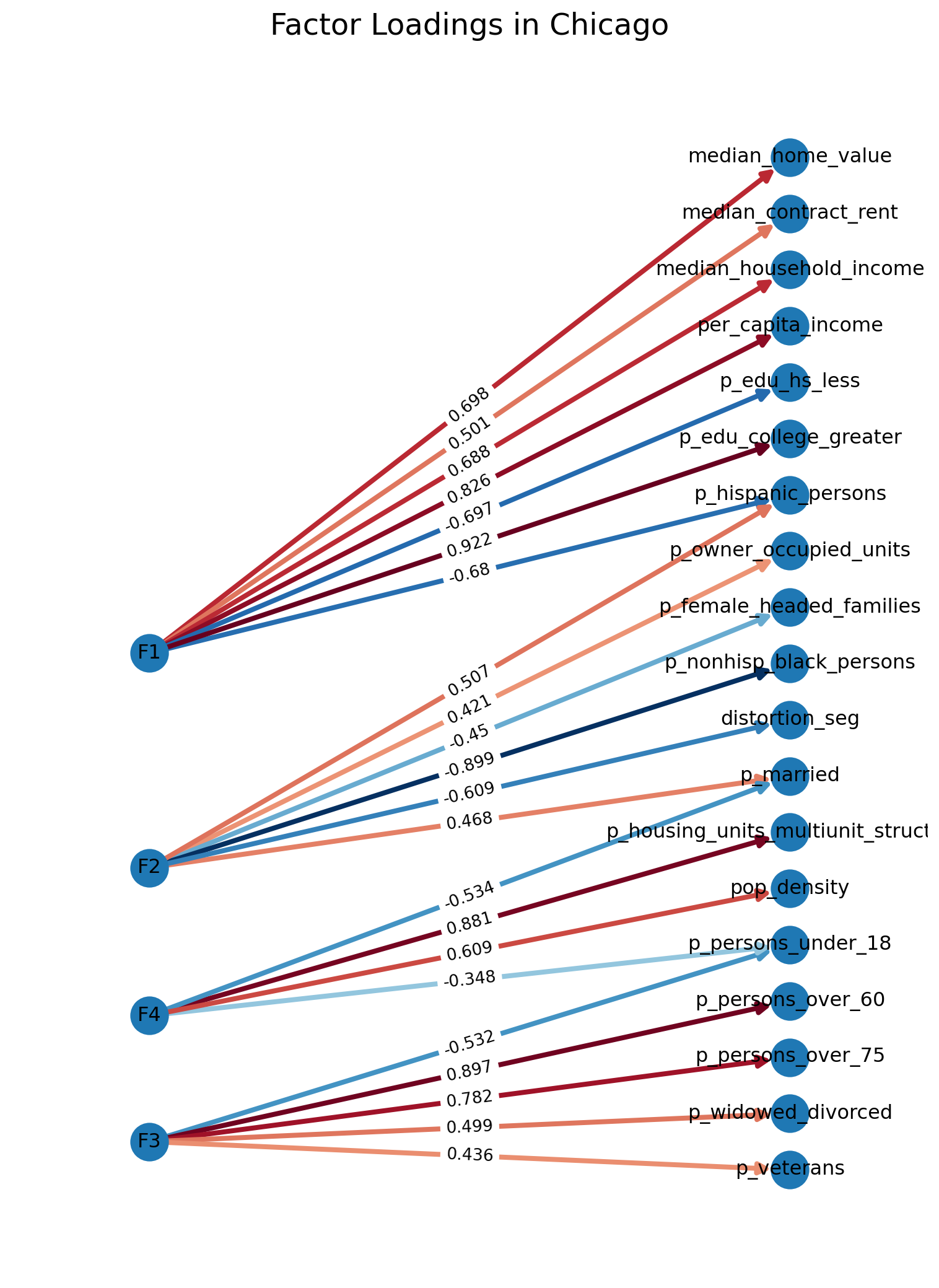
In Greater Los Angeles, the first factor loads strongly onto income, home values, and college education, which corresponds to the conventional socioeconomic status dimension. The second factor in L.A. loads strongly onto age, and to a lesser extent veterancy and divorced marital status. This factor largely captures some dimension of family status, presumably capturing the way older households settle into established neighborhoods. The third dimension clearly measures segregation, and loads onto the Hispanic/Latino and Asian population (positively for the former and negatively for the latter), as well as the distortion segregation measure; lower educational attainment (less than high school) also loads positively onto this factor, which may capture sorting or differential attainment among groups. Finally, the fourth factor loads onto multi-unit housing, and to a lesser extent crude population density and households with married householders. We could probably safely call this factor ‘urbanization’.
These results are very similar to Anderson & Bean (1961), who find that the original Shevky/Bell urbanization factor is better split into two concepts, one demographic and one morphological (Anderson & Bean, 1961). As a generic categorization, these factors map fairly well onto the original SAA factors (as long as you have them in mind), though obviously the loading structure can be quite different across cities, even if the conceptual factors are similar.
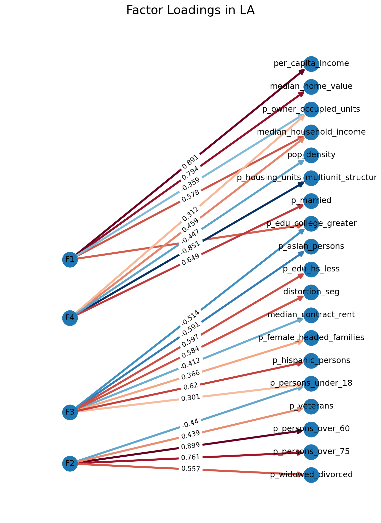
As an alternative to the loadings table, it can be useful to visualize the variable/factor relationships using a network diagram (for which there is standard tooling in R). In Python, there is no simple function built into the factor analysis packages (yet), though it is straghtforward to create a simple diagram using networkX and graphviz (the latter of which is not technically necessary, though helps dramatically with the layout). To do this, we stack our loading matrix to create an adjacency list representation, then use it to create a new networkX graph object. Then, we draw the graph (which has nodes for each variable and factor, then draws the edges using the loading matrix). We will also use a cool/warm colormap so factors that load positively get a darker hue of red and those loading negatively get progressively more blue.
Code
Gla = nx.from_pandas_edgelist( factors_la.T.stack().rename("weight").reset_index().round(3), source="level_0", target="level_1", edge_attr="weight", edge_key="weight", create_using=nx.DiGraph,)f, ax = plt.subplots(figsize=(8, 11))pos = graphviz_layout(Gla, prog="dot", args='-Grankdir="LR"')nx.draw_networkx( Gla, pos=pos, with_labels=True, ax=ax, edge_cmap=plt.cm.RdBu_r, edge_color=factors_la.T.stack().values, node_size=500, width=3, arrowsize=14,)labels = nx.get_edge_attributes(Gla, "weight")nx.draw_networkx_edge_labels(Gla, pos, edge_labels=labels)ax.margins(0.2, None) # add some horizontal space to fit labelsax.axis("off")plt.suptitle("Factor Loadings in LA", fontsize=18)plt.tight_layout()plt.show()
Factor Loadings in Los Angeles
The network visualization helps demonstrate that this model has done a pretty good job of generating the ‘simple structure’ we are shooting for; there are only a couple cross-loading variables, and most load strongly onto a single factor, giving us relatively distinct dimensions.
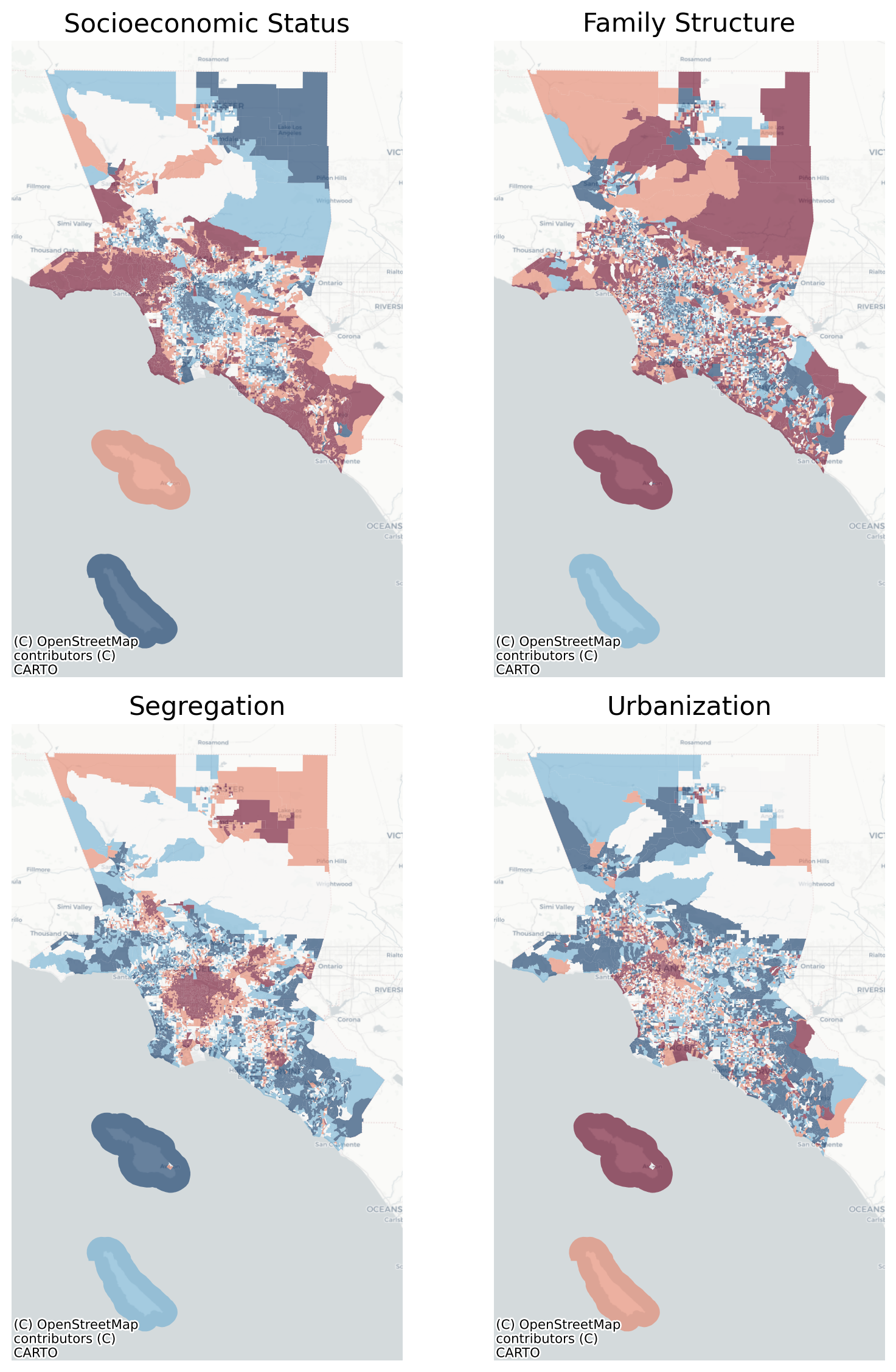
Unlike the dimensions of segregation explored in Chapter 16, these latent variables are more useful than their constituent parts. Thus we can use the factor model to estimate the latent variables for each observation to map or analyze them further. To do so, let us first rename each factor for easier presentation (which we do by mapping names via a dictionary), then use the transform method to generate our factor scores, once for each column. We will also switch the sign of the urbanization factor for ease of interpretation, since higher factor values correspond to greater population density, etc. Finally, we will plot each factor as a choropleth using a quintile classification.
/Users/knaaptime/miniforge3/envs/urban_analysis/lib/python3.12/site-packages/sklearn/utils/deprecation.py:132: FutureWarning: 'force_all_finite' was renamed to 'ensure_all_finite' in 1.6 and will be removed in 1.8.
warnings.warn(
Map of Social Ecological Factors in L.A.
These maps show us the spatial pattern of the four ‘social ecological factors’ uncovered in the Los Angeles metro region, and each reveals some distinct patterning, especially in the segregation and SES factors, which seem to show an urban/suburban divide.
/Users/knaaptime/miniforge3/envs/urban_analysis/lib/python3.12/site-packages/sklearn/utils/deprecation.py:132: FutureWarning: 'force_all_finite' was renamed to 'ensure_all_finite' in 1.6 and will be removed in 1.8.
warnings.warn(
F1
F2
F3
F4
median_home_value
0.697759
NaN
NaN
NaN
median_contract_rent
0.501152
NaN
NaN
NaN
median_household_income
0.687950
NaN
NaN
NaN
per_capita_income
0.826066
NaN
NaN
NaN
p_owner_occupied_units
NaN
0.421074
NaN
NaN
p_housing_units_multiunit_structures
NaN
NaN
NaN
0.880981
p_persons_under_18
NaN
NaN
-0.531596
-0.348346
p_persons_over_60
NaN
NaN
0.896800
NaN
p_persons_over_75
NaN
NaN
0.781841
NaN
p_married
NaN
0.467928
NaN
-0.533887
p_widowed_divorced
NaN
NaN
0.499039
NaN
p_female_headed_families
NaN
-0.449684
NaN
NaN
p_nonhisp_black_persons
NaN
-0.898698
NaN
NaN
p_hispanic_persons
-0.680068
0.507285
NaN
NaN
p_edu_hs_less
-0.697173
NaN
NaN
NaN
p_edu_college_greater
0.921688
NaN
NaN
NaN
p_veterans
NaN
NaN
0.436297
NaN
pop_density
NaN
NaN
NaN
0.609139
distortion_seg
NaN
-0.608980
NaN
NaN
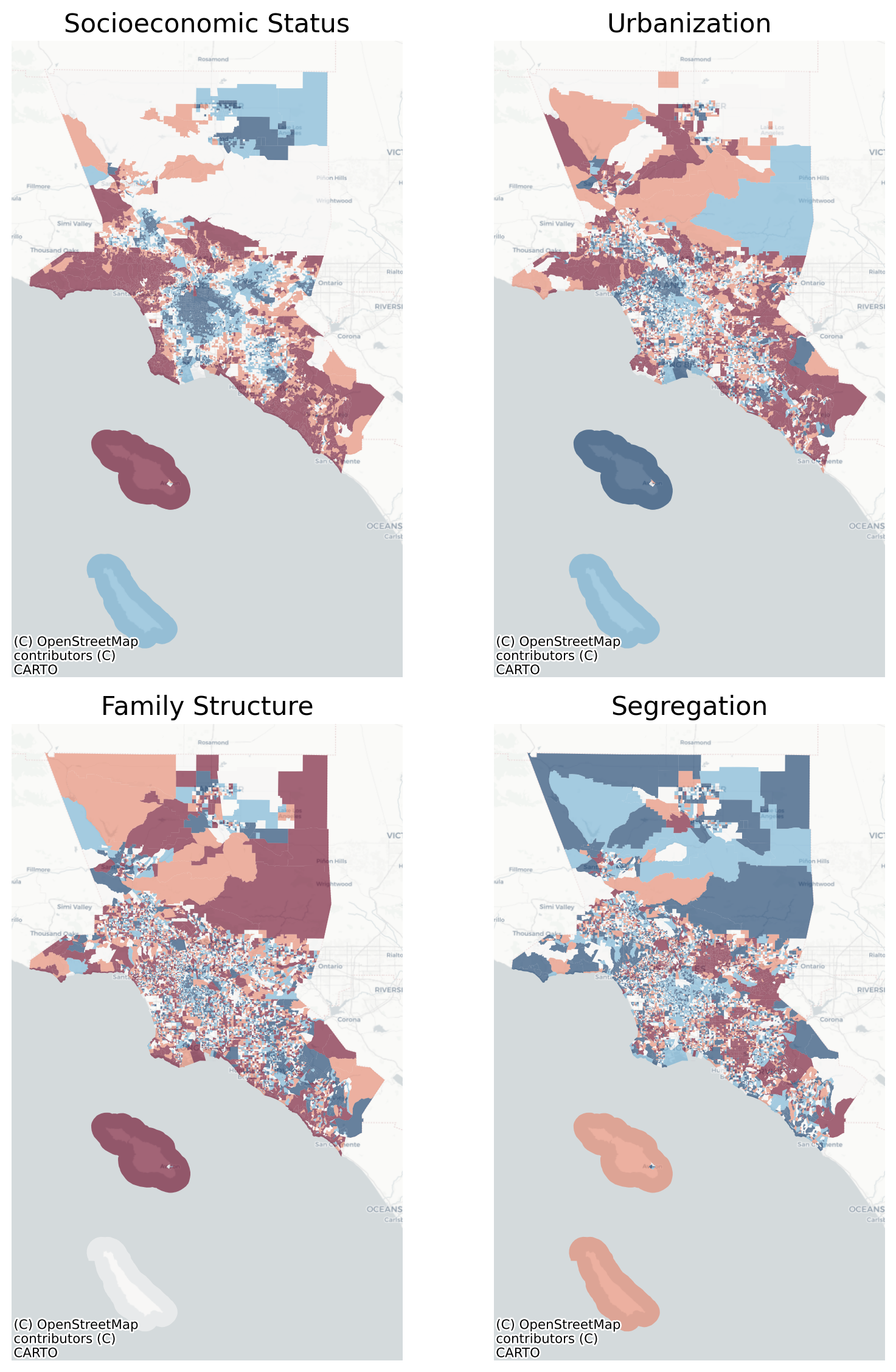
In Chicago, however, the factors load just a bit differently. The first factor is still, clearly, socioeconomic status, with high loadings on income and home values. In this case, both education variables load onto SES (instead of just college education in L.A.), and the SES factor also has a realtively strong negative association with the Hispanic population share. The second factor in Chicago is segregation, with very high loadings onto the black population and the distortion segregation measure, with some additional loadings with female headed families and married household heads. The third factor is the ‘urbanization’ dimension, with high loadings on population density and multi-unit dwellings. Finally, the fourth dimension, again, captures variables related to age and marital status, with strong positive loadings for the elderly population and negative association with population under 18 years old.
Code
Gchi = nx.from_pandas_edgelist( factors_chi.T.stack().rename("weight").reset_index().round(3), source="level_0", target="level_1", edge_attr="weight", edge_key="weight", create_using=nx.DiGraph,)f, ax = plt.subplots(figsize=(8, 11))pos = graphviz_layout(Gchi, prog="dot", args='-Grankdir="LR"')nx.draw_networkx( Gchi, pos=pos, with_labels=True, ax=ax, edge_cmap=plt.cm.RdBu_r, edge_color=factors_chi.T.stack().values, node_size=500, width=3, arrowsize=14,)labels = nx.get_edge_attributes(Gchi, "weight")nx.draw_networkx_edge_labels(Gchi, pos, edge_labels=labels)ax.margins(0.15, None) # add some horizontal space to fit labelsax.axis("off")plt.suptitle("Factor Loadings in Chicago", fontsize=18)plt.tight_layout()plt.show()
Factor Loadings in Chicago
Again the network graph helps visualize our ‘simple structure’ (which also looks good in this case); we have a few cross-loading variables including the Hispanic/Latino population, which loads simultaneously onto SES and segregation, population under 18, which loads onto both family structure and urbanization, and married household head, which loads onto both segregation and family structure.
/Users/knaaptime/miniforge3/envs/urban_analysis/lib/python3.12/site-packages/sklearn/utils/deprecation.py:132: FutureWarning: 'force_all_finite' was renamed to 'ensure_all_finite' in 1.6 and will be removed in 1.8.
warnings.warn(
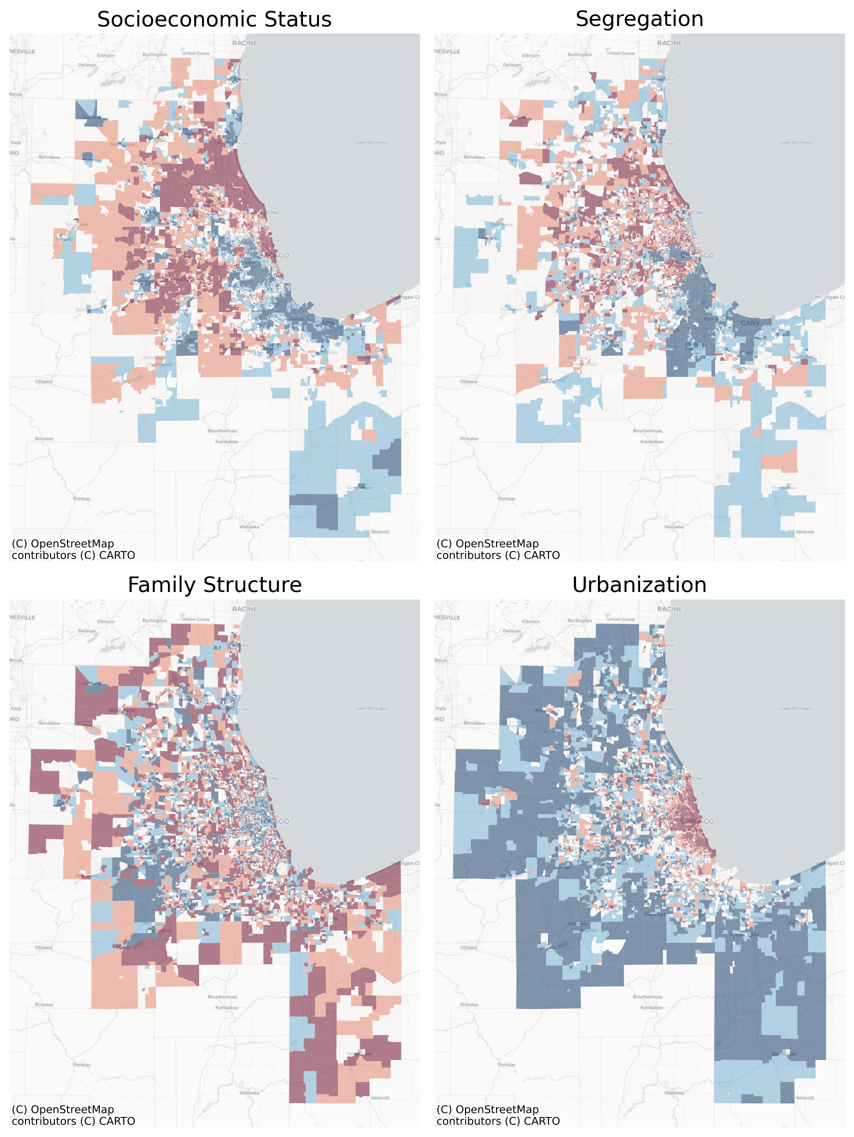
Map of Ecological Factors in Chicago
The spatial patterns of these four factors are, if anything, even clearer in Chicago than L.A.
For the sake of illustration, I will plot the SES factor along with the location of the apartment I lived in when I was a visiting assistant professor at UIC–and just for context, we’re talking 2017; I was 29 years old, my salary was $35k, and my student loans were in repayment (after accumulating three degrees’ worth of compound interest at Great Recession rates…)
Code
m = chi[["socioeconomic status", "geometry"]].assign(geometry=chi.geometry.simplify(50)).explore("socioeconomic status", scheme="quantiles", cmap="RdBu_r", style_kwds=dict(fill_opacity=0.4, weight=0.3), tiles="CartoDB Positron",)# this is my old place in chicagoapt = gpd.tools.geocode("3658 armitage ave, chicago, il", timeout=50, user_agent='urban_analysis_book')apt.explore( color="black", marker_kwds=dict(radius=12), style_kwds=dict(fill_opacity=1), m=m,)
Make this Notebook Trusted to load map: File -> Trust Notebook
By just about any estimate, this map makes me a gentrifier. While my income was probably at or below the median for the neighborhood, I was younger and more educated than most of my neighbors, and a white guy living in a predominantly Latino neighborhood. If you are not familiar with Chicago’s social geography, this is near the already-gentrified Bucktown, Wicker Park, and Logan Square neighborhoods, all of which have more shopping and nightlife amenities (and closer to the L), but none of which I could afford.
When I would describe my neighborhood to colleagues, they would almost inevitably describe that region of the city as ‘block to block’ in terms of ‘desireability’. In uncoded terms, that part of the city is widely perceived as the gentrifying frontier, and if you zoom into the circle, it is easy to understand why: it sits at the gateway of high-high and low-low SES local clusters, and in a few hundred meters, incomes change very fast. This brings a lot of diverse groups into contact with one another in a small space. Some spaces get defended (Kadowaki, 2019; Suttles, 1972), others get invaded (London, 1980; Park et al., 1925), but this is the region where the dividing lines are being drawn actively.
Parenthetically, the diverse set of residents did seem strongly united in their political views and party affiliation
Our Boston Terrier Lew1 with the local artwork in Logan Square, September 2017
(Obviously, I didn’t deface the sidewalk myself, but I couldn’t resist the opportunity to document the local context in my new neighborhood at the time). Political graffiti, especially on publicly-owned property, is a clear indicator of a specific form of collective efficacy (Alvarado, 2016; Carbone & McMillin, 2019; Cohen et al., 2008; Feinberg & Sturm, 2019; Hipp, 2016; Sampson et al., 1999). I left the location metadata in the image for enterprising readers desperate to know where the photo was taken (though it’s only a few blocks from the geocoded point above).
20.1.4 Comparative Ecology
Despite differences in the loadings (which is unsurprising, given the two regions’ relatively different demographic makeups), extracting four social ecological factors in Chicago and Los Angeles produces very similar results. While not exactly the factor structure described by Shevky and Bell, but the outcome is nonetheless very similar to the large body of replication work that followed in the 60s and 70s. The factors are ordered slightly differently between the two regions, but follow the same general structure and relative composition.
the ‘social rank’ factor is dominated by income, education, and land value (rent/home value) to an extent.
the ‘family structure’ factor is dominated by variables related to age and marital status
the ‘urbanization’ factor seems to capture density and morphology
‘segregation factor’ captures race and ‘distortion’ segregation (an isolation measure)
Despite their similarity, there are also some important differences between the two regions. In both cities, SES is by far the factor accounting for the greatest share of variance, which means separation by income and education is the predominant means of residential differentiation in both places. However, in Chicago, the segregation factor is second largest, compared to fourth largest in L.A. This means sorting by race is a more important neighborhood differentiator in Chicago.
Further, the relative demographic makeup in the two places shows how race and ethnicity enter the sorting equation differently. In Los Angeles, the Black population does not load signigicantly onto any factor, and only correlates weakly with other income, education, and density variables. Instead, the segregation factor in L.A. is dominated by the Hispanic/Latino and Asian populations–which load in opposite directions, and may suggest that Hispanic/Asian integration is uncommon in the L.A. region. By contast, the segregation factor in Chicago is defined almost entirely by the location of its Black residents. This is unsurprising about Chicago, but sobering nonetheless; after accounting for differences in socioeconomic status, the most important factor for understanding residential differentiation in the Chicago metro is Black (and to a lesser extent Hispanic/Latino) segregation.
The distinction between these places is important in different ways. In Los Angeles, racial inequality is so deeply intertwined with socioeconomic inequality (at the neighborhood level) that they cant be separated into distinct factors. More bluntly, when you are talking about a predominantly Hispanic/Latino neighborhood, you are almost inevitably talking about a low SES neighborhood. When we think about segregation and neighborhood effects, the idea that race and inequality are essentially synonymous in LA is sobering, to say the least. If we want to make a dent in inequality, then it means intentionally shooting for more integration…
But the Chicago result, showing the converse, is also important. There, Black and Hispanic segregation load on a different factor than socioeconomic status, which is striking in a different way. While the separation of these factors means that there are a good number of high-SES predominantly Black neighborhoods (so ‘SES’ and ‘[racial] segregation’ measure distinct concepts), it also means that you cannot understand Chicago’s social geography without considering Black and Hispanic/Latino segregation (the race factor is more important in Chicago than LA, in that it explains a greater share of the covariance). Put differently, the Black/Hispanic composition of the neighborhood is one of the most salient factors guiding location choice in Chicago. In LA, any preference for white neighborhoods is masked by a preference by high SES neighborhoods.
For example what defines the segregation dimension in LA is the share of Hispanic/Latino and Asian population, whereas in Chicago the factor is defined by its share of Black and Hispanic/Latino residents. Put differently, if you were trying to define the most important social dimensions to define American cities, then race and ethnicity would certainly comprise one of the dimensions, but the particular makeup of the factor depend on the history and demography of the city under study.
“Another charge is that all of our comparative studies are guilty of ethnocentrism and ideological bias, particularly in studies that presume the material and structural superiority of the complex industrial structures of industrial societies in general and Western democracies in particular. The presumption can be overtly stated, or implied by the transfer of conceptual and methodological schemes. Undoubtedly, this charge has much truth to it. Probably 90 percent of all cross-national research is initiated in the United States and has its dimensions of comparison defined in U.S. terms”
“to quote the author of an important recent textbook,”by far the major finding is that residential differentiation in the great majority of cities is dominated by a socio-economic dimension, with a second dimension characterised by family status/life cycle characteristics and a third dimension relating to segregation along ethnic divisions” (Knox1981,p.81). This is a common, but rather misleading, conclusion. Socio-economic status is generally the pre-eminent factor, which frequently accounts for over a third of the total variance. However, this reflects the spatial congruence of an important group of structural parameters - occupation, income, number of years schooling, employment status among them - rather than the degree to which any one parameter which is indicative of socio-economic status is correlated with area of residence. Other important structural parameters, such as racial and ethnic status, do not co-vary spatially and are consequently represented by separate, relatively unimportant factors (for example, Rees 1970)
This is almost exactly what the results still show using 2021 ACS Data.
The conceptual argument for factorial ecology is that residential areas can be characterized by lots of different data points–hundreds of Census indicators if so desired–but after considering all these measures, the differentiation between neighborhoods can be characterized, almost entirely, by a small handful of representative dimensions. Destite some arguments over interpretation and application, dozens of replication studies agree with this basic premise, and as the scree plots above show, four or so factors capture nearly all the covariation in the blockgroup attributes. The empirical findings of factorial ecology are more or less uncontested.
The major critique of factor ecology is its inescapable rooting in human ecology, which for all of its contributions, views urban dynamics as ‘natural’ elements akin to biology. Obviously our understanding of structural inqeuality today regards that view as flippant, and that many of that spatial patterns we observe in cities today are the direct result of institutionalized racism and intentionally-designed public policies.
The kernel of genius apparent in factorial ecology, and our contemporary understanding of structural inequality are perfectly compatible, as long as we reorient the interpretation of the latent variables to represent “sorting factors” guided by political, economic and social forces, rather than outcomes from some natural ecological (or utility maximizing) process (Quillian, 2015). Class, race, age, and the characteristics of the built environment remain the primary ways that cities are organized, through a mixture of individual choices, market forces, and public policies, and factor ecology is a good tool to help explore these patterns empirically (Morgan, 1984).
20.2 Spatial Structure in Social Dimensions
In another classic example from the factor ecology literature, Anderson & Egeland (1961) argue that the factorial dimensions identified above should demonstrate different spatial layouts.
“the results indicate clearly that Burgess’ concentric zone hypothesis is essentially supported with respect to urbanization but not with respect to social rank (or prestige value as this dimension is termed in this paper), while Hoyt’s sector hypothesis is supported with respect to social rank (prestige value) but not with respect to urbanization”
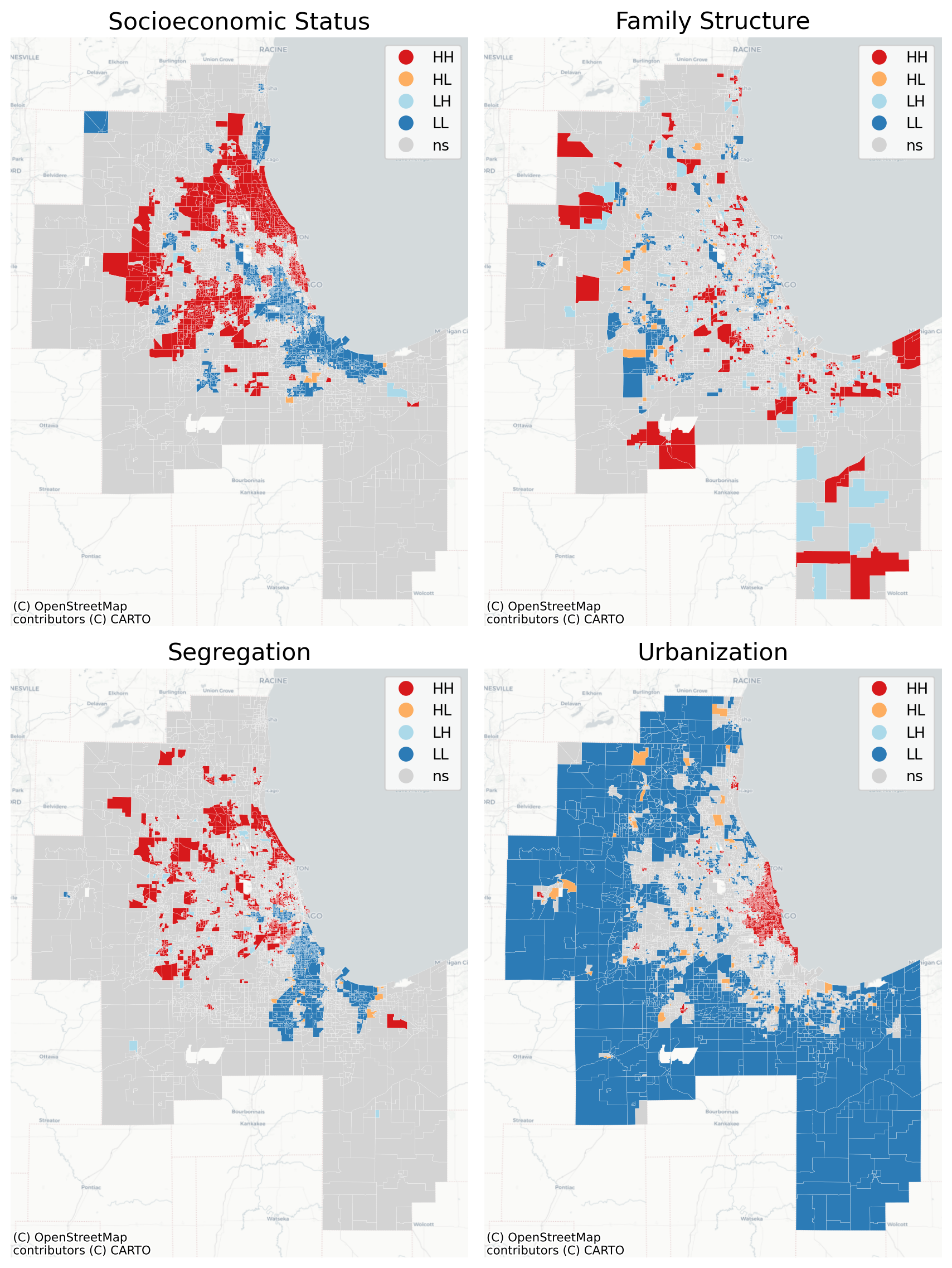
The maps above suggest our factors do follow different spatial patterns, however, an important difference between today’s urban analytics and yesterday’s factor ecology is the ability to conduct formal tests of spatial structure, so we now have the opportunity to test these hypotheses more formally. Techniques like the LISA were not developed until the 1990s, by which time factor ecology had been all but abandoned (Anselin, 1996, 2010). This yields a unique opportunity to examine spatial strucure in social structure. That is, do we find a strong spatial signal in the different social dimensions?
and is the signal the same across dimensions?
across places?
over time?
A compelling argument is given by Savitz & Raudenbush (2009) that spatial effects can be used to develop better estimates of the latent factors, but I am not aware of anyone who has examined spatial dependence in the resulting latent dimensions.
Code
w_chi = Rook.from_dataframe(chi)ds = []for col in chi_scores.columns: m = Moran(chi[col].values, w_chi) d = pd.Series({"I": m.I, "p-val": m.p_sim}, name=col) ds.append(d)pd.DataFrame(ds)
/var/folders/j8/5bgcw6hs7cqcbbz48d6bsftw0000gp/T/ipykernel_40049/4099440288.py:1: FutureWarning: `use_index` defaults to False but will default to True in future. Set True/False directly to control this behavior and silence this warning
w_chi = Rook.from_dataframe(chi)
I
p-val
socioeconomic status
0.796604
0.001
segregation
0.848050
0.001
family structure
0.258604
0.001
urbanization
0.704858
0.001
In Chicago, all the dimensions show significant spatial autocorrelation, with SES, urbanization, and segregation all having Moran’s I values greater than 0.7–which is remarkably high. This is a unique finding… the exploratory factor analysis suggests a 4 factor fit (which loosely comports with the general factor ecology results), and the obliquely-rotated factors are essentially independent–but all have very strong spatial patterning. That suggests four social dimensions with four spatial signatures…
In Chicago, home of the monocentric model, the urbanization factor reveals our concentric rings as clear as day–it’s pretty remarkable, actually. The dense urban core in red, followed by a ring of white, then the blue surrounding suburbs show a clearly declining density gradient as one moves outward from Lake Michigan. The other dimensions have more nuance, though. The family structure variable in Chicago is basically a map of where the young people live… Low-Low clusters are the young places–hip and trendy, but not very career-established, so not particularly high-income. The really hip and trendy neighborhoods here are the “High-Low” observations like Wicker Park and Mount Pleasant, where older established families (who can afford the relatively expensive places) live in the core of the cool neighborhood.
And the segregation variable is a similarly familiar depiction of the Black and Hispanic neighborhoods in the region, whose hypersegregation (especially in Chicago) has been long studied.
Make this Notebook Trusted to load map: File -> Trust Notebook
This is not a picture of monocentrism:
And look at the distinct transition between zones moving westward from the lake along I-290!
By contrast, the infamously polycentric Los Angeles turns into an egg yolk, with nearly concentric rings telling a story about city vs suburbs
Code
w = Rook.from_dataframe(la)ds = []for col in la_scores.columns: m = Moran(la[col].values, w) d = pd.Series({"I": m.I, "p-val": m.p_sim}, name=col) ds.append(d)pd.DataFrame(ds)
/var/folders/j8/5bgcw6hs7cqcbbz48d6bsftw0000gp/T/ipykernel_40049/2765111550.py:1: FutureWarning: `use_index` defaults to False but will default to True in future. Set True/False directly to control this behavior and silence this warning
w = Rook.from_dataframe(la)
/Users/knaaptime/miniforge3/envs/urban_analysis/lib/python3.12/site-packages/libpysal/weights/contiguity.py:61: UserWarning: The weights matrix is not fully connected:
There are 4 disconnected components.
There is 1 island with id: 5441.
W.__init__(self, neighbors, ids=ids, **kw)
('WARNING: ', 5441, ' is an island (no neighbors)')
I
p-val
socioeconomic status
0.779925
0.001
family structure
0.342406
0.001
segregation
0.823846
0.001
urbanization
0.574475
0.001
In LA, all the dimensions are significantly spatially patterned as well, though with a bit more nuance than Chicago. The Moran value for SES is dramatically high at .84
LISA Clusters of Ecological Factors in Los Angeles
These results show nuance compared to Anderson & Egeland (1961); specifically, the results are similar in Chicago, but differ in LA. ‘Social rank’ follows a concentric pattern in LA whereas urbanization is sectoral; the converse is true in Chicago, where urbanization is monocentric but social rank is polycentric. Despite its many criticisms, a useful contribution of factorial ecology is its ability to summarize the features that dominate the partitioning of population groups in space. While the resulting factors sre imperfect, they do allow us to understand whether the axes of differentiation are changing over time or across places (Berry & Rees, 1969).
“Social status” still seems to be the dominant mode by which American cities are organized. The social component explains the largest share of covariance, by far, and it has the strongest spatial signal in both Chicago and LA (demonstrated by an enormously high Moran’s I). In that light, recent work showing a modest decline in racial segregation albeit an increase in income segregation is probably just a continuation of a decades long pattern (Bischoff & Owens, 2019; Bischoff & Reardon, 2013; Intrator et al., 2016; Logan et al., 2018; Reardon et al., 2018; Reardon & Bischoff, 2011)
20.3 Recovering Social Areas
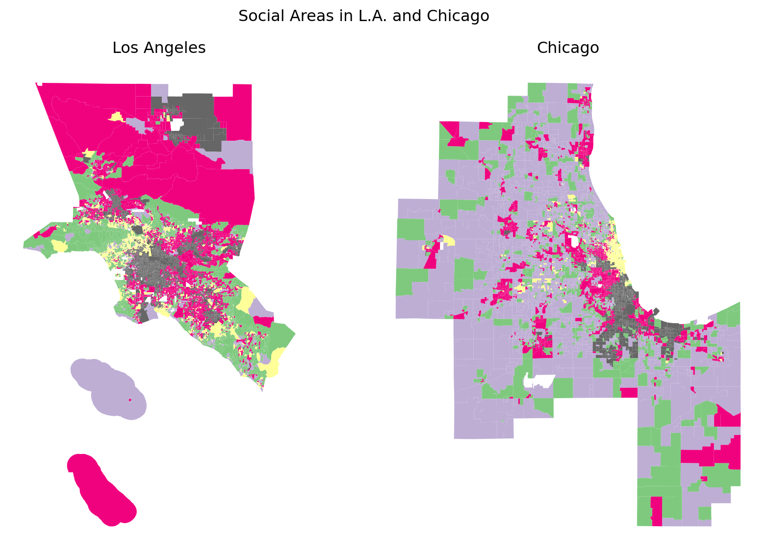
Our focus in this chapter is factor ecology, not social area analysis, but since we have come this far and have everything on hand to proceed, we may as well just do so. Technically, the last step of SAA is to typologize the observations according to the revealed factors. The original SAA typologies were simple (only three variables in their case, after all), but why not throw them at a clustering algorithm. In theory, this final step will return us ‘social areas’, a typolopgy of neighborhood categories which are similar along each of the four factorial dimensions. While, procedurally, this gives us a thoroughly modern analysis, where we apply dimensionality reduction, then pipe those numbers into an unsupervised machine learning algorithm (if we want to sound sexy), this technique was pioneered in the 1950s.
We wont bother interpreting these ‘social areas’, but the cluster analysis gives us back a set of neighborhood types which differ by kind rather than degree, so we visualize them using a categorical color map.
Code
f, ax = plt.subplots(1, 2, figsize=(9, 6))la_types[["kmeans", "geometry"]].plot("kmeans", categorical=True, cmap="Accent_r", figsize=(8, 8), ax=ax[0])ax[0].set_title("Los Angeles")chi_types[["kmeans", "geometry"]].plot("kmeans", categorical=True, cmap="Accent_r", figsize=(8, 8), ax=ax[1])ax[1].set_title("Chicago")for ax in ax: ax.axis("off")plt.suptitle("Social Areas in L.A. and Chicago")plt.tight_layout()
Revealed Social Areas in Chicago and L.A.
Today, it is common to forego the factor analysis portion and instead proceed directly to generating neighborhood typologies using clustering algorithms, including every variable available. We explore this technique, often called “geodemographics” in Chapter 23.
Alvarado, S. E. (2016). Neighborhood disadvantage and obesity across childhood and adolescence: Evidence from the NLSY children and young adults cohort (1986-2010). Social Science Research, 57, 80–98. https://doi.org/10.1016/j.ssresearch.2016.01.008
Anderson, T. R., & Bean, L. L. (1961). The Shevky-Bell Social Areas: Confirmation of Results and a Reinterpretation. Social Forces, 40(2), 119–124. https://doi.org/10.2307/2574289
Anderson, T. R., & Egeland, J. A. (1961). Spatial Aspects of Social Area Analysis. American Sociological Review, 26(3), 392. https://doi.org/10.2307/2090666
Anselin, L. (1996). The Moran Scatterplot as an ESDA tool to assess local instability in spatial association. In Spatial analytical perspectives on GIS (Vol. 111, pp. 111–125).
Arsdol, M. D., Camilleri, S. F., & Schmid, C. F. (1958). An Application of the Shevky Social Area Indexes to a Model of Urban Society. Social Forces, 37(1), 26–32. https://doi.org/10.2307/2573775
Barrett, P. (2007). Structural equation modelling: Adjudging model fit. Personality and Individual Differences, 42(5), 815–824. https://doi.org/10.1016/j.paid.2006.09.018
Bell, W. (1955). Economic, Family, and Ethnic Status: An Empirical Test. American Sociological Review, 20(1), 45–52. https://doi.org/10.2307/2088199
Bell, W., & Greer, S. (1962). Social Area Analysis and Its Critics. The Pacific Sociological Review, 5(1), 3–9. https://doi.org/10.2307/1388270
Berry, B. J. L. (1971). Introduction: The Logic and Limitations of Comparative Factorial Ecology. Economic Geography, 47(4), 209. https://doi.org/10.2307/143204
Berry, B. J. L., & Rees, P. H. (1969). The Factorial Ecology of Calcutta. American Journal of Sociology, 74(5), 445–491. https://doi.org/10.1086/224681
Bischoff, K., & Owens, A. (2019). The Segregation of Opportunity: Social and Financial Resources in the Educational Contexts of Lower- and Higher-Income Children, 1990–2014. Demography, 1990–2014. https://doi.org/10.1007/s13524-019-00817-y
Bischoff, K., & Reardon. (2013). Residential Segregation by Income, 1970-2009. The Lost Decade? Social Change in the U.S. After 2000, 44.
Carbone, J. T., & McMillin, S. E. (2019). Reconsidering Collective Efficacy: The Roles of Perceptions of Community and Strong Social Ties. City & Community, 1–18. https://doi.org/10.1111/cico.12413
Finch, W. H. (2020). Using Fit Statistic Differences to Determine the Optimal Number of Factors to Retain in an Exploratory Factor Analysis. Educational and Psychological Measurement, 80(2), 217–241. https://doi.org/10.1177/0013164419865769
Galster, G. C., & Killen, S. P. (1995). The geography of metropolitan opportunity: A reconnaissance and conceptual framework. Housing Policy Debate, 6(1), 7–43. https://doi.org/10.1080/10511482.1995.9521180
Gore, W. L., & Widiger, T. A. (2013). The DSM-5 dimensional trait model and five-factor models of general personality. Journal of Abnormal Psychology, 122(3), 816–821. https://doi.org/10.1037/a0032822
Greer, S. (1956). Urbanism Reconsidered: A Comparative Study of Local Areas in a Metropolis. American Sociological Review, 21(1), 19. https://doi.org/10.2307/2089335
Greer, S. (1960). The Social Structure and Political Process of Suburbia. American Sociological Review, 25(4), 514–526. https://doi.org/10.2307/2092936
Hengartner, M. P., Ajdacic-Gross, V., Rodgers, S., Müller, M., & Rössler, W. (2014). The joint structure of normal and pathological personality: Further evidence for a dimensional model. Comprehensive Psychiatry, 55(3), 667–674. https://doi.org/10.1016/j.comppsych.2013.10.011
Hipp, J. R. (2016). Collective efficacy: How is it conceptualized, how is it measured, and does it really matter for understanding perceived neighborhood crime and disorder? Journal of Criminal Justice, 46(46), 32–44. https://doi.org/10.1016/j.jcrimjus.2016.02.016
Intrator, J., Tannen, J., & Massey, D. S. (2016). Segregation by race and income in the United States 1970–2010. Social Science Research, 60, 45–60. https://doi.org/10.1016/j.ssresearch.2016.08.003
Irwing, F. P. (Ed.). (2018). The Wiley handbook of psychometric testing: A multidisciplinary reference on survey, scale, and test development (First Edition). Wiley Blackwell.
Johnston, R., Jones, K., Burgess, S. M., Propper, C., Sarker, R., & Bolster, A. (2004). Scale, Factor Analyses, and Neighborhood Effects. Geographical Analysis, 36(4), 350–368. https://doi.org/10.1353/geo.2004.0016
Kadowaki, J. (2019). The Contemporary Defended Neighborhood: Maintaining Stability and Diversity through Processes of Community Defense. City & Community, 18(4), 1220–1239. https://doi.org/10.1111/cico.12471
Lawley, D. N., & Maxwell, A. E. (1962). Factor Analysis as a Statistical Method. Journal of the Royal Statistical Society. Series D (The Statistician), 12(3), 209–229. https://doi.org/10.2307/2986915
Logan, J. R., Foster, A., Ke, J., & Li, F. (2018). The uptick in income segregation: Real trend or random sampling variation? American Journal of Sociology, 124(1), 185–222. https://doi.org/10.1086/697528
London, B. (1980). Gentrification as Urban Reinvasion: Some Preliminary Definitional and Theoretical Considerations. In Back to the city: Issues in neighborhood renovation.
Massey, D. S., & Eggers, M. L. (1990). The Ecology of Inequality: Minorities and the Concentration of Poverty, 1970-1980. American Journal of Sociology, 95(5), 1153–1188. https://doi.org/10.1086/229425
Mulaik, S. A. (2009). Foundations of Factor Analysis (2nd edition). Chapman and Hall/CRC.
O’Connor, B. P. (2002). A Quantitative Review of the Comprehensiveness of the Five-Factor Model in Relation to Popular Personality Inventories. Assessment, 9(2), 188–203. https://doi.org/10.1177/1073191102092010
Osborne, J. W. (2019). What is Rotating in Exploratory Factor Analysis? Practical Assessment, Research, and Evaluation, 20(1, 1). https://doi.org/10.7275/hb2g-m060
Quillian, L. (2015). A Comparison of Traditional and Discrete-Choice Approaches to the Analysis of Residential Mobility and Locational Attainment. The ANNALS of the American Academy of Political and Social Science, 660(1), 240–260. https://doi.org/10.1177/0002716215577770
Reardon, S. F., & Bischoff, K. (2011). Income Inequality and Income Segregation. American Journal of Sociology, 116(4), 1092–1153. https://doi.org/10.1086/657114
Reardon, S. F., Bischoff, K., Owens, A., & Townsend, J. B. (2018). Has Income Segregation Really Increased? Bias and Bias Correction in Sample-Based Segregation Estimates. Demography. https://doi.org/10.1007/s13524-018-0721-4
Rees, P. H. (1971). Factorial Ecology: An Extended Definition, Survey, and Critique of the Field. Economic Geography, 47(4), 220. https://doi.org/10.2307/143205
Revelle, W. (n.d.). The Personality Project: An introduction to psychometric theory. Retrieved December 19, 2023, from https://personality-project.org/r/book/
Revelle, W., & Wilt, J. (2013). The General Factor of Personality: A General Critique. Journal of Research in Personality, 47(5), 493–504. https://doi.org/10.1016/j.jrp.2013.04.012
Salins, P. D. (1971). Household Location Patterns in American Metropolitan Areas. Economic Geography, 47(1), 234. https://doi.org/10.2307/143206
Sampson, R. J., Morenoff, J. D., & Earls, F. (1999). Beyond Social Capital: Spatial Dynamics of Collective Efficacy for Children. American Sociological Review, 64(5), 633–660. https://doi.org/10.2307/2657367
Savitz, N. V., & Raudenbush, S. W. (2009). Exploiting Spatial Dependence to Improve Measurement of Neighborhood Social Processes. Sociological Methodology, 39(1), 151–183. https://doi.org/10.1111/j.1467-9531.2009.01221.x
Schmid, C. F., MacCannell, E. H., & van Arsdol Jr., M. D. (1958). The Ecology of the American City: Further Comparison and Validation of Generalizations. American Sociological Review, 23(4), 392–401. https://doi.org/10.2307/2088802
Shevky, E., & Williams, M. (1949). The social areas of Los Angeles: Analysis and typology. Published for the John Randolph Haynes and Dora Haynes Foundation by the University of California Press. https://books.google.com/books?id=nrUPAQAAMAAJ
Van Arsdol, M. D., Camilleri, S. F., & Schmid, C. F. (1961). An Investigation of the Utility of Urban Typology. The Pacific Sociological Review, 4(1), 26–32. https://doi.org/10.2307/1388484
Van Arsdol, M. D., Camilleri, S. F., & Schmid, C. F. (1962). Further Comments on the Utility of Urban Typology. The Pacific Sociological Review, 5(1), 9–13. https://doi.org/10.2307/1388271
Velicer, W. F., & Jackson, D. N. (1990). Component Analysis versus Common Factor Analysis: Some issues in Selecting an Appropriate Procedure. Multivariate Behavioral Research, 25(1), 1–28. https://doi.org/10.1207/s15327906mbr2501_1
personal Easter egg: Monica Lewinsky Hopkins “Lew” belongs to a planning academic from D.C. and is thus named as an homage both to one of my favorite human rights activists, and to urban planning theorist Lewis D. Hopkins↩︎