import contextily as ctximport geopandas as gpdimport matplotlib.pyplot as pltfrom geosnap import DataStorefrom geosnap import analyze as gazfrom geosnap import io as giofrom geosnap import visualize as gvz%load_ext watermark%watermark -a 'eli knaap'-iv -d -u
OMP: Info #276: omp_set_nested routine deprecated, please use omp_set_max_active_levels instead.
Author: eli knaap
Last updated: 2025-11-25
matplotlib: 3.10.8
geopandas : 1.1.1
geosnap : 0.15.3
contextily: 1.6.2
Geodemographic analysis, which includes the application of unsupervised learning algorithms to demographic and socioeconomic data, is a widely-used technique that falls under the broad umbrella of “spatial data science”. Technically there is no formal spatial analysis in traditional geodemographics, however given its emphasis on geographic units of analysis (and subsequent mapping of the results) it is often viewed as a first (if not requisite step) in exploratory analyses of a particular study area.
The intellectual roots of geodemographics extend from analytical sociology and classic studies from Factorial Ecology and Social Area Analysis. Today, demogemographic analysis is routinely applied in academic studies of neighborhood segregation and neighborhood change, and used extremely frequently in industry, particularly marketing where products like tapestry and mosaic are sold for their predictive power. Whereas social scientists often look at the resulting map of neighborhood types and ask how these patterns came to be, practitioners often look at the map and ask how they can use the patterns to inform better strategic decisions.
In urban social science, our goal is often to undertand the social composition of neighborhoods in a region, understand whether they have changed over time (and where) and whether these neighborhood types are consistent over time and across places. That requires a common pipeline of collecting the same variable sets, standardizing them (often within the same time period so they can be pooled with other time periods) then clustering the entire long-form dataset followed by further analysis and visualization of the results. Most often, this process happens repeatedly using diffferent combinations of variables or different algorithms or cluster outputs (and in different places at different times). Geosnap provides a set of tools to simplify this pipeline
/Users/knaaptime/miniforge3/envs/urban_analysis/lib/python3.12/site-packages/geosnap/io/util.py:273: UserWarning: Unable to find local adjustment year for 2021. Attempting from online data
warn(
/Users/knaaptime/miniforge3/envs/urban_analysis/lib/python3.12/site-packages/geosnap/io/constructors.py:218: UserWarning: Currency columns unavailable at this resolution; not adjusting for inflation
warn(
23.1 Cross-Sectional Clustering
To create a simple geodemographic typology, use the cluster function and pass a geodataframe, a set of columns to include in the cluster analysis, the algorithm to use and the number of clusters to fit (though some algorithms require different arguments and/or discover the number of clusters endogenously. By default, this will z-standardize all the input columns, drop observations with missing values for input columns, realign the geometries for the input data, and return a geodataframe with the cluster labels as a new column (named after the clustering algorithm)
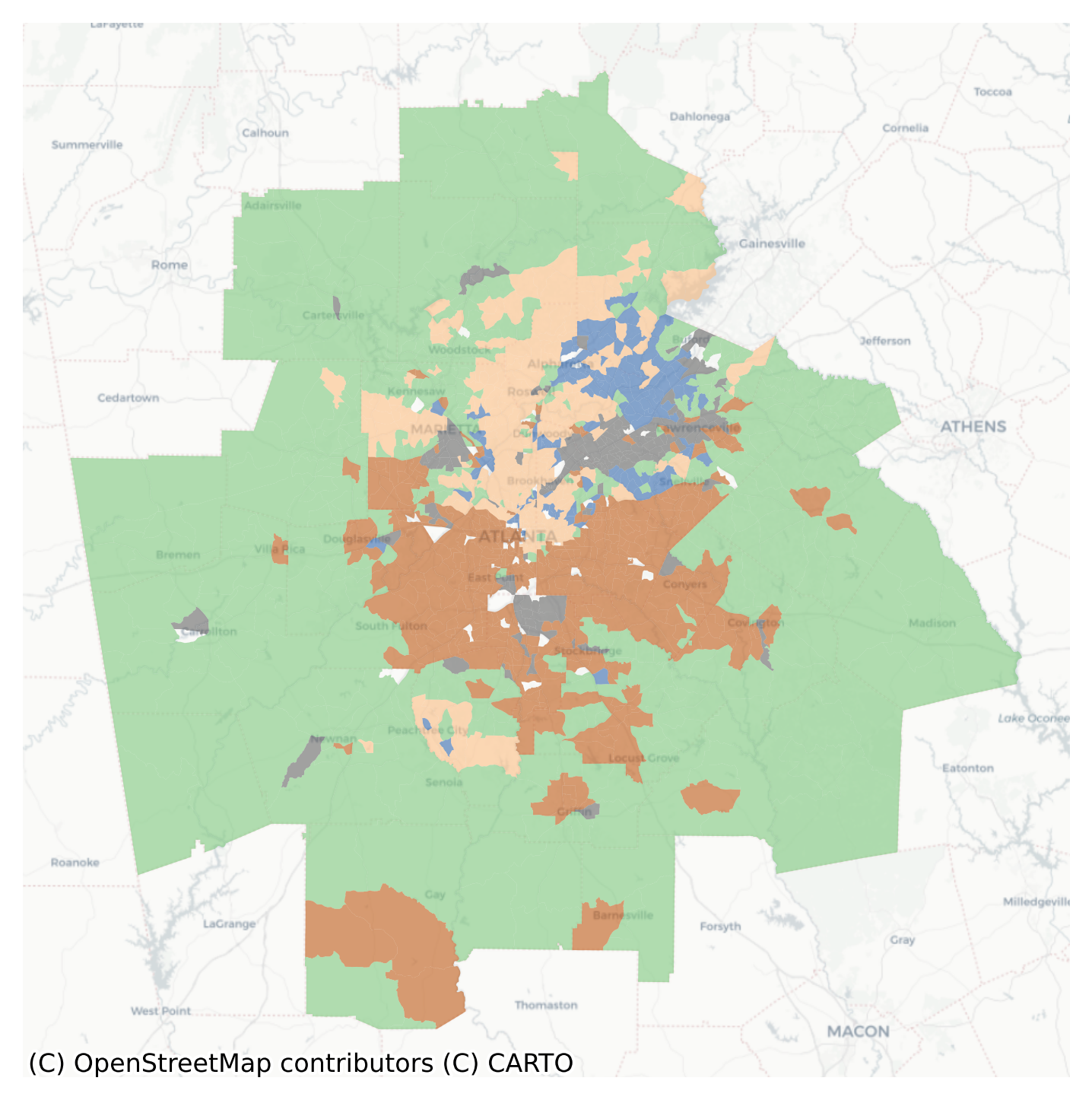
K-means Geodemographic Typology in the Atlanta Metro
There are two obvious patterns in this map. There’s an urban-rural distinction, where type 1 dominates the periphery of the metro, and is basically absent from the core. There is also a north-south distinction, where type 0 is exclusively located in the southern portion and type 3 is exclusively in the north. Types 2 and 4 seem to have their own distinctive pockets. Even at this surface level, the map tells a pretty powerful story about multivariate segregation in the region. The kmeans clustering algorithm does not consider space at all, yet all of the types form distinctive spatial clusters that are apparent in the map. We can also conduct formal tests for whether these patterns diverge from spatial randomness using join count statistics either individually for each cluster or jointly for all clusters (though it is pretty obvious here that a co-location statistic for these five variables would be wildly significant)
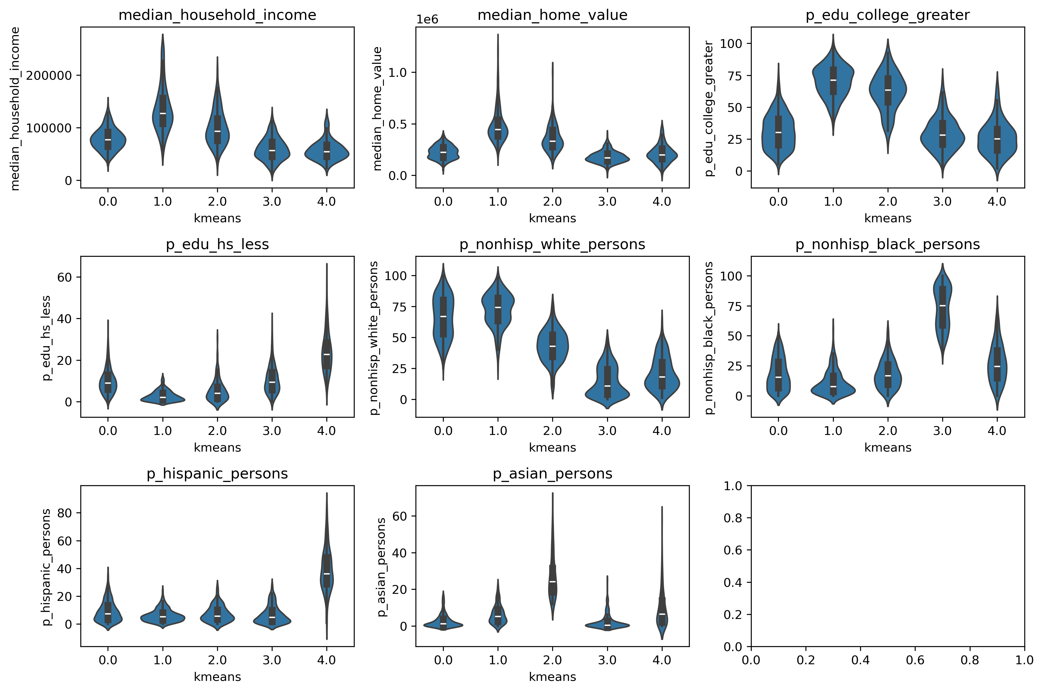
To understand what the clusters are identifying, another data visualisation technique is useful. Here, we rely on the Tufte-ian principle of “small multiples”, and create a set of violin plots that show how each variable is distributed across each of the clusters. Each of the inset boxes shows a different variable, with cluster assignments on the x-axis, and the variable itself on the y-axis The boxplot in the center shows the median and IQR, and the “body” of the “violin” is a kernel-density estimate reflected across the x-axis. In short, the fat parts of the violin show where the bulk of the observations are located, and the skinny “necks” show the long tails.
Note that in this case we are visualizing the same attributes used to create the cluster model because this is what differentiates the clusters from one another, but the columns argument accepts a list of any variables present in the dataframe. This can be useful for examining the distribution of another variable across the clusters. For example if the clusters are based purely on sociodemographic data and an analyst wants to treat cluster assignments as “exogenous” and examine how another resource like affordable housing or exposure to pollution is spread across the different neighborhood types
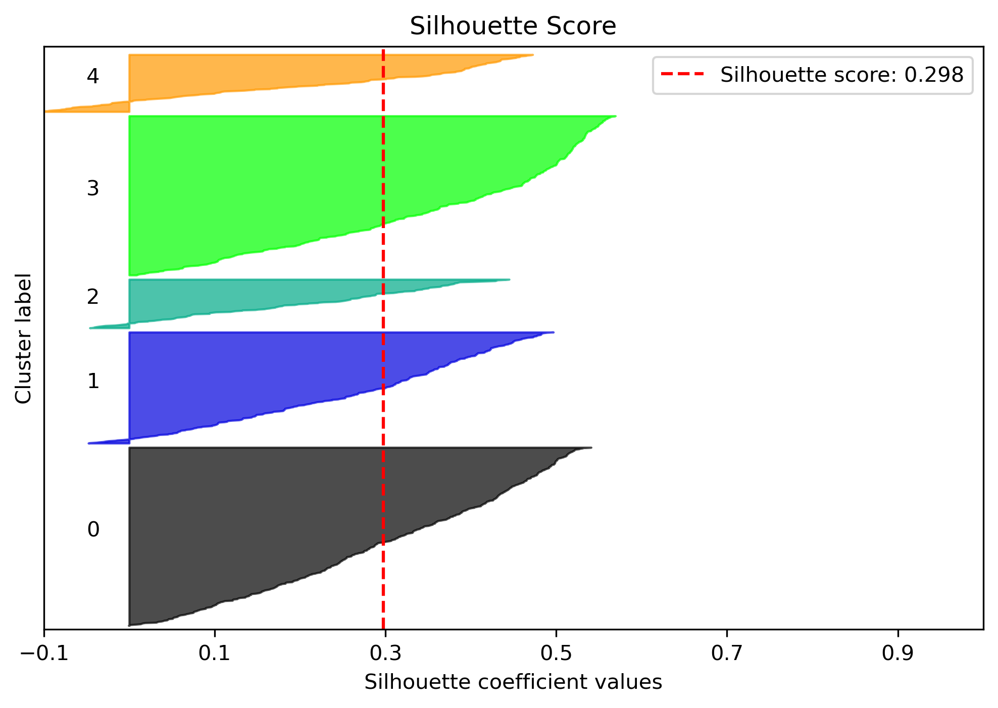
We can also use a statistic to tell us how well this model fits the data. To do so, we can use scikit-learn’s silhouette score
The Silhouette Coefficient is calculated using the mean intra-cluster distance (a) and the mean nearest-cluster distance (b) for each >sample. The Silhouette Coefficient for a sample is (b - a) / max(a, b). To clarify, b is the distance between a sample and the nearest >cluster that the sample is not a part of. Note that Silhouette Coefficient is only defined if number of labels is 2 <= n_labels <= >n_samples - 1.
This function returns the mean Silhouette Coefficient over all samples. To obtain the values for each sample, use silhouette_samples.
The best value is 1 and the worst value is -1. Values near 0 indicate overlapping clusters. Negative values generally indicate that a sample has been assigned to the wrong cluster, as a different cluster is more similar.
The geosnap ModelResults class that is returned with the geodataframe includes a set of methods for quickly computing and visualizing these fit statistics (and their distribution in space)
Code
atl_k_model.plot_silhouette()plt.show()
Plot of Silhouette Scores
Code
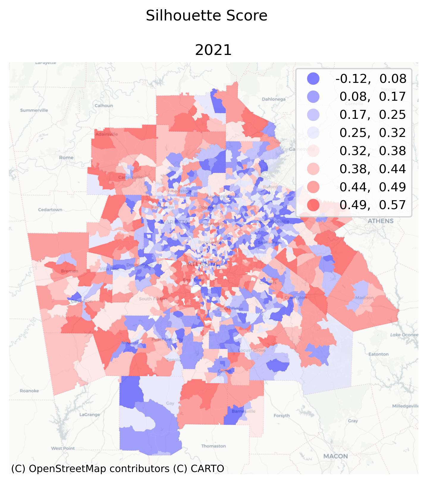
atl_k_model.plot_silhouette_map(figsize=(6, 6))
/Users/knaaptime/miniforge3/envs/urban_analysis/lib/python3.12/site-packages/geosnap/visualize/mapping.py:171: UserWarning: `proplot` is not installed. Falling back to matplotlib
warn("`proplot` is not installed. Falling back to matplotlib")
Map of Silhouette Scores in Greater Atlanta
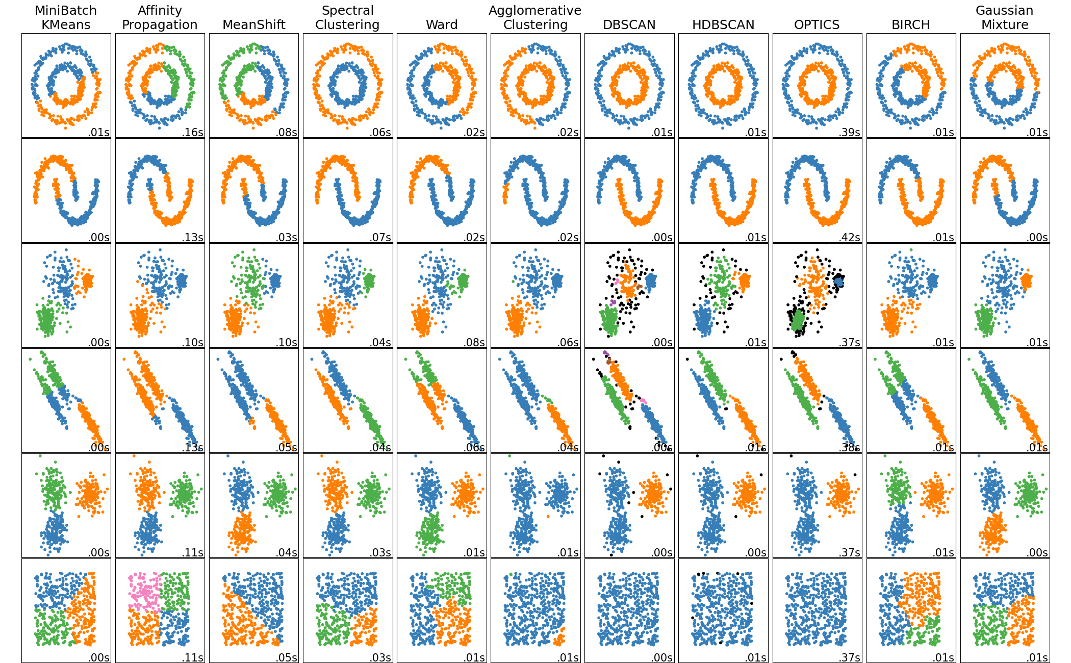
If there is spatial patterning in the silhouette scores for each observation, then it suggests there are particular places where the cluster model does not fit well. That could mean that a different model may work better, e.g. by increasing (or decreasing) the number of clusters, or by using a different clustering algorithm. There are many algorithms to choose from, and they differ in their ability to capture different kinds of structure in the set of attributes. For more details, see the scikit-learn clustering page, including this excellent graphic:
To get a feel for how these different algorithms generate alternative results for geodemographic typologies, we can use the same input data for each of the clustering techniques and map the results.
/Users/knaaptime/miniforge3/envs/urban_analysis/lib/python3.12/site-packages/geosnap/analyze/_cluster_wrappers.py:272: UserWarning: Note: Gaussian Mixture Clustering is probabilistic--cluster labels may be different for different runs. If you need consistency, you should set the `random_state` parameter
warn(
Geodemographic Typologies using Alternative Clustering Methods
Note that the colors do not mean anything when comparing across maps, only the patterns matter. Thus, even though the kmeans, ward, and affinity propagation maps use different colors, the algorithms are largely capturing similar patterns, as the tracts tend to end up in similar groups across the maps. According to the silhouette score, the kmeans solution fits the best (.284). Needless to say, these clusting algorithms pick up on different spatial patterns, but the most appropriate algorithm is a choice determined by the research question (or an analyst’s preferred fit metric)
To compare solutions directly, you can use holoviews to create a linked plot that will pan together (this requires hvplot and geoviews, which are not dependencies)
Code
import geoviews as gvimport hvplot.pandasimport matplotlib.pyplot as pltimport seaborn as snsgv.extension("matplotlib", "bokeh")gv.output(backend="bokeh")
Using a linked interactive plot we can explor similarity in the kmeans and affinity propagation solutions, which have the highes silhouette scores. This is useful to see whether they discover the same spatial patterns, but in this case also because affinity propagation is an algorithm where k is endogenous (so the affinity propagation solution here only includes 4 clusters vs the k-means’ 6).
 (from the
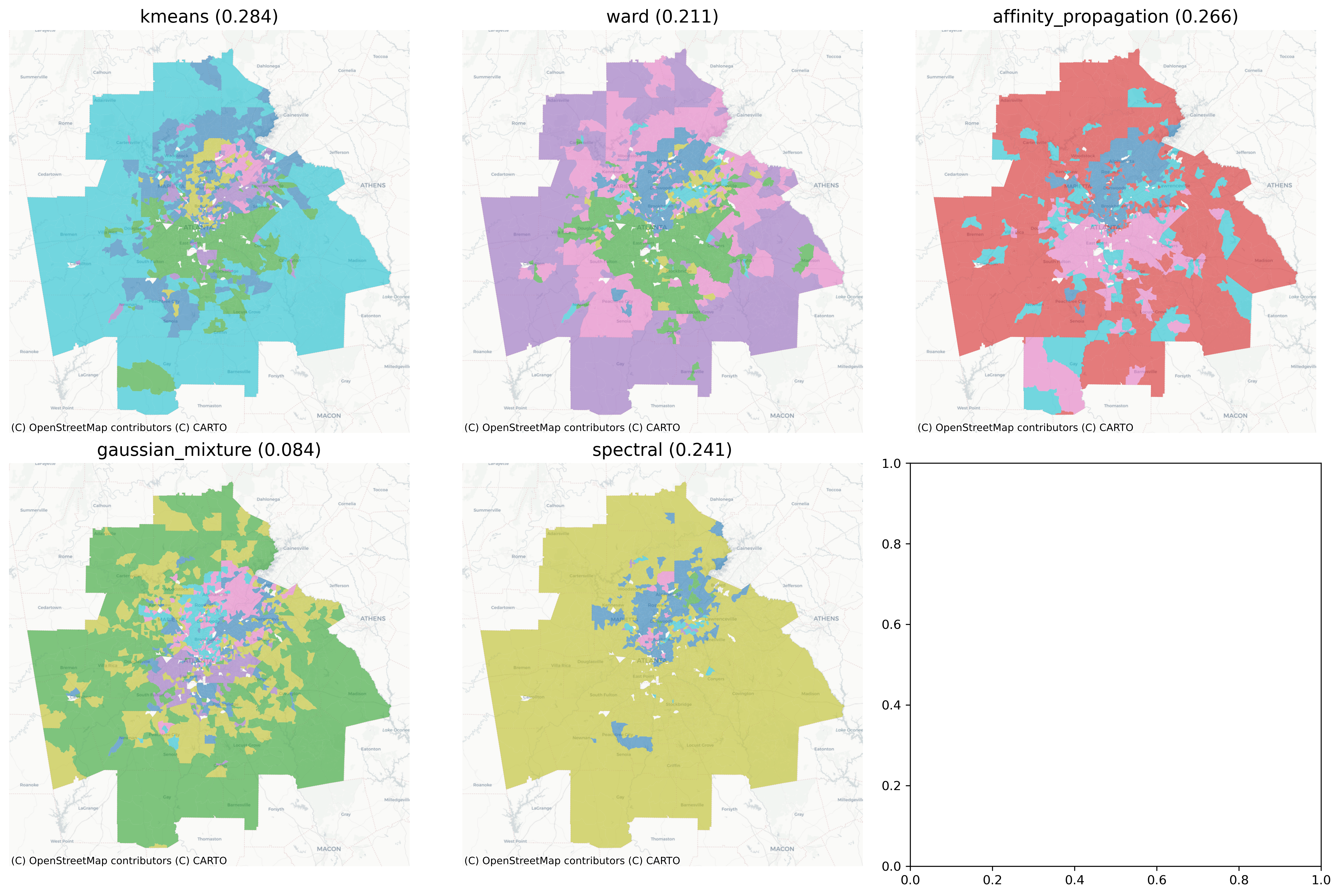